Logo
The simple, strong shorthand for our brand. A beautifully crafted mark that gives us license to be brave and bold, wherever it appears.
Cheat sheet
Here's a quick overview of how we use our logo. Refer back to this whenever you need a quick reminder. For more detail, read on.
Here's a quick overview of how we use our logo. Refer back to this whenever you need a quick reminder. For more detail, read on.
Logo
Our logo is the shorthand for our brand, so it’s important we use it boldly — but consistently. We want to build equity into our core symbol, so wherever possible lead with it (instead of our full lockup).
Overview
Used as our primary logo, our symbol represents progress and impact through two forms driving outwards, forming a confident “B” shape. To make sure it remains recognisable, our logo should never be altered, distorted, or positioned inappropriately. Our logo must always maintain the set arrangement and dimensions as shown in the following sections. To keep our logo feeling sophisticated, we only use it in Off White and Dark Green, never Red or Blue.
Used as our primary logo, our symbol represents progress and impact through two forms driving outwards, forming a confident “B” shape. To make sure it remains recognisable, our logo should never be altered, distorted, or positioned inappropriately. Our logo must always maintain the set arrangement and dimensions as shown in the following sections. To keep our logo feeling sophisticated, we only use it in Off White and Dark Green, never Red or Blue.
Sizing
To make sure that our logo is easy to read and stands out, follow the clear space rules detailed below. This goes for all touchpoints, from print to digital. To ensure maximum legibility, the logo should never be reduced below the following minimum size.
To make sure that our logo is easy to read and stands out, follow the clear space rules detailed below. This goes for all touchpoints, from print to digital. To ensure maximum legibility, the logo should never be reduced below the following minimum size.
Sizing
heirarchy
The following examples showcase the three ways that we approach sizing our logo in different scenarios.
In primary examples, where the logo is the hero, it should take centre stage over all other elements.
The following examples showcase the three ways that we approach sizing our logo in different scenarios.
In primary examples, where the logo is the hero, it should take centre stage over all other elements.

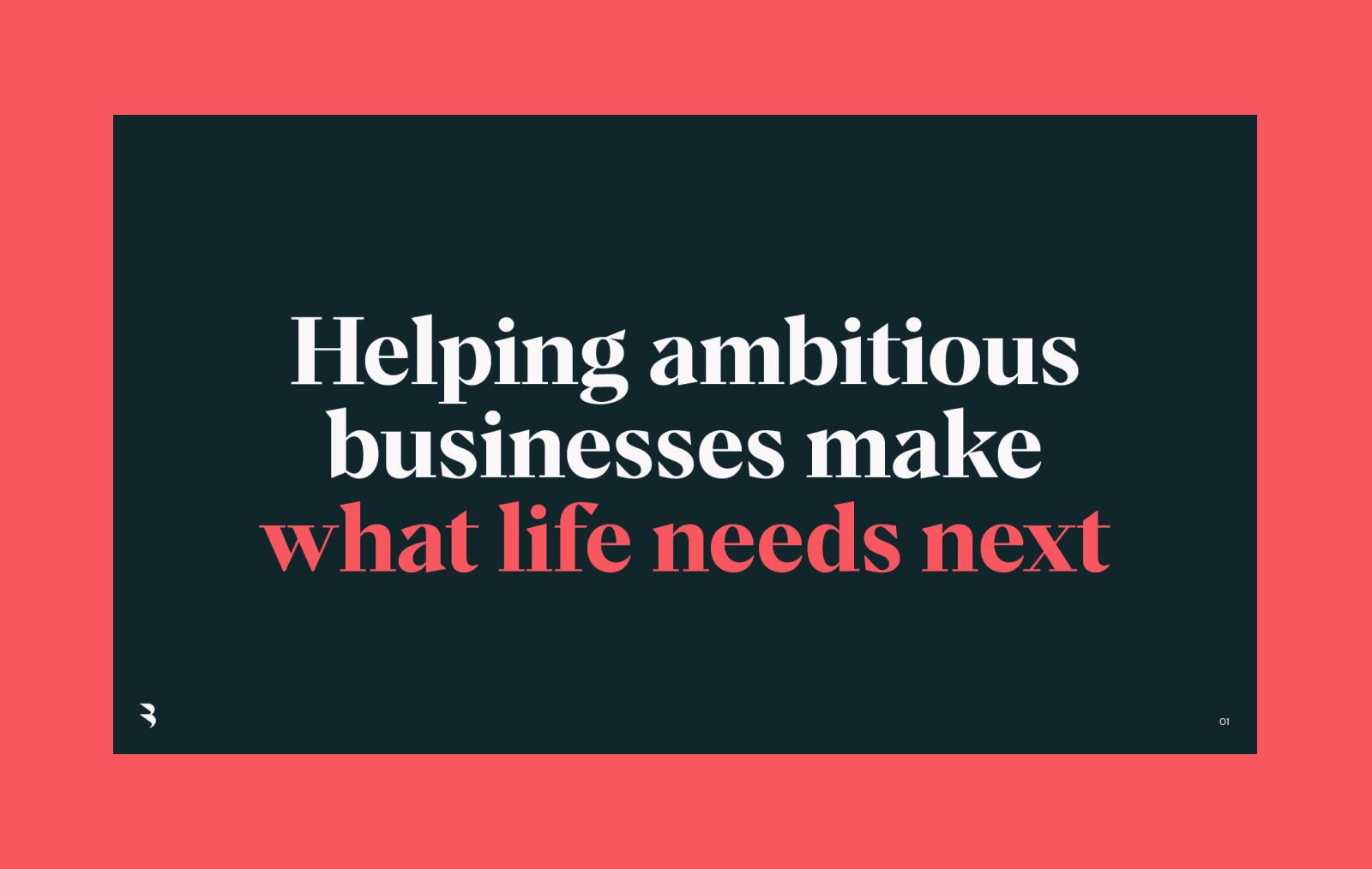
In this 16:9 example, the logo’s height matches 1/3 of the composition’s.
This should be used as a rough guide, as different compositions will require more dynamic sizing usage.
In this 16:9 example, the logo’s height matches 1/3 of the composition’s.
This should be used as a rough guide, as different compositions will require more dynamic sizing usage.

In this 16:9 example, the logo’s height matches 1/10 of the composition’s.
This should be used as a rough guide, as different compositions will require more dynamic sizing usage.
The following examples showcase the three ways that we approach sizing our logo in different scenarios.
In secondary examples, the logo should be placed on equal footing with the rest of the content.
In this 16:9 example, the logo’s height matches 1/27 of the composition’s.
This should be used as a rough guide, as different compositions will require more dynamic sizing usage.
The following examples showcase the three ways that we approach sizing our logo in different scenarios.
In tertiary examples, the logo should be completely secondary to hero content. This usage is mostly found in presentation slide footers.
Placement
Due to our logo’s unique construction, it should be shifted slightly left-of-center, in order to create optical alignment on the page. When placed close to page borders, make sure to use always keep the above mentioned clear space rules in mind.
Due to our logo’s unique construction, it should be shifted slightly left-of-center, in order to create optical alignment on the page. When placed close to page borders, make sure to use always keep the above mentioned clear space rules in mind.
Logo usage
The following examples showcase how we can use our logo in bold ways — from small to large touchpoints.
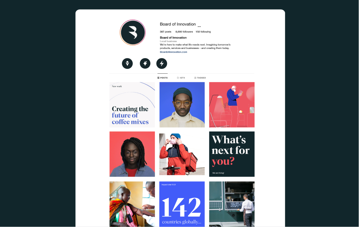
Even in smaller spaces, such as social media avatars, it works well to quickly communicate who we are.
The following examples showcase how we can use our logo in bold ways — from small to large touchpoints.
Even in smaller spaces, such as social media avatars, it works well to quickly communicate who we are.
The following examples showcase how we can use our logo in bold ways — from small to large touchpoints.
Even in smaller spaces, such as social media avatars, it works well to quickly communicate who we are.
The following examples showcase how we can use our logo in bold ways — from small to large touchpoints.
Even in smaller spaces, such as social media avatars, it works well to quickly communicate who we are.
Logo as
a super
graphic
When we’re feeling our boldest — and in more expressive brand moments — we can use our logo as a confident supergraphic element. Taking over spaces and making an impact. Here are some examples in action.
When we’re feeling our boldest — and in more expressive brand moments — we can use our logo as a confident supergraphic element. Taking over spaces and making an impact. Here are some examples in action.
Super
graphic
usage
When using our logo as a supergraphic, use the following rules to ensure it’s always looking its best.
The logo should be cropped at the top and bottom, just inside the anchor point of each respective curve. The solid magenta dots are illustrating where the anchor points are, with the dotted line showing the crop.
For perfect results, use the Supergraphic logo asset provided.

When using our logo as a super graphic, use the following plcements to ensure it’s always looking its best.

When using our logo as a super graphic, avoid doing the following.
Our logo should never be used to mask imagery or illustration.
Full Lockup
In rare cases, or scenarios where people need to know our full name, we can use our full logo lockup. Here’s how we use it.
Overview
Our full logo lockup is our symbol paired with a bespoke wordmark — a modern sans-serif with customised letterforms inspired by our symbol. Together, they work as sophisticated signifier to communicate our distinctive personality. Our full lockup must always maintain the set arrangement and dimensions as shown on the following pages.
Our full logo lockup is our symbol paired with a bespoke wordmark — a modern sans-serif with customised letterforms inspired by our symbol. Together, they work as sophisticated signifier to communicate our distinctive personality. Our full lockup must always maintain the set arrangement and dimensions as shown on the following pages.


Full lockup
sizing
To make sure that our full lockup maintains legibility and impact, follow the clear space rules outlined below. These rules should be applied on all touchpoints, from print to digital. To ensure legibility, the full lockup should never be reduced below the following minimum size.
To make sure that our full lockup maintains legibility and impact, follow the clear space rules outlined below. These rules should be applied on all touchpoints, from print to digital. To ensure legibility, the full lockup should never be reduced below the following minimum size.

Full lockup
usage
The following examples showcase the scenarios where we might use our full lockup.
The following examples showcase the scenarios where we might use our full lockup.

The following examples showcase the scenarios where we might use our full lockup.
The following examples showcase the scenarios where we might use our full lockup.
Lockup
variations
Besides our horizontal full lockup, we also have a vertical lockup available. Always use the version that will give us the best legibility, depending on the layout it’s placed into. When partnering our lockup with other logos follow this spacing guidance.
Besides our horizontal full lockup, we also have a vertical lockup available. Always use the version that will give us the best legibility, depending on the layout it’s placed into. When partnering our lockup with other logos follow this spacing guidance.


Dynamic
lockups
When using the full logo as a singular element on a composition, these dynamic lock-ups can be utilised for further flexibility and building equity and recognition in our brand elements. Wherever they’re placed, it’s important that the symbol and the wordmark are aligned in order to convey the relationship between the two.
When using the full logo as a singular element on a composition, these dynamic lock-ups can be utilised for further flexibility and building equity and recognition in our brand elements. Wherever they’re placed, it’s important that the symbol and the wordmark are aligned in order to convey the relationship between the two.


Dynamic
lock-ups
usage
The following examples showcase where we may want to use dynamic lockups — leading with our symbol, but ensuring recognition by including our wordmark separately, but aligned.
The following examples showcase where we may want to use dynamic lockups — leading with our symbol, but ensuring recognition by including our wordmark separately, but aligned.
Things to avoid
Don’t use custom colors
Dont rotate the logo
Never apply shadow effects
Don’t stretch or warp
Don’t use logo or lockup in Blue
Don’t use the logo or lockup in Red
Never alter the lock-up spacing
Don’t reverse the lock-up order