Icons
Simple, distinctive icons help us symbolise our values and capabilities. And crucially, they help us deliver our very own flavour of feedback.
Introduction
01. Stock icons
When you need to find icons for use in presentations, reports and tools, we can select from stock libraries to ensure we have maximum flexibility. So they always feel consistent and on-brand, follow the style guidance below when selecting new ones.
Overview
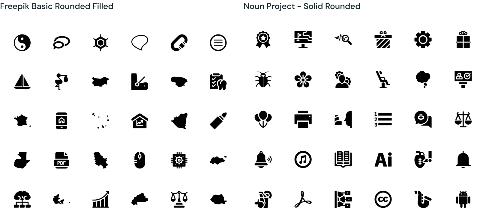
Here are some example stock icons to use as a benchmark for our style. Read on and we will unpack this further.
Here are some example stock icons to use as a benchmark for our style. Read on and we will unpack this further.
Icon styling
These are the main characteristics to look our for when selecting from stock, based on our bespoke icons. Try and always select icons that are as simple as possible, are a block colour rather than keyline, and have a good mix or straight and rounded corners.
These are the main characteristics to look our for when selecting from stock, based on our bespoke icons. Try and always select icons that are as simple as possible, are a block colour rather than keyline, and have a good mix or straight and rounded corners.
Stock
libraries
Not all icons in specific libraries will be spot on and consistent, but as a starting point, look for libraries with the following key words.
Not all icons in specific libraries will be spot on and consistent, but as a starting point, look for libraries with the following key words.

Stock icon usage
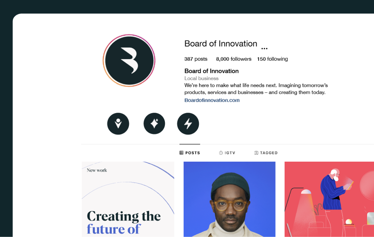
Here’s some examples of our stock icons in use.
Here’s some examples of our stock icons in use.
Things to avoid
Don’t use icons that don’t fit our style
Don’t apply strokes or effects
Don’t replace bespoke icons
Don’t tile the icons to create patterns
Don’t rotate icons
02. Bespoke icons
The following icons have been created completely bespoke to us. We use these to communicate some of the most important aspects of our brand. They have been crafted to fit into our visual language seamlessly.
Icon sets
These icons represent our three brand values in the most shorthand way. We use them to convey what we stand for and how we help our clients quickly and directly.
These icons represent our three brand values in the most shorthand way. We use them to convey what we stand for and how we help our clients quickly and directly.
These icons represent our three brand values in the most shorthand way. We use them to convey what we stand for and how we help our clients quickly and directly.
Our services icons communicate what we can offer clients from a more technical point of view. Even though abstract in nature, these forms help us to further explain and identify our core capabilities.
Giving clear feedback is important, but it doesn’t always have to be boring. These icons can be used as emojis to help identify what kind of feedback we want to give on a piece of work. These should only be used internally, and not as a brand asset.
Unlike other icons, these can be used not only in our Off White and Dark Green, but also in Red or Blue.
Icon style
Our bespoke icons are born from our logo. When creating new ones it’s important to remember these key visual traits to keep them feeling consistent.
Our bespoke icons are born from our logo. When creating new ones it’s important to remember these key visual traits to keep them feeling consistent.
Icon
construction
Keeping the visual traits in mind, the icons should first be crafted in simple forms on the following grid. We then round the corners to align with our logo style. This ensures visual consitency and harmony across all communications.
Keeping the visual traits in mind, the icons should first be crafted in simple forms on the following grid. We then round the corners to align with our logo style. This ensures visual consitency and harmony across all communications.
Things to avoid
Don’t change or edit current icons
Don’t apply strokes or effects
Don’t use the un-rounded versions
Don’t tile the icons to create patterns
Don’t rotate icons