Layout & templates
Our brand and design system is all about creating focus and showing impact. That’s why we’ve created some clear principles and key templates for every layout.
Introduction
01. Templates
We have two types of templates: Google Slides and Miro. Here are the rules of using both.
The basics
When using our templates, make sure you always follow these rules to keep presentations and workshops feeling consistent:
Google Slides
When using our templates, make sure you always follow these rules to keep presentations and workshops feeling consistent:
Google Slides
Google Slides
Google Slides
Google Slides
Google Slides
Google
Slides
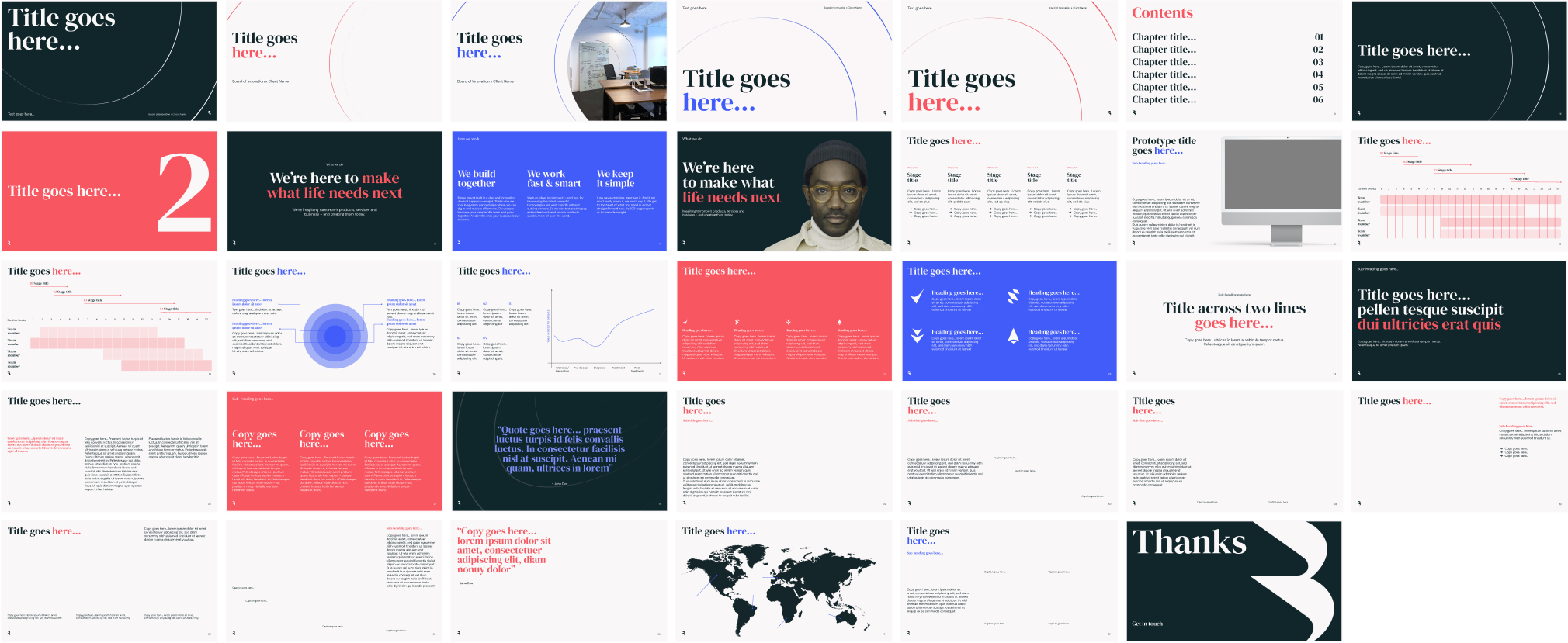
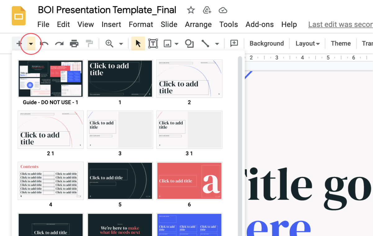
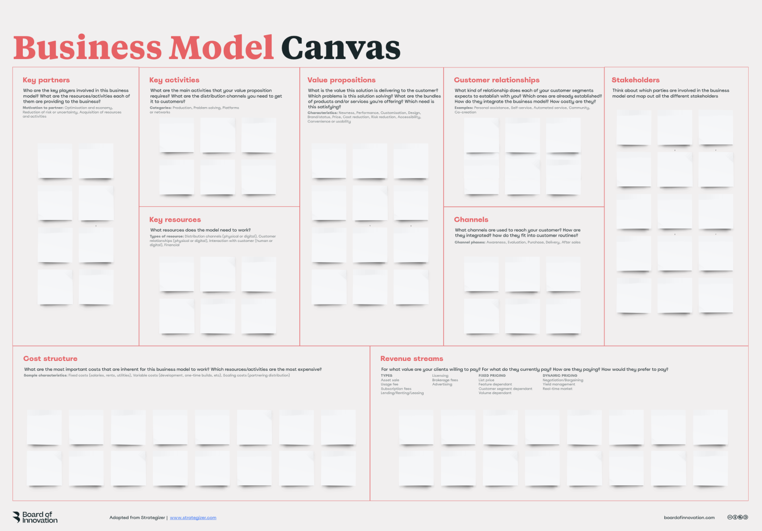
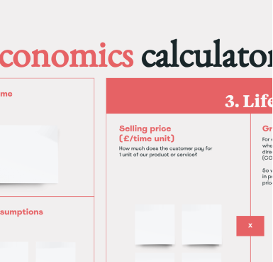
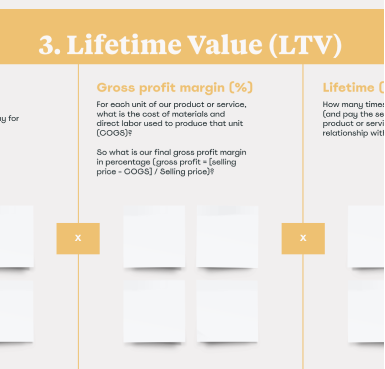
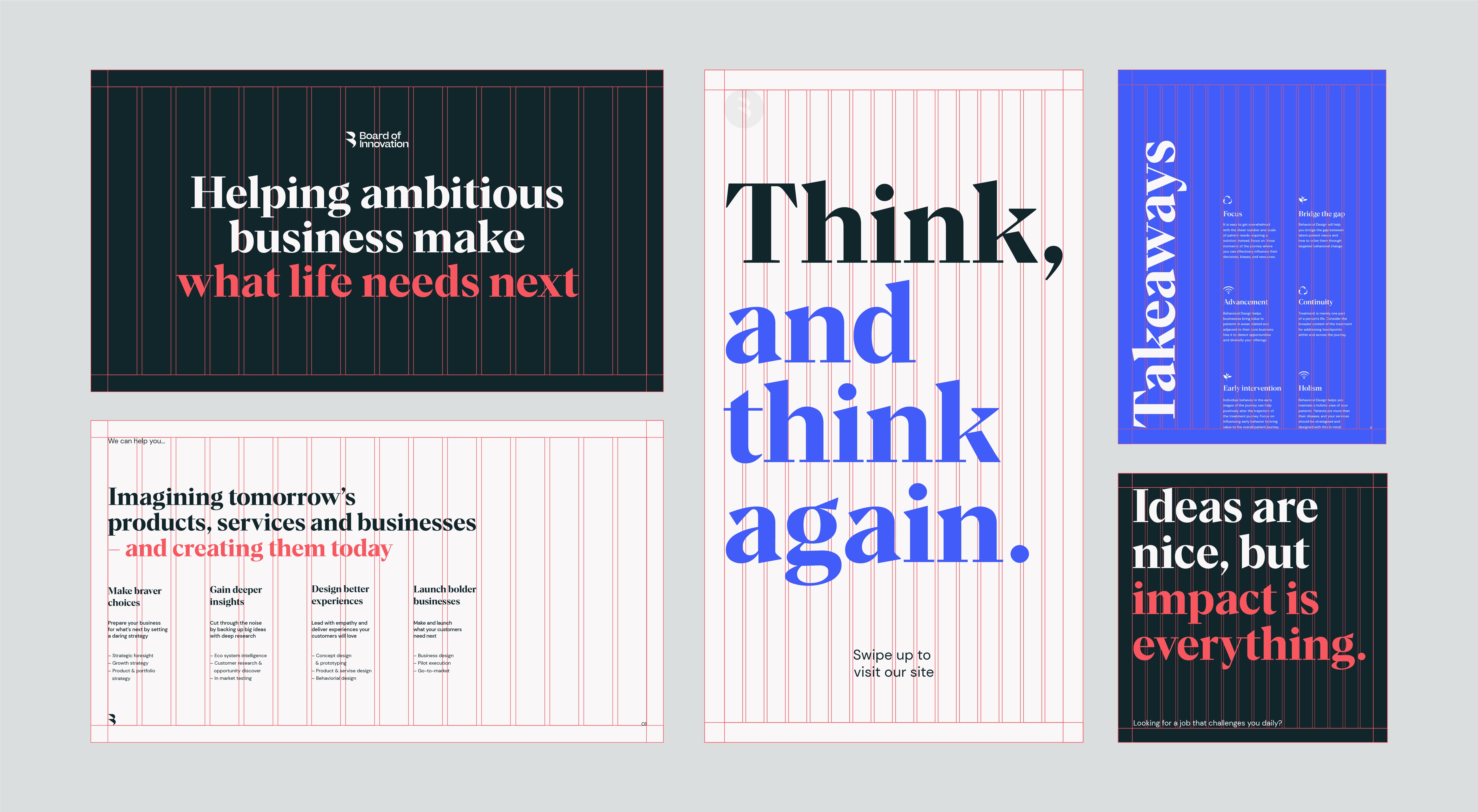
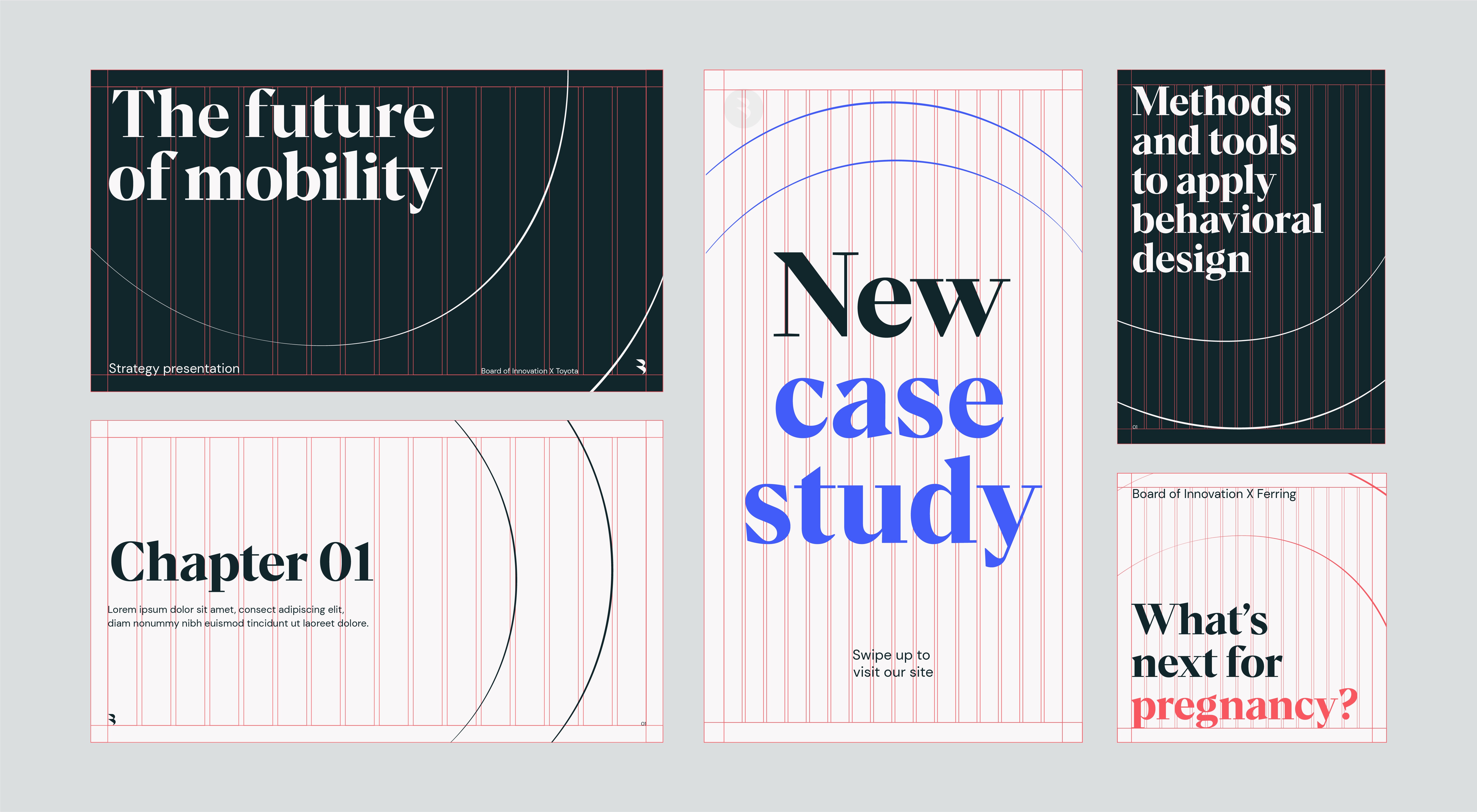
This is an overview of the Google slide templates. Use these as a basis when creating presentations.
This is an overview of the Google slide templates. Use these as a basis when creating presentations.
How to use
We lead with our hero pairing for key headlines and type areas. Our Off White and Green have great contrast and make sure we achieve good legibility and standout and legebility in all applications.
We lead with our hero pairing for key headlines and type areas. Our Off White and Green have great contrast and make sure we achieve good legibility and standout and legebility in all applications.
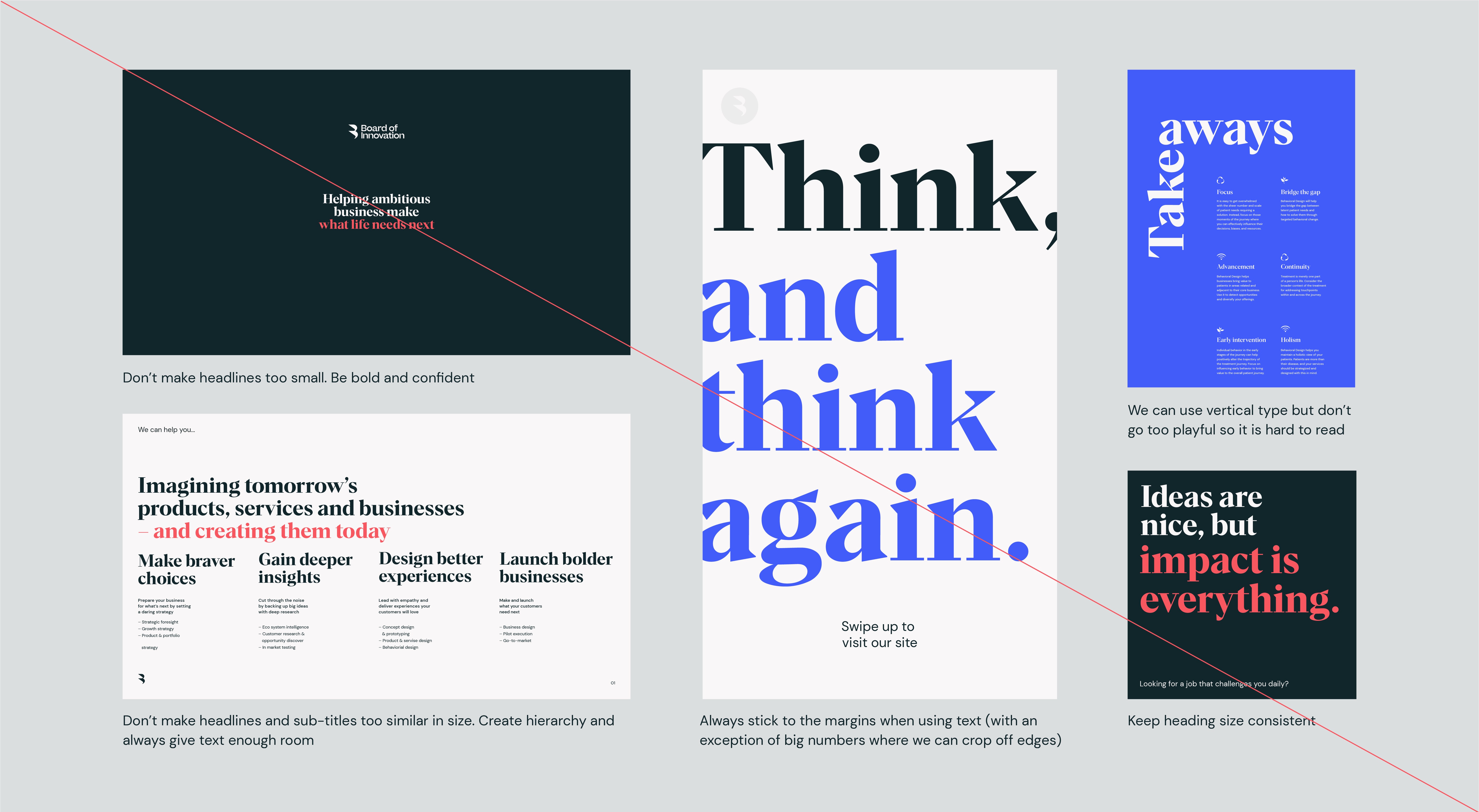
Things to avoid
Don’t edit the master theme

Replace placeholder content
Don’t use the guidance pages
Miro
example
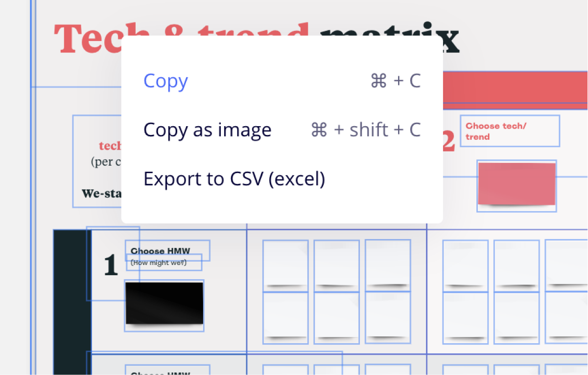
This is an example of one of our Miro templates, which can be completely customised using Miro’s design tools.
This is an example of one of our Miro templates, which can be completely customised using Miro’s design tools.
How to use
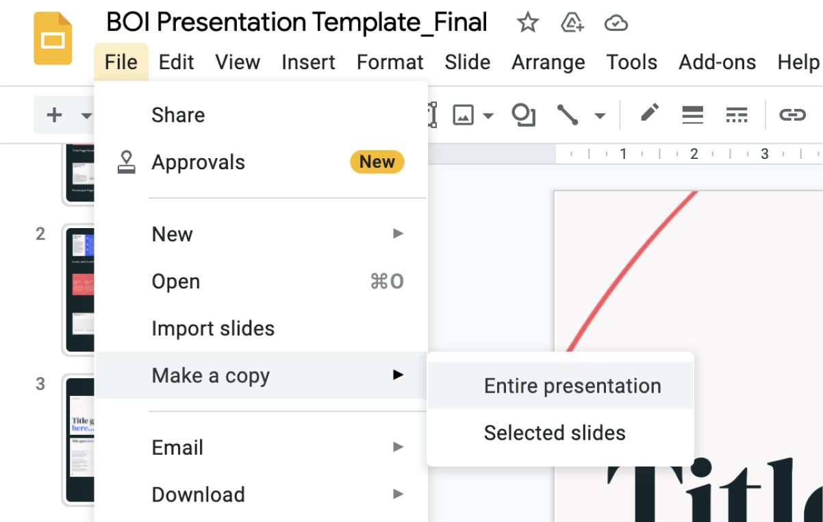
Just like out Google Slides, there are a few steps you should take before editing our Miro templates. The most important is to always copy the original board before making any changes or creating new ones.
Just like out Google Slides, there are a few steps you should take before editing our Miro templates. The most important is to always copy the original board before making any changes or creating new ones.
Things to avoid
Don’t change typefaces
Don’t edit colours
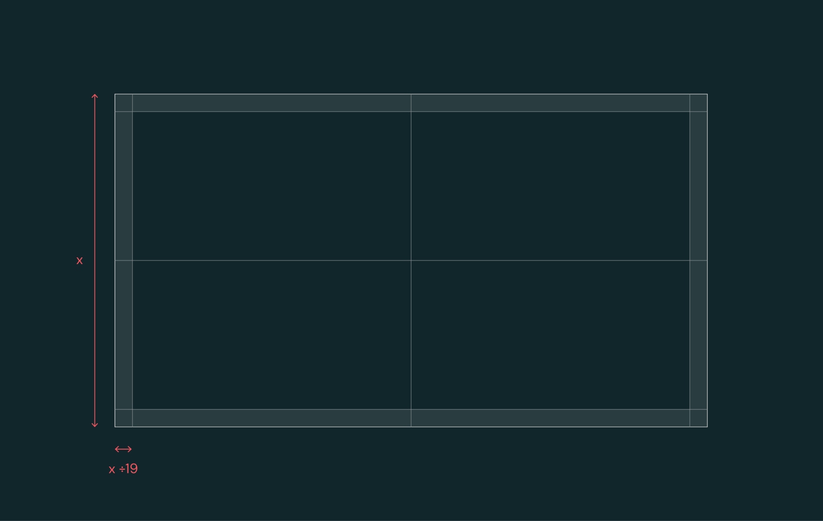
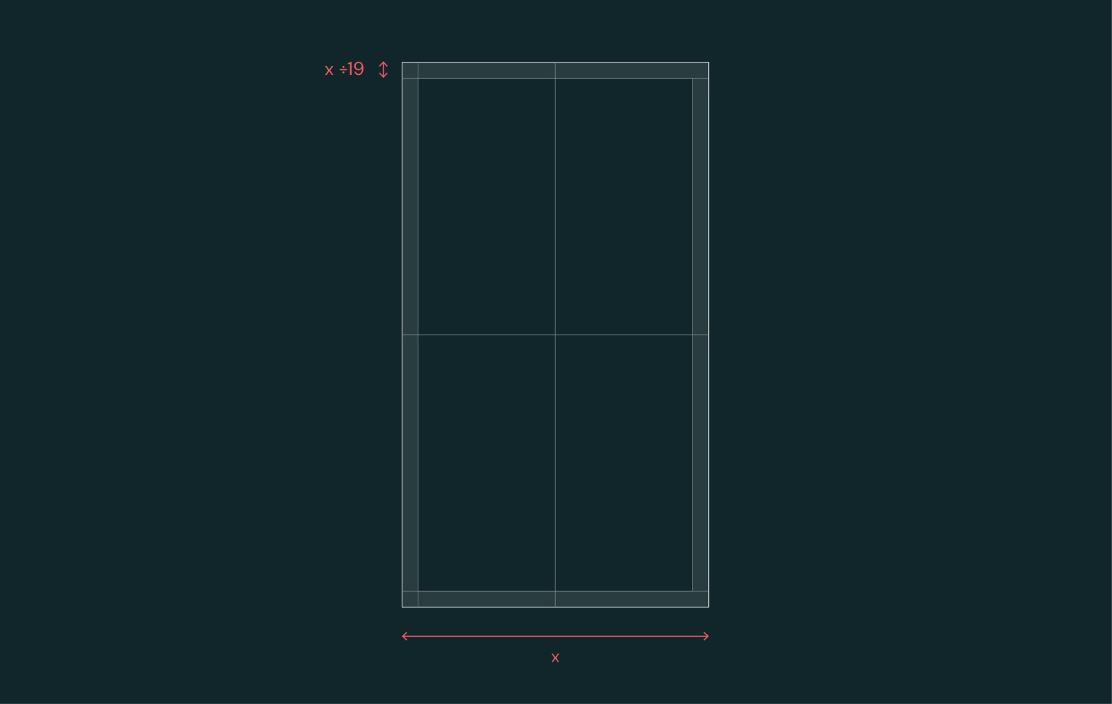
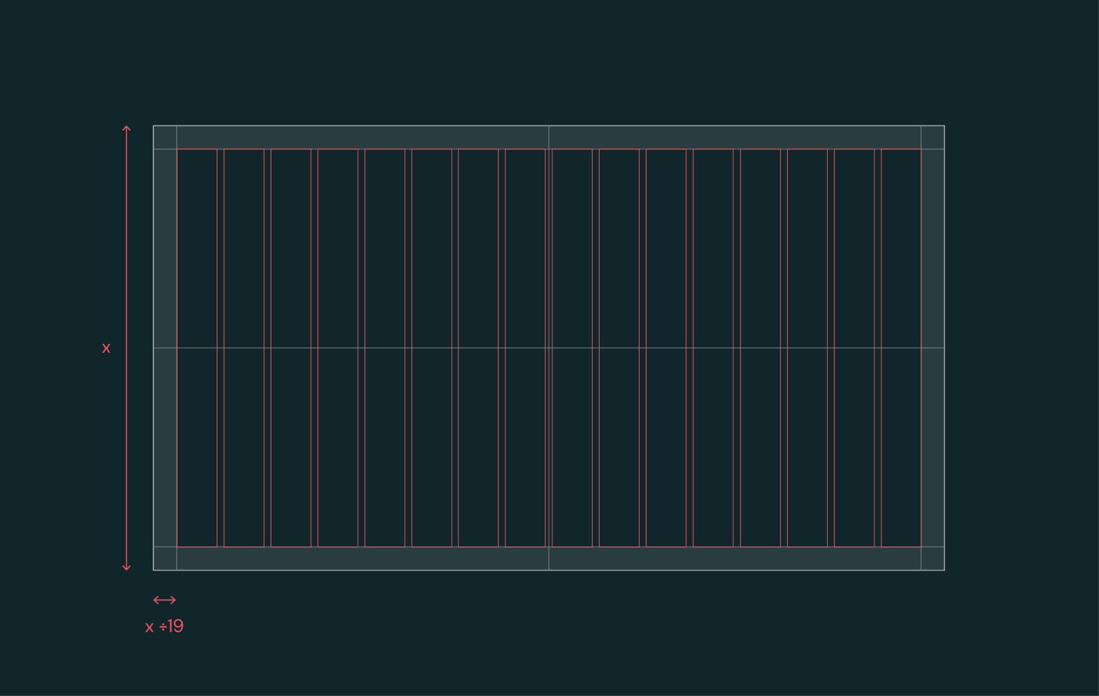
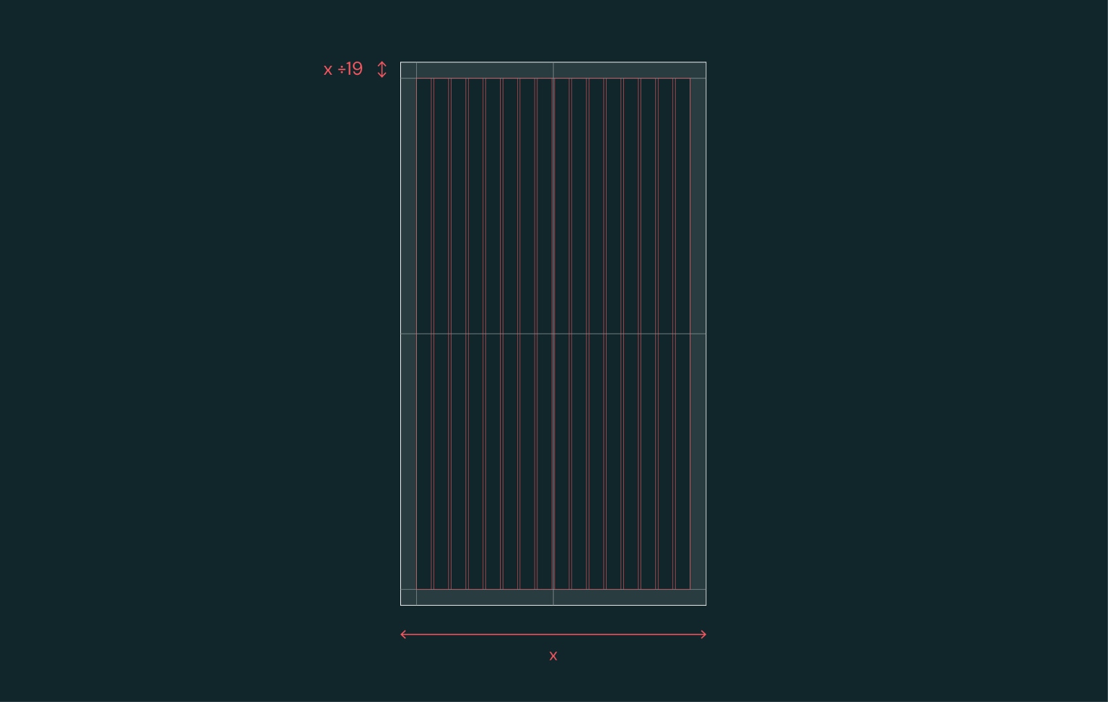
02. Grids
Whenever you create layouts, always use the following grid and margin rules to ensure consistency. These rules may be adapted for some extreme formats.
03. Layouts
We have four key layout types. These are outlined below with examples of best practice layouts, how they’re constucted on our grid, plus some things to avoid when designing new ones.
Layout types
Our design system is really versatile, and can flex to accommodate a variety of functions and formats. Here’s an overview of the ways you can use our elements to create different layouts.
Our design system is really versatile, and can flex to accommodate a variety of functions and formats. Here’s an overview of the ways you can use our elements to create different layouts.

Type only
When creating type-only layouts, go big and bold wherever possible. Always refer back to our type hierarchy page to ensure a consitent use of type styles and sizes.
When creating type-only layouts, go big and bold wherever possible. Always refer back to our type hierarchy page to ensure a consitent use of type styles and sizes.

Type with
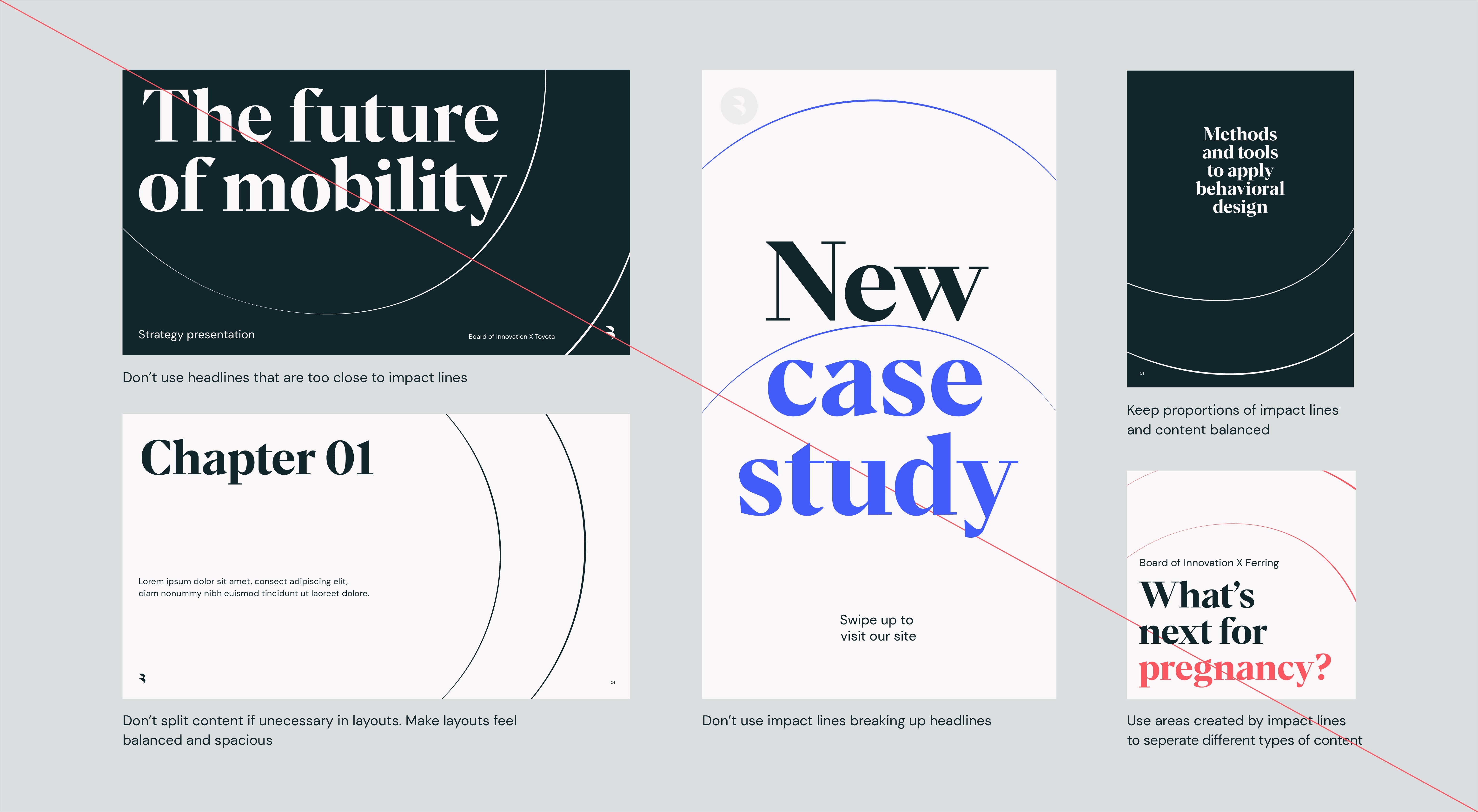
impact lines
When using our impact lines and type, use these rules to ensure the elements interact in the clearest way possible. It is important to make sure that the impact lines don’t get too close to the type.
When using our impact lines and type, use these rules to ensure the elements interact in the clearest way possible. It is important to make sure that the impact lines don’t get too close to the type.

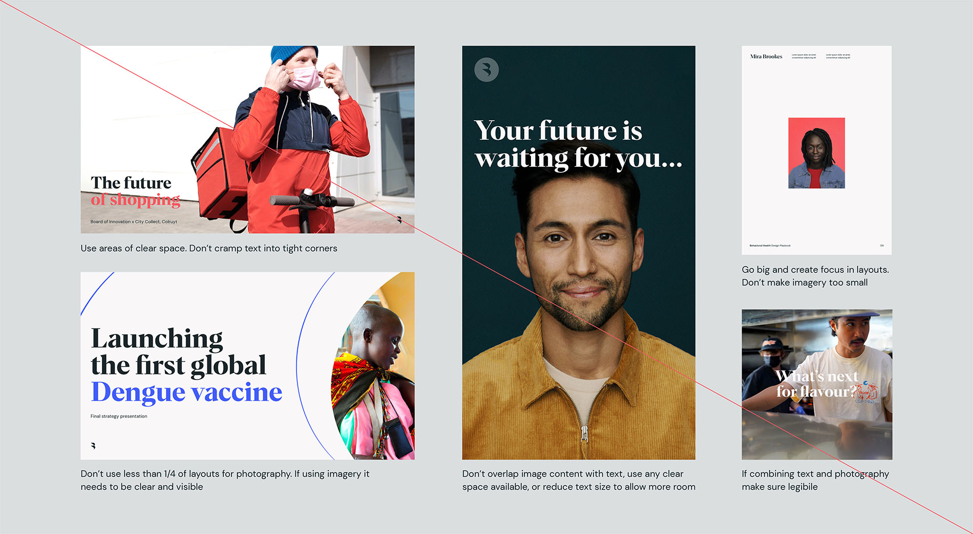
Photography
Using type and imagery together can create bold results, but it’s always important to ensure complete legibility so all our content is digestable. Type should only be used on top of art direction when there is a clear space to place it.
Using type and imagery together can create bold results, but it’s always important to ensure complete legibility so all our content is digestable. Type should only be used on top of art direction when there is a clear space to place it.

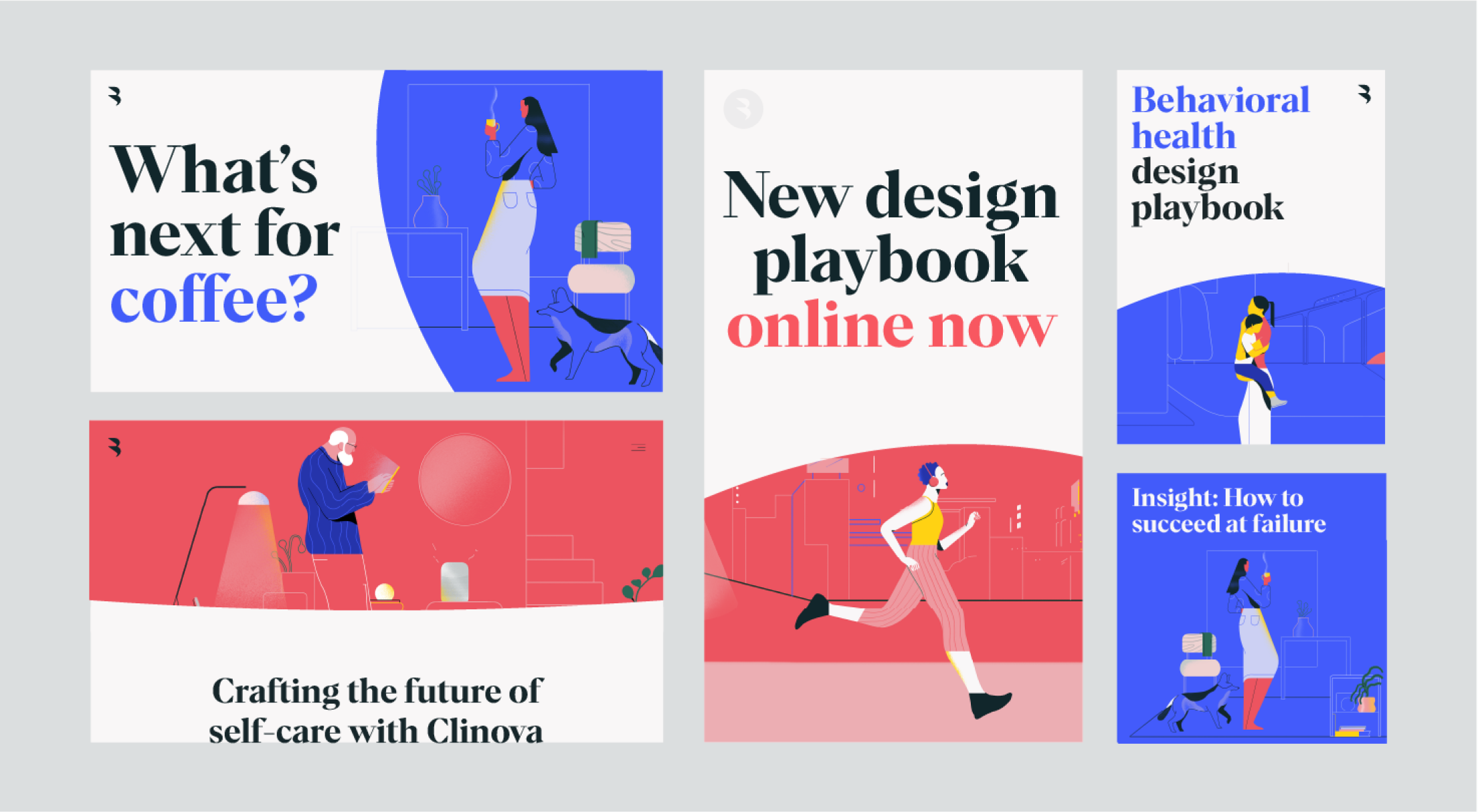
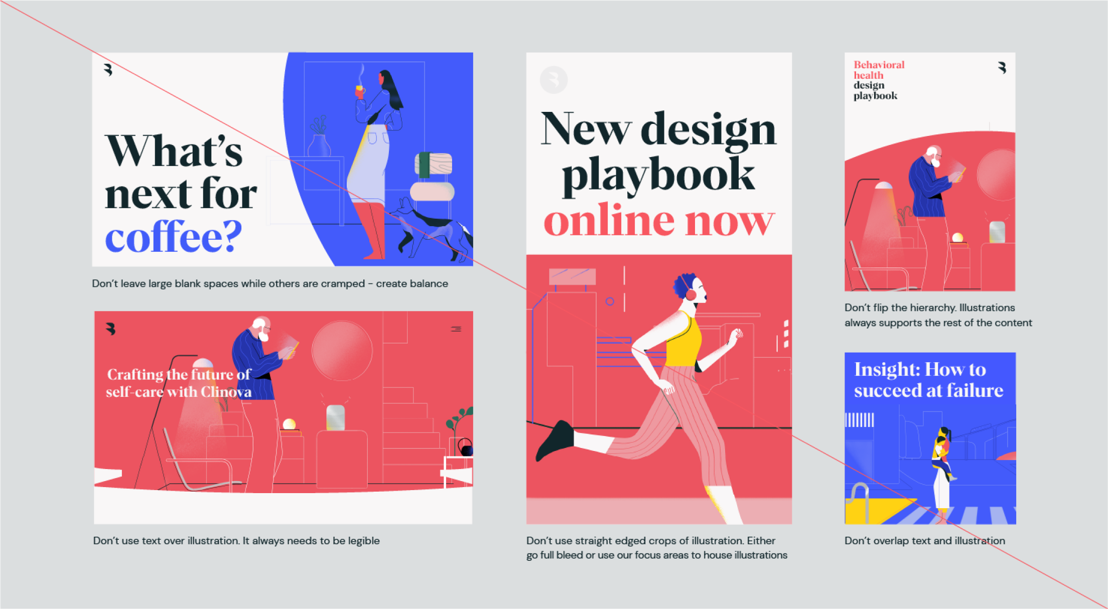
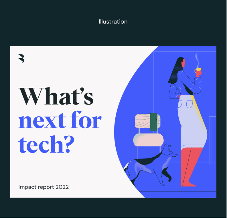
Illustration
These same rules apply to our intergration with type and illustration. The following layout examples show how best to balance out the two elements.
These same rules apply to our intergration with type and illustration. The following layout examples show how best to balance out the two elements.