Brand idea
Our brand idea is the bridge between our strategy and visual identity — it’s the concept that underpins the visual concept that helps us bring our brand to life.
The idea
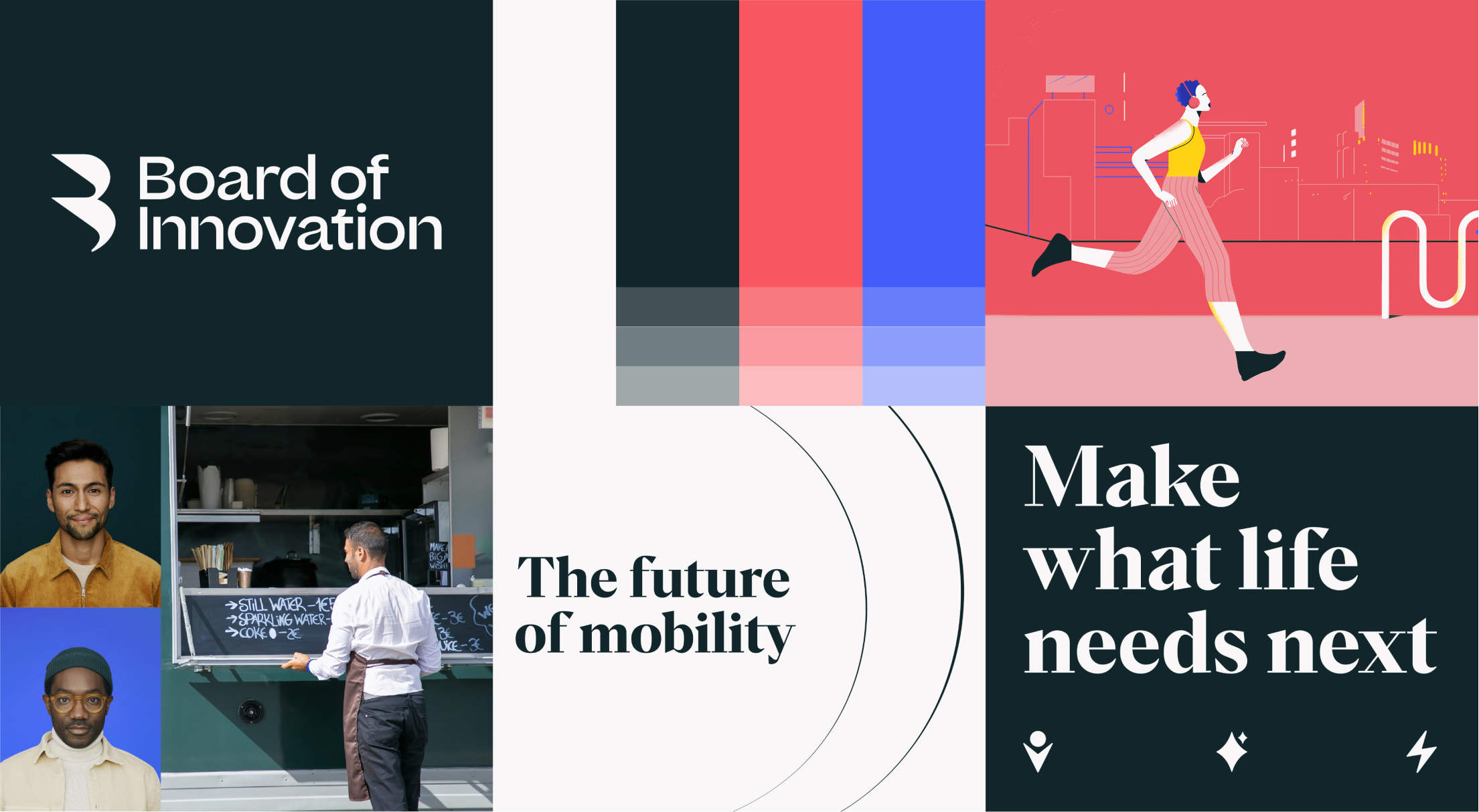
Every element in our toolkit is designed to create focus, complemented by graphic elements that represent our impact on the world around us. Tonally, we combine bold, eye-catching elements with striking sophistication.
Every element in our toolkit is designed to create focus, complemented by graphic elements that represent our impact on the world around us. Tonally, we combine bold, eye-catching elements with striking sophistication.

Focus
& impact
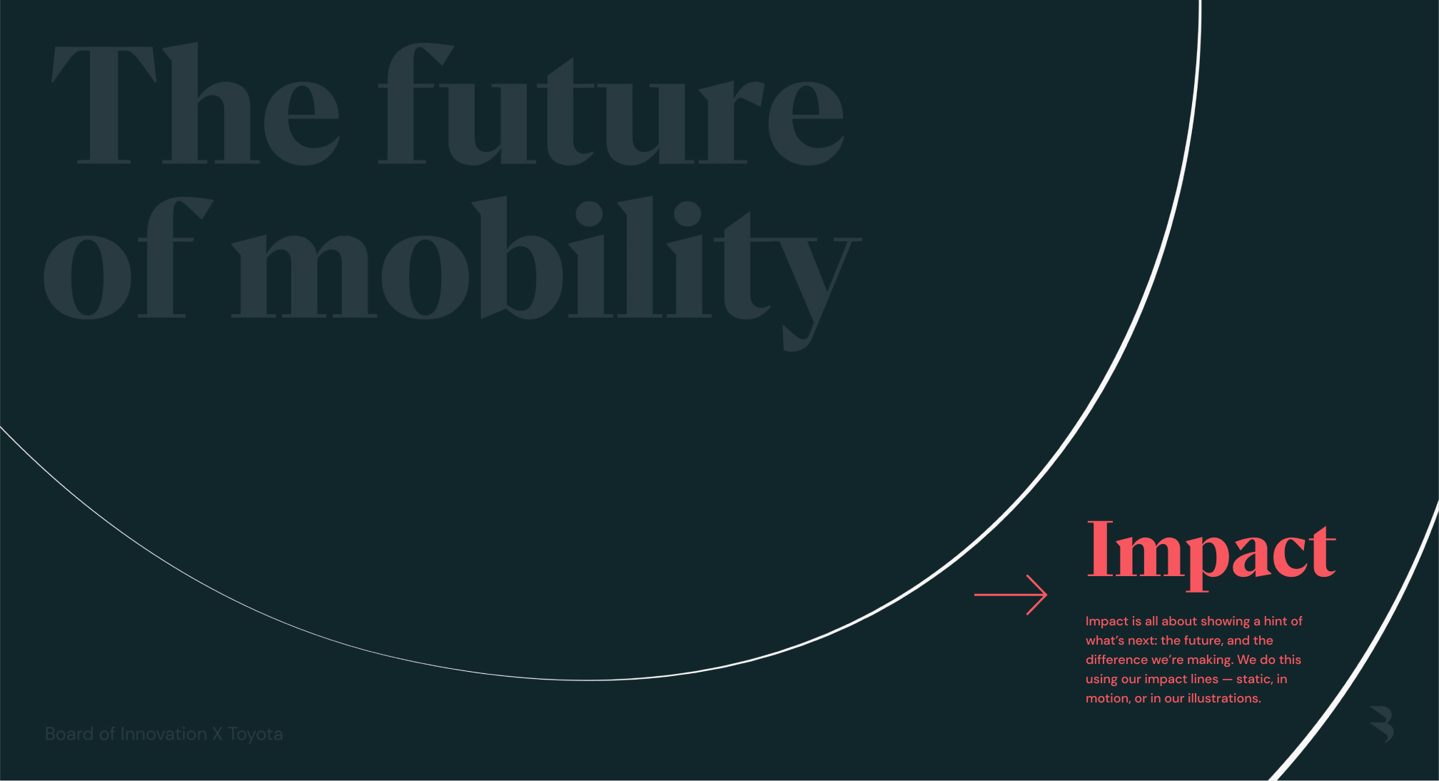
Here’s an example of our Focus and Impact concept in use. In every touchpoint, we should make sure we convey an equal balance of both — creating clear focus first, then demonstrating impact — a hint at “what’s next”.
Here’s an example of our Focus and Impact concept in use. In every touchpoint, we should make sure we convey an equal balance of both — creating clear focus first, then demonstrating impact — a hint at “what’s next”.
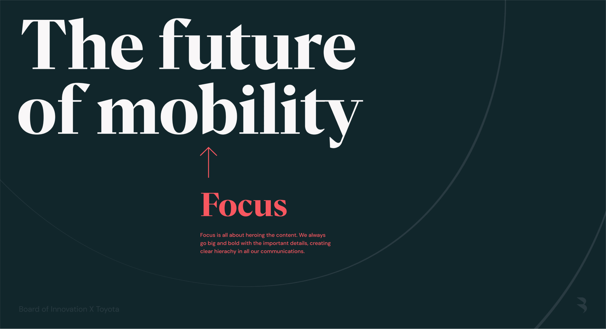
Focus
Here are some ways to create Focus:
Here are some ways to create Focus:
Colour to create focus areas
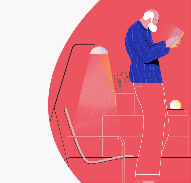
Draw attention to illustration and photography using focus areas of full colour.
Go big & bold
By scaling up certain elements, we draw attention to important details, while creating focus and hierarchy.
Highlight type
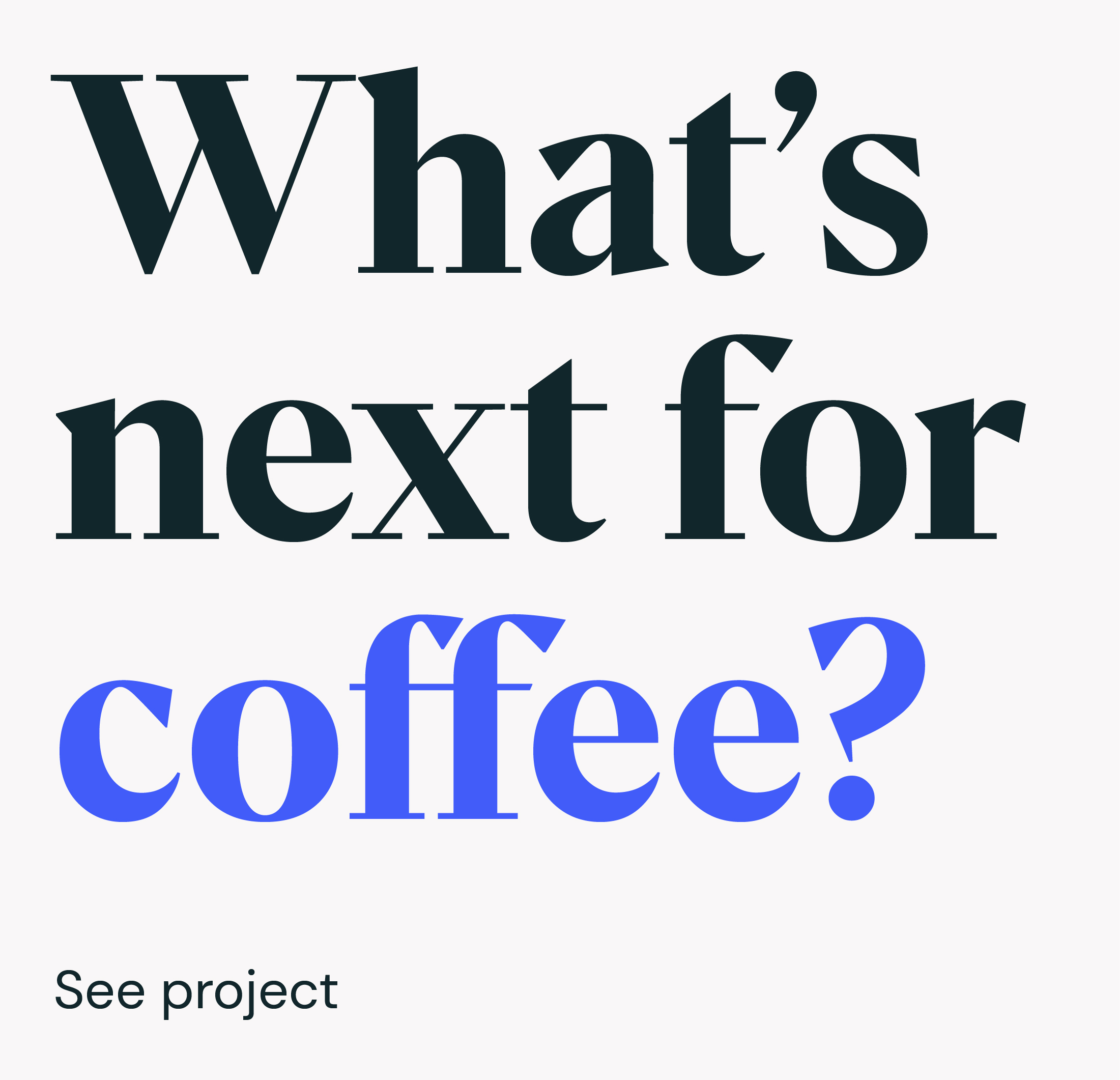
Focus on the most important part of headlines using coloured highlights.
Colourful pops
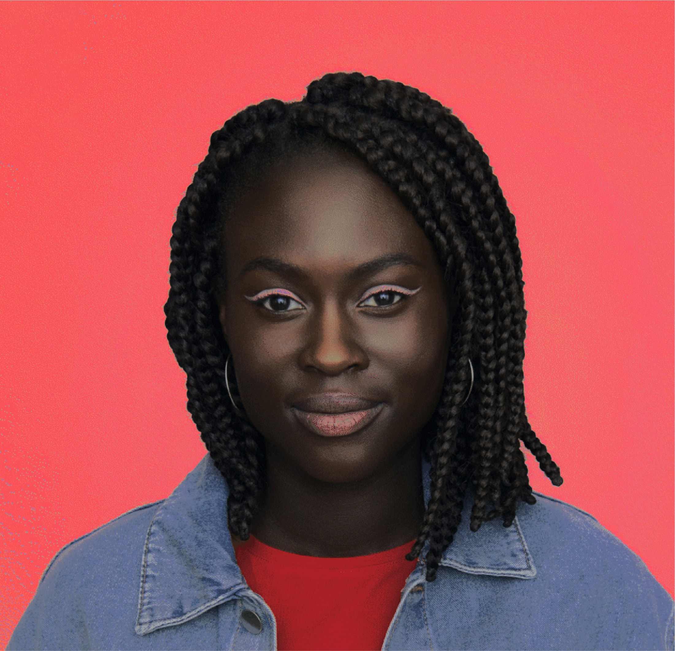
Draw focus and attention to a subject with bright coloured backgrounds.
Impact
Once we’ve created Focus, we can start to demonstrate Impact:
Once we’ve created Focus, we can start to demonstrate Impact:
Impact lines
We use our impact lines as a graphic representation of the impact we make.
Impact lines extending beyond illustrations
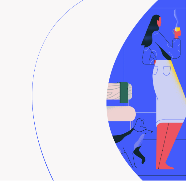
When the lines of our illustration break beyond the frame of the focus area, we emphasise the reach of our impact into the future.
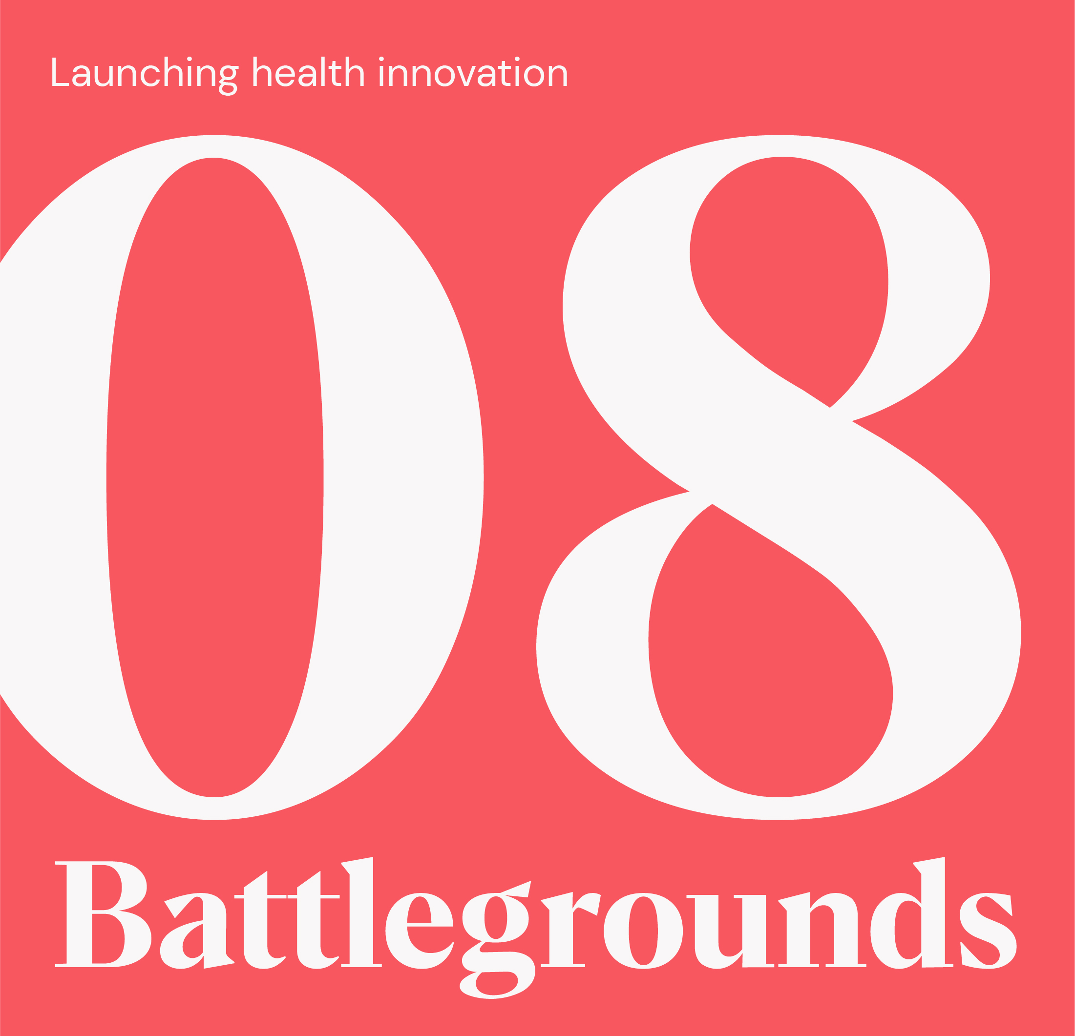
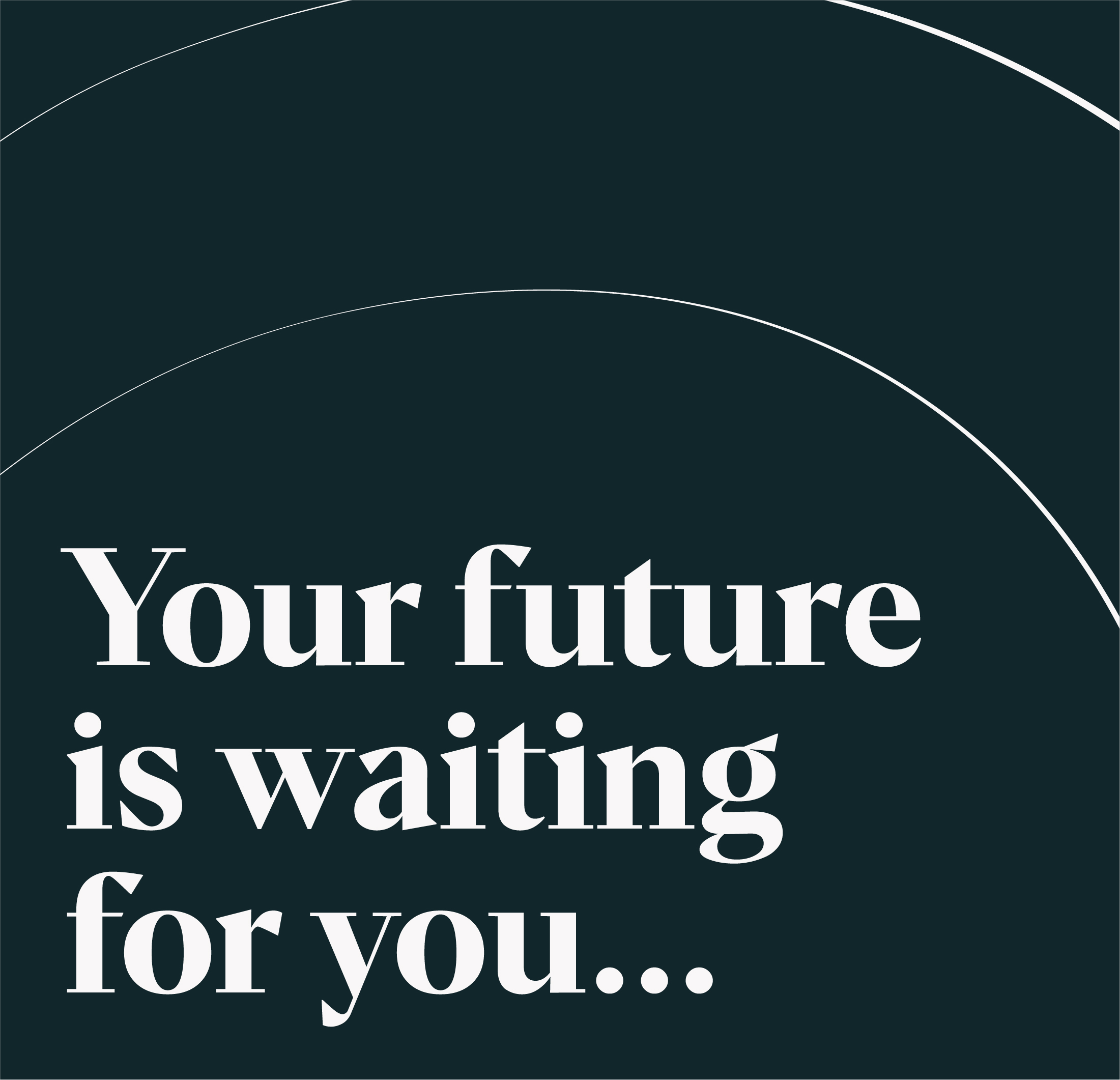
Cropped numbers
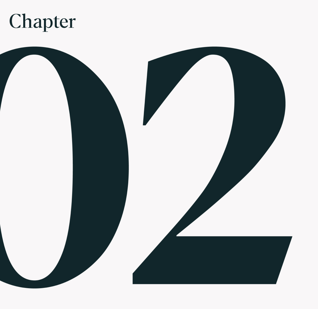
We accentuate the idea of ‘”what’s next” and Impact by cropping off large type elements and going beyond edges of a layout.
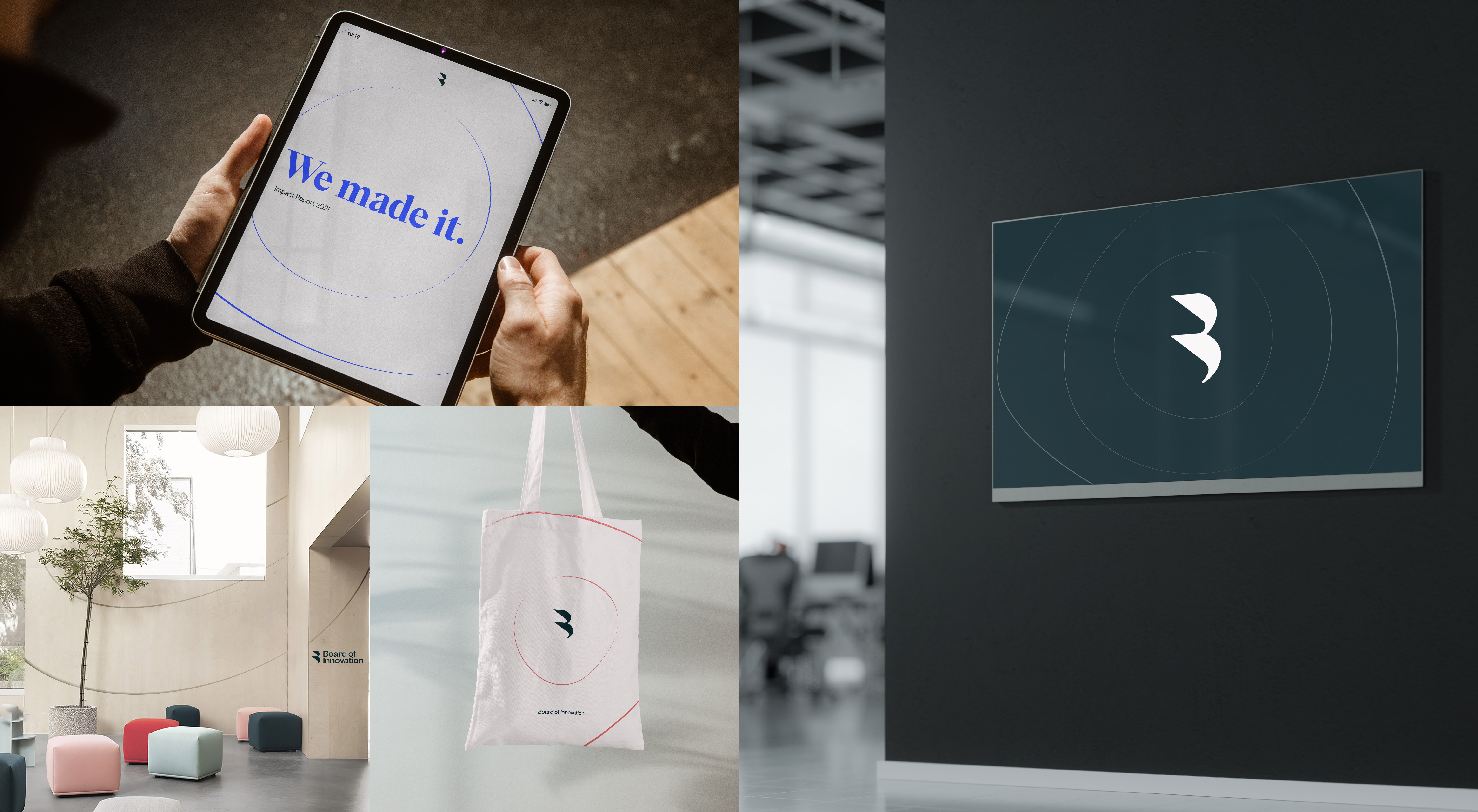
Bringing it together
This is a snapshot overview of our visual identity: a flexible, simple system designed to dial up to full expression, or dial down for paired back strategic sophistication. Our core principles of Focus and Impact work in tandem throughout our entire brand to tell the story of our strategy — making what life needs next.
This is a snapshot overview of our visual identity: a flexible, simple system designed to dial up to full expression, or dial down for paired back strategic sophistication. Our core principles of Focus and Impact work in tandem throughout our entire brand to tell the story of our strategy — making what life needs next.