Color
Our color palette pairs a stripped back and grounded core with bright, impactful punches of colour. Together, they strike the perfect balance.
Our color
palette
R 249 G 247 B 247
C 3 M 4 Y 4 K 0
Hex: F9F7F7
R 249 G 247 B 247
C 3 M 4 Y 4 K 0
Hex: 11262B
Pantone: 627C
Tint: 80%
Hex: 415155
Tint: 60%
Hex: 707D80
Tint: 40%
Hex: A0A8AA
R 248 G 87 B 96
C 0 M 87 Y 61 K 0
Hex: F85760
Pantone: 178C
Tint: 80%
Hex: F97980
Tint: 60%
Hex: FB9AA0
Tint: 40%
Hex: FCBCBF
R 65 G 92 B 249
C 89 M 64 Y 1 K 0
Hex: 415CF9
Pantone: 2726C
Tint: 80%
Hex: 677DFA
Tint: 60%
Hex: 8D9DFB
Tint: 40%
Hex: B3BEFD
Color
hierarchy
Our lead brand colours are our Dark Green and Off White. The Red and Blue are bright highlights. They create accents or focus, and can be used as secondary backgrounds. Tints of our colours can be used for clarity in more functional cases such as graphs and charts.
Our lead brand colours are our Dark Green and Off White. The Red and Blue are bright highlights. They create accents or focus, and can be used as secondary backgrounds. Tints of our colours can be used for clarity in more functional cases such as graphs and charts.

Color combos
Our colors have been selected to work in harmony together. Color parings have been considered with accessibility, standout and flexibility in mind. These examples are our primary pairings and should be used wherever possible.
Our colors have been selected to work in harmony together. Color parings have been considered with accessibility, standout and flexibility in mind. These examples are our primary pairings and should be used wherever possible.


Color
with type
We lead with our hero pairing for key headlines and type areas. The Off White and Dark Green have great contrast, ensuring good legibility and standout.
We lead with our hero pairing for key headlines and type areas. The Off White and Dark Green have great contrast, ensuring good legibility and standout.

We lead with our hero pairing for key headlines and type areas. The Off White and Dark Green have great contrast, ensuring good legibility and standout.

We use our accent color palette to draw focus to specific moments of impact within headlines and intoductions.
With
illustration
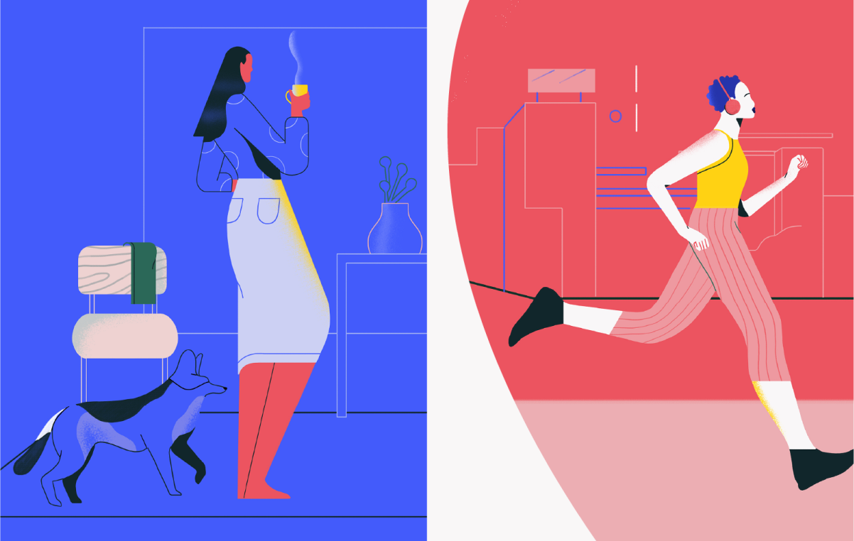
We use our accent colors to create focus areas or punchy backgrounds around our illustrations.
Our illustrations will work on all of our different colored backgrounds; Dark Green, Off-White, Red and Blue, and we will have an additional illustration only colour palette for the characters, context and objects.
Color in
team photos
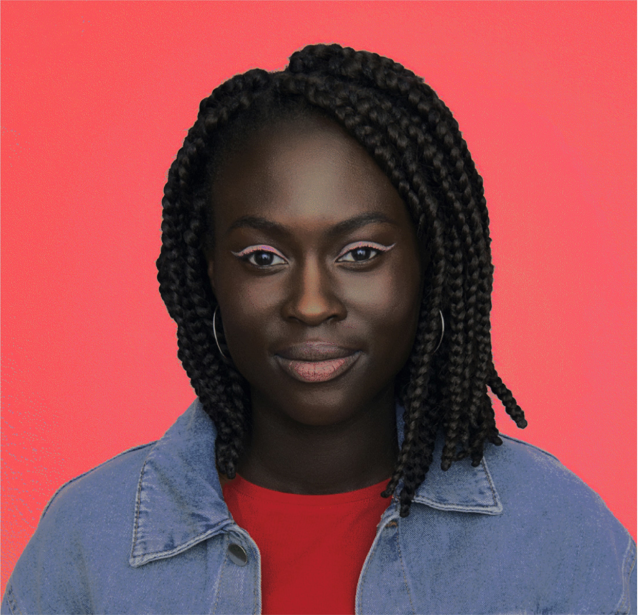
We also use our strong, punchy colors to draw focus to our incredible team. For team photos, avoid using our Off-white as a background. Our other colours create impactful, distinctive visuals.
We also use our strong, punchy colors to draw focus to our incredible team. For team photos, avoid using our Off-white as a background. Our other colours create impactful, distinctive visuals.
Dark Green background

Red background
Blue background

Color
accessibility
To ensure legibility and accessibility in digital applications, use the following pairings.
The magenta dots indicate that type needs to be larger than 17pt in order to remain accessible on that colour combination.
To ensure legibility and accessibility in digital applications, use the following pairings.
The magenta dots indicate that type needs to be larger than 17pt in order to remain accessible on that colour combination.

If you’re using larger paragraphs of text on Dark Green and you want to draw focus to that particular piece of content, we can use a 60% tint of our Blue or Red. The slightly lighter colour creates better legibility and contrast. Use 60% tint only, nothing higher or lower. This rule applies to text only.
Using tints
If you’re using larger paragraphs of text on Dark Green and you want to draw focus to that particular piece of content, we can use a 60% tint of our Blue or Red. The slightly lighter colour creates better legibility and contrast. Use 60% tint only, nothing higher or lower. This rule applies to text only.
If you’re using larger paragraphs of text on Dark Green and you want to draw focus to that particular piece of content, we can use a 60% tint of our Blue or Red. The slightly lighter colour creates better legibility and contrast. Use 60% tint only, nothing higher or lower. This rule applies to text only.
If you’re using larger paragraphs of text on Dark Green and you want to draw focus to that particular piece of content, we can use a 60% tint of our Blue or Red. The slightly lighter colour creates better legibility and contrast. Use 60% tint only, nothing higher or lower. This rule applies to text only.
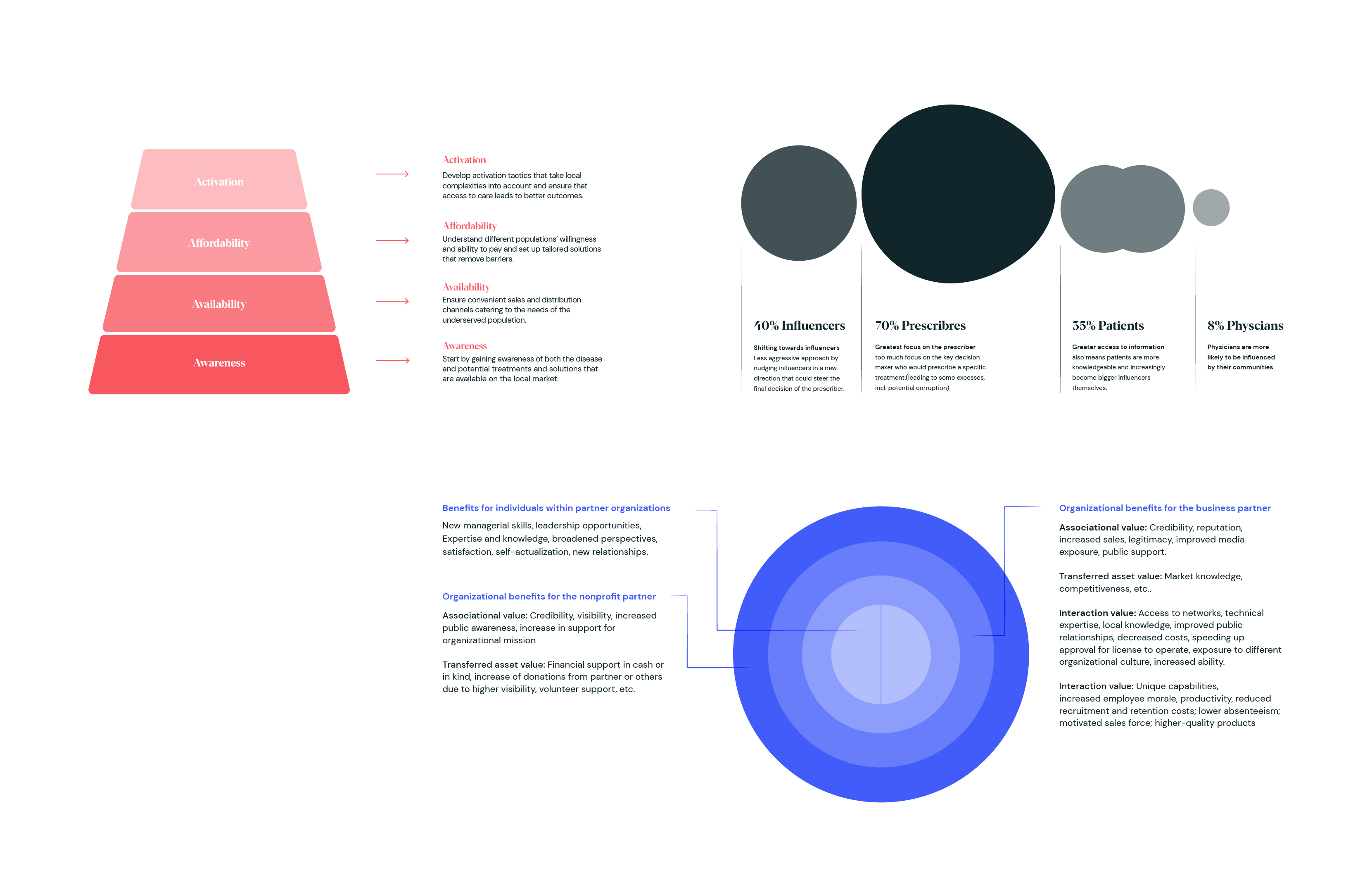
We can use any of our colours and the specified tints for graphs, charts and infographics. They can be used on pure White or our Off White backgrounds. To keep them feeling sophisticated, they should be tonal wherever possible, rather than mixing colours.
In cases where you need more than
4 different shades you can use tints down to 10% but no lower.
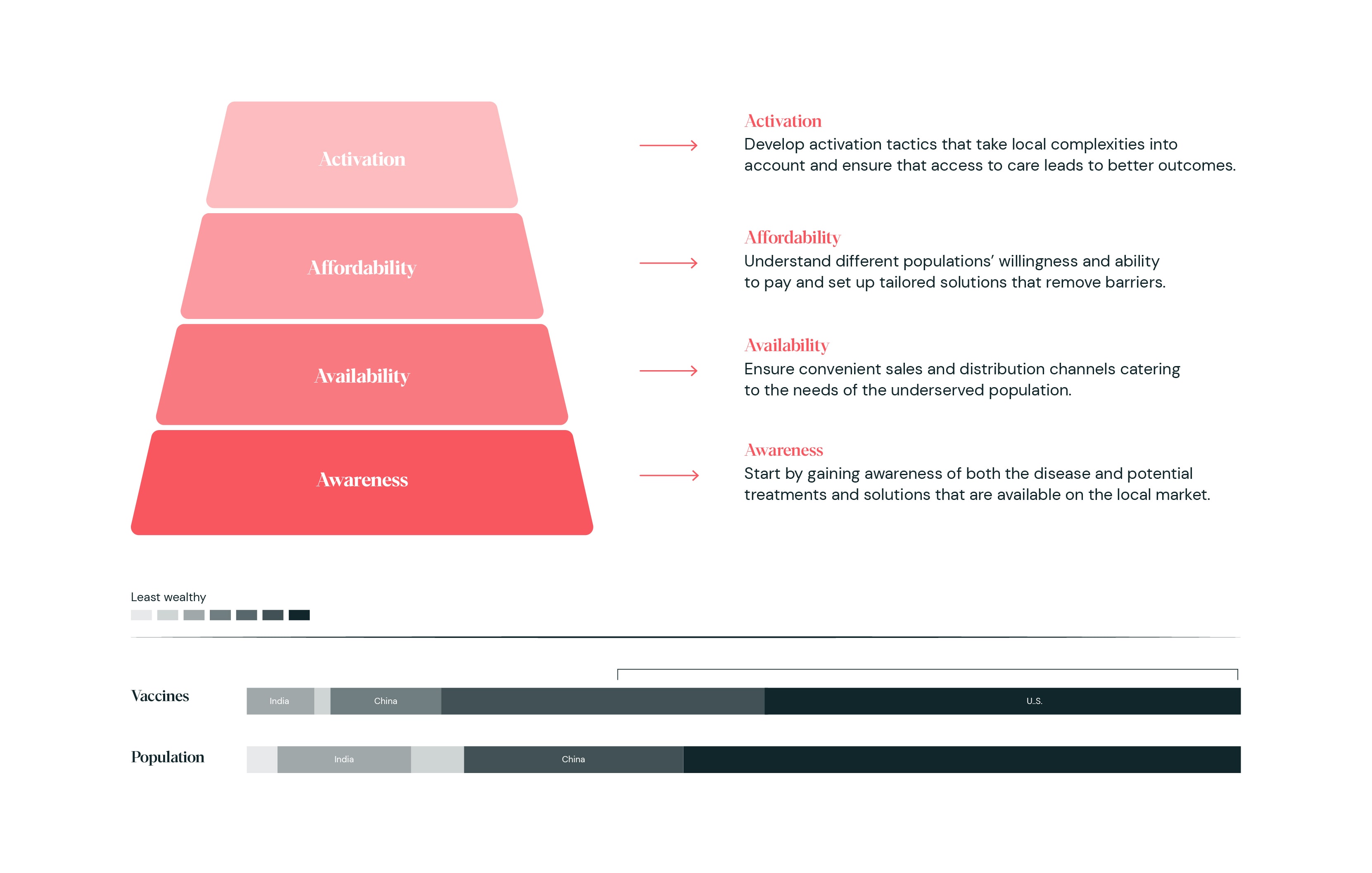
When we have multiple charts, graphs or infographics in one layout, always use either Red or Blue for one and then the other with the more neutral Dark green. To create hierarchy use the Red or Blue for the most important one. Avoid mixing Red and Blue if possible.
An exception to the rule of mixing Red and Blue is this example. When the content is showing comparative information, we can use Red and Blue tints together. When designing tables with alot of text, for legibility we drop the tints down to 10 & 20%.
Here are some things to avoid when using tints.
Color usage
When using our colours we lead
with a more paired back approach, heroing our Off White and Dark Green backgrounds.
We then dial up the expression, from using smaller colour pops and text highlights, to large full backgrounds colour pops.
When using our colours we lead
with a more paired back approach, heroing our Off White and Dark Green backgrounds.
We then dial up the expression, from using smaller colour pops and text highlights, to large full backgrounds colour pops.
When using our colours we lead
with a more paired back approach, heroing our Off White and Dark Green backgrounds.
We then dial up the expression, from using smaller colour pops and text highlights, to large full backgrounds colour pops.
We also use our brighter Blue and Red as smaller accents to highlight and hero content. We can do this within a specific message to highlight a key word or sentence, or to draw focus to a quote or statement.
We can also use our accent colours as backgrounds to create focus on our team, and also hero areas in layouts to create hierarchy.
Examples
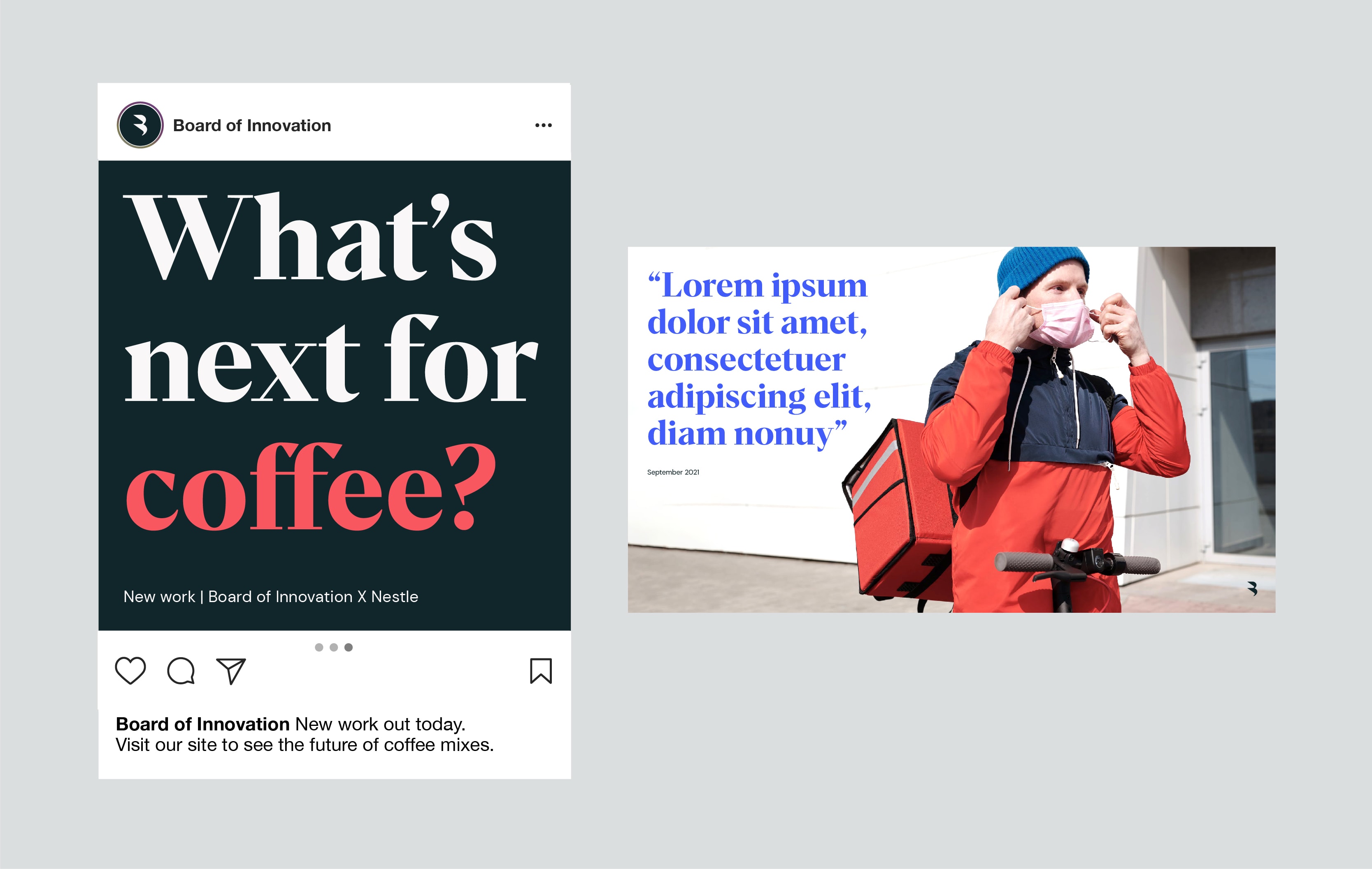
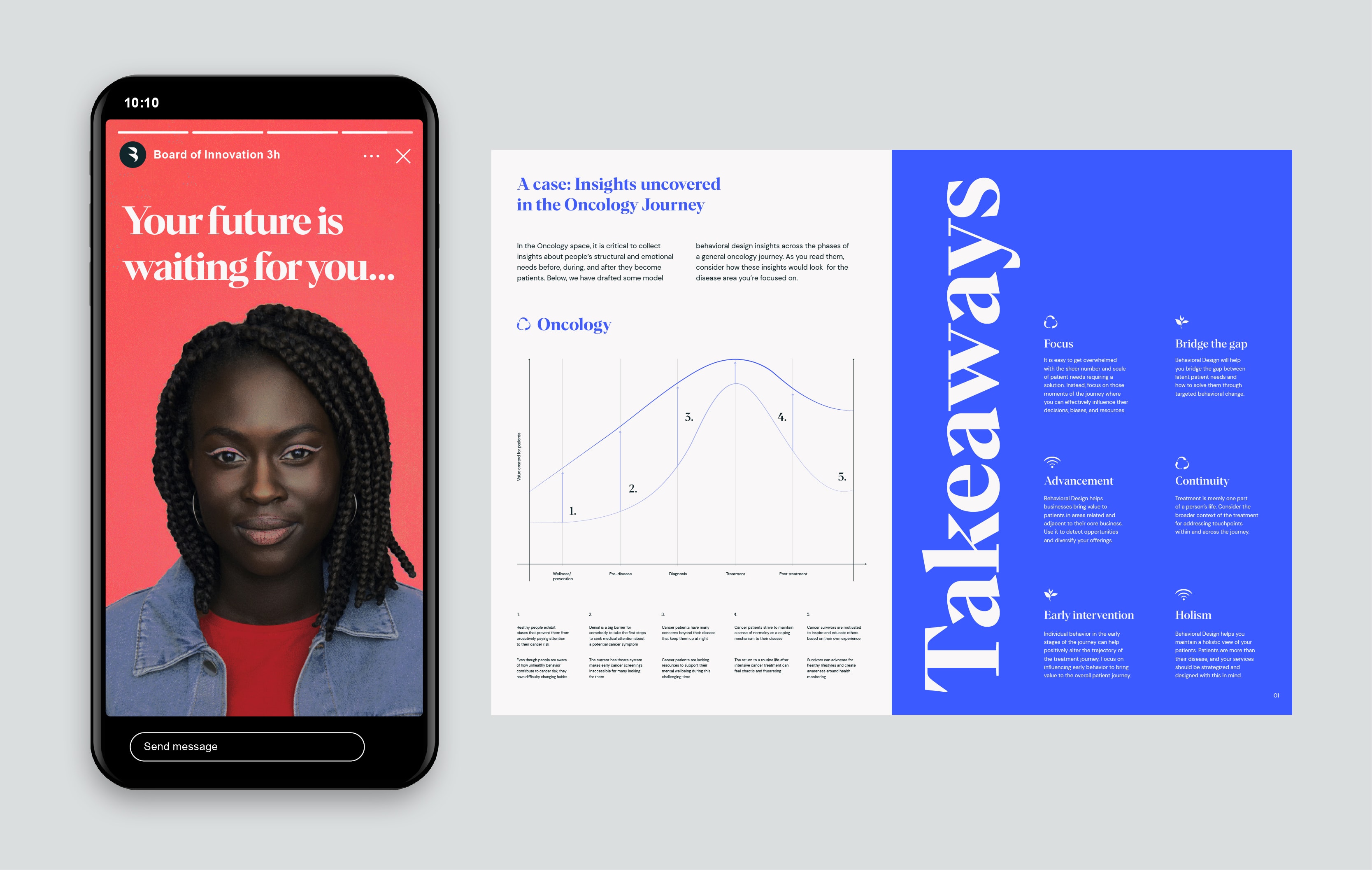
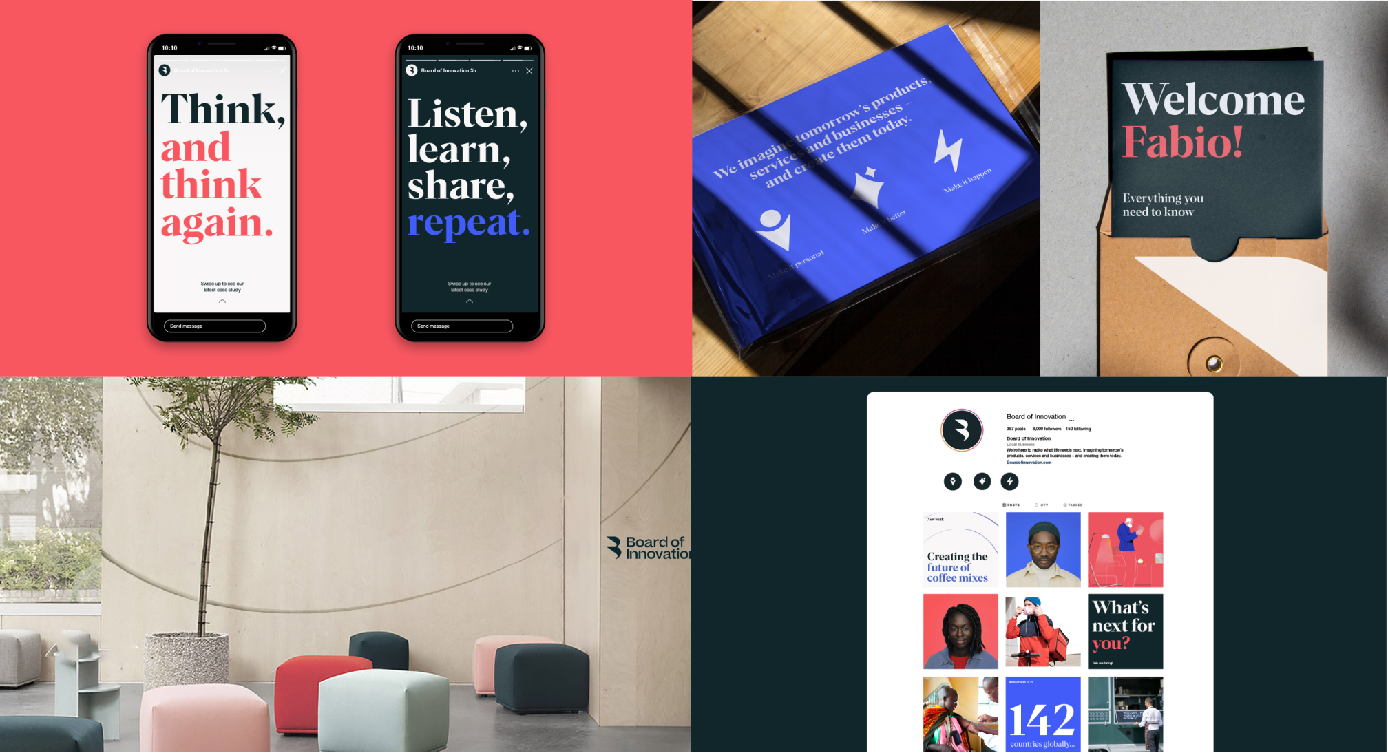
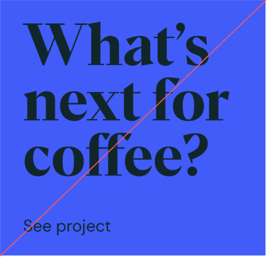
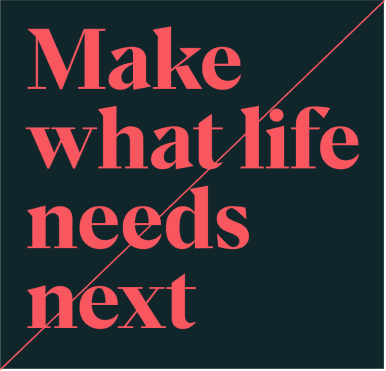
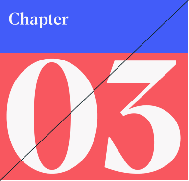
Here’s some examples of our colors in use. Our palette is flexible, allowing us to create variation throughout the brand. When we want to feel more strategic we can lead with our Off White and Dark Green to create a calm stripped back feel, or when we want to be bright, bold and contemporary on social media or internally, dial up the use of the Red and Blue.
Here’s some examples of our colors in use. Our palette is flexible, allowing us to create variation throughout the brand. When we want to feel more strategic we can lead with our Off White and Dark Green to create a calm stripped back feel, or when we want to be bright, bold and contemporary on social media or internally, dial up the use of the Red and Blue.

Things to avoid

Avoid colour combos that arent specified

Don’t use tonal shades as lead backgrounds
Don’t introduce new colours
Don’t use Dark Green text on Blue
Don’t use Red headlines on Dark Green
Don’t use multiple solid background colours per layout

Don’t use same colored backgrounds for adjacent team images