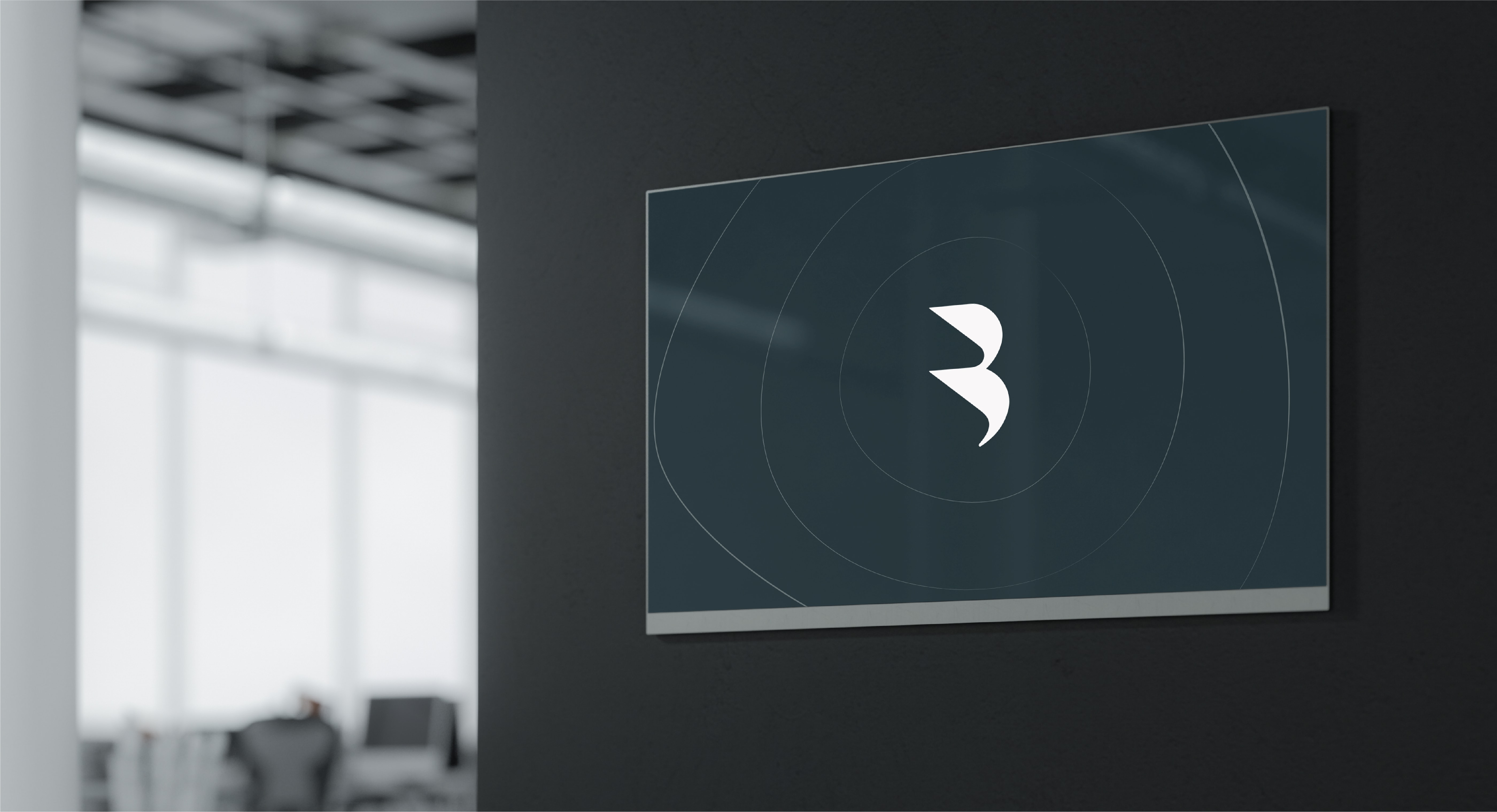
Impact
lines
Meet our impact lines: a distinctive graphic device that represents the impact we're making, now and in the future.
Introduction
Our layout and templates section is split into the following parts:
Our layout and templates section is split into the following parts:
Cheat sheet
Our impact lines are a key part of our identity toolkit. We’ve outlined four different ways of using them to accomodate for different types of content and keep the brand feeling fresh.
Our impact lines are a key part of our identity toolkit. We’ve outlined four different ways of using them to accomodate for different types of content and keep the brand feeling fresh.
Impact lines
Focus areas
Combined
Patterns

The content is always the hero. Lines act as a secondary element, and therefore should never restrict or contain type too tightly.
Across all of the different uses, the quality of our lines and focus areas are always the same. Never perfectly symmetrical, they are soft and organic, representing life.
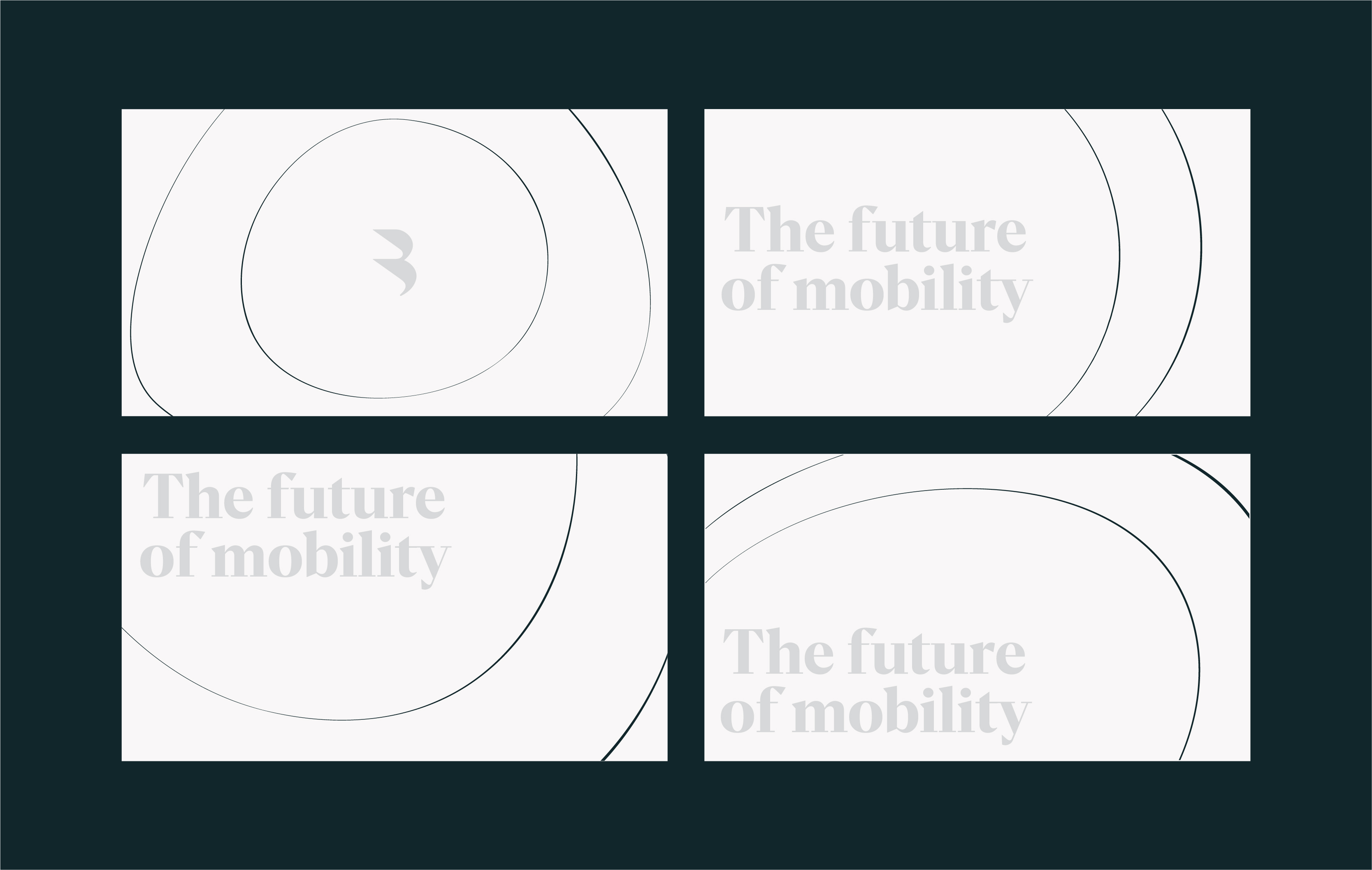
01. Impact lines
Our impact lines are the brand asset we use the most, so it’s important we use them properly. We’ll show you how to make your own, including all the templates you’ll need.
The basics
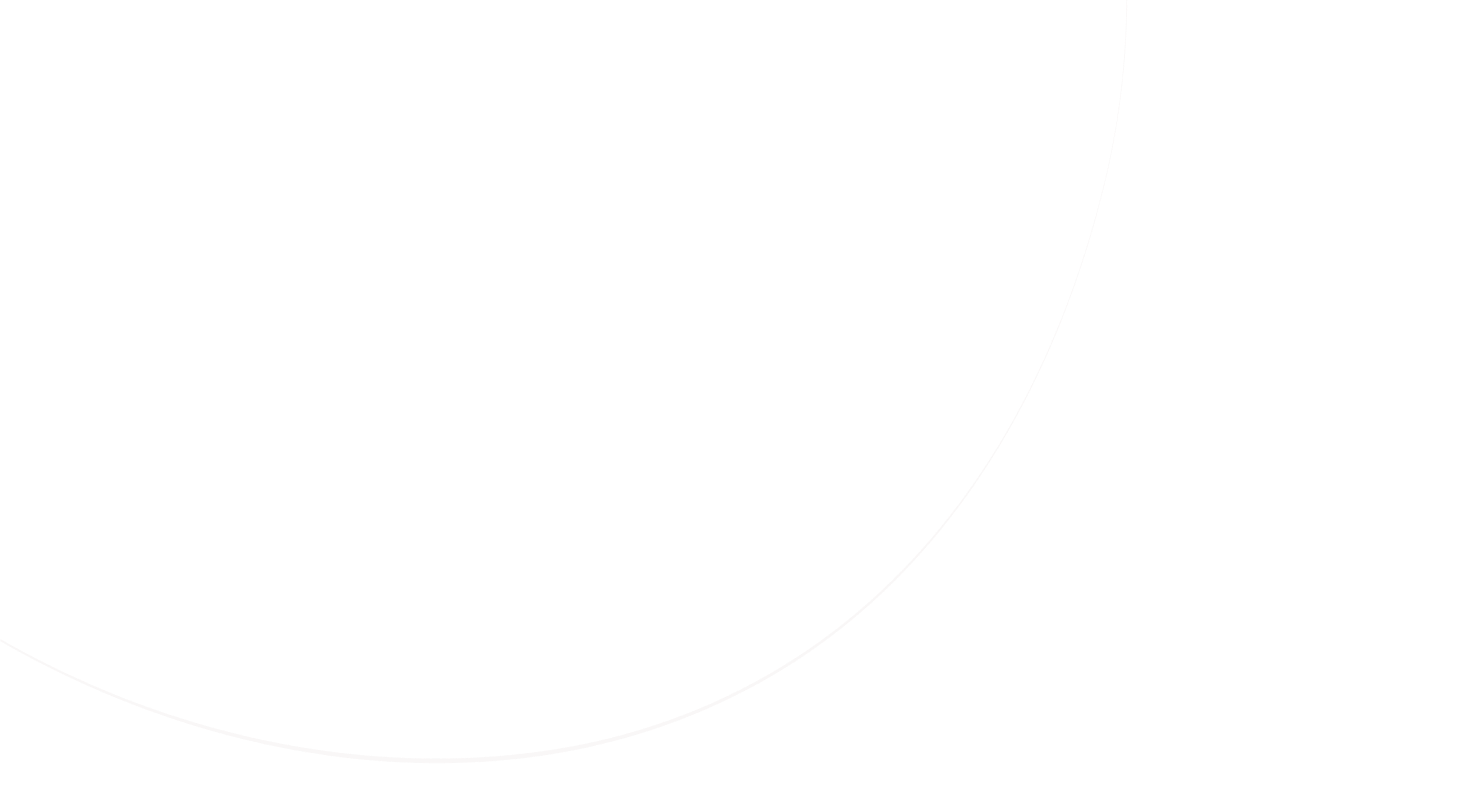
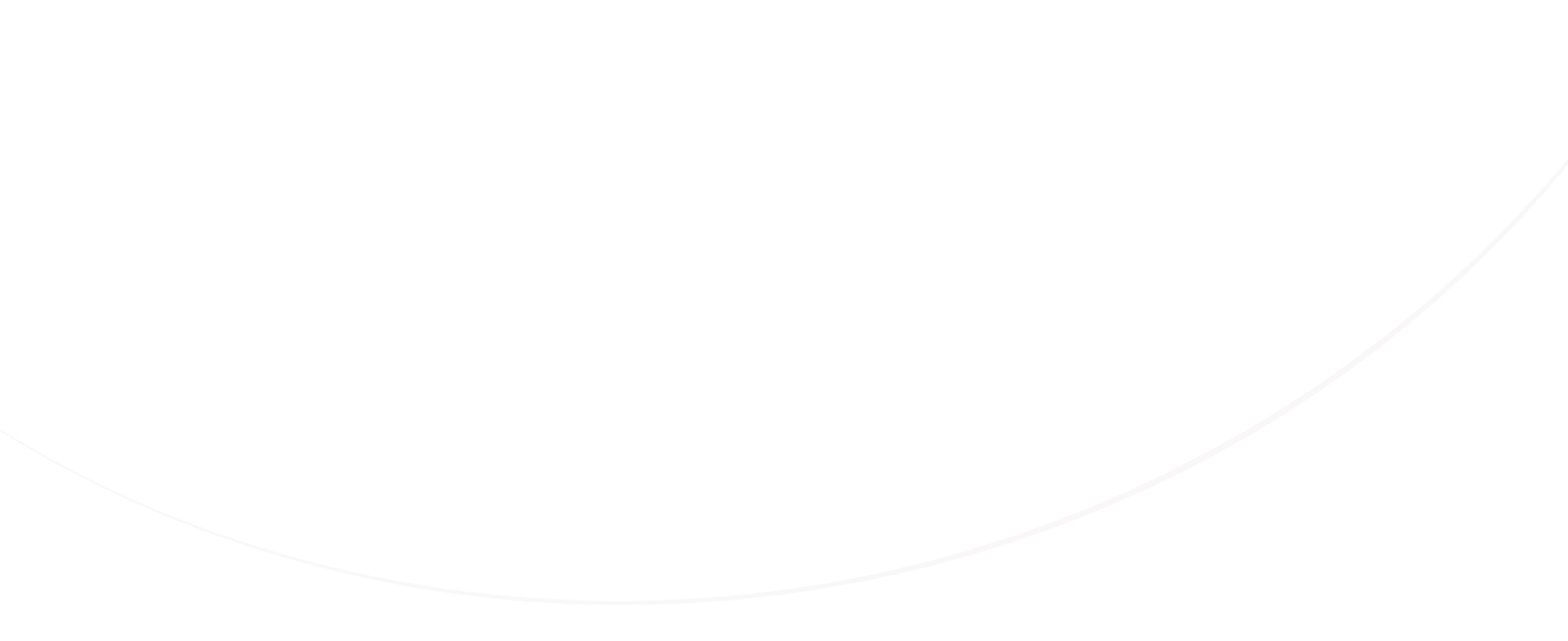
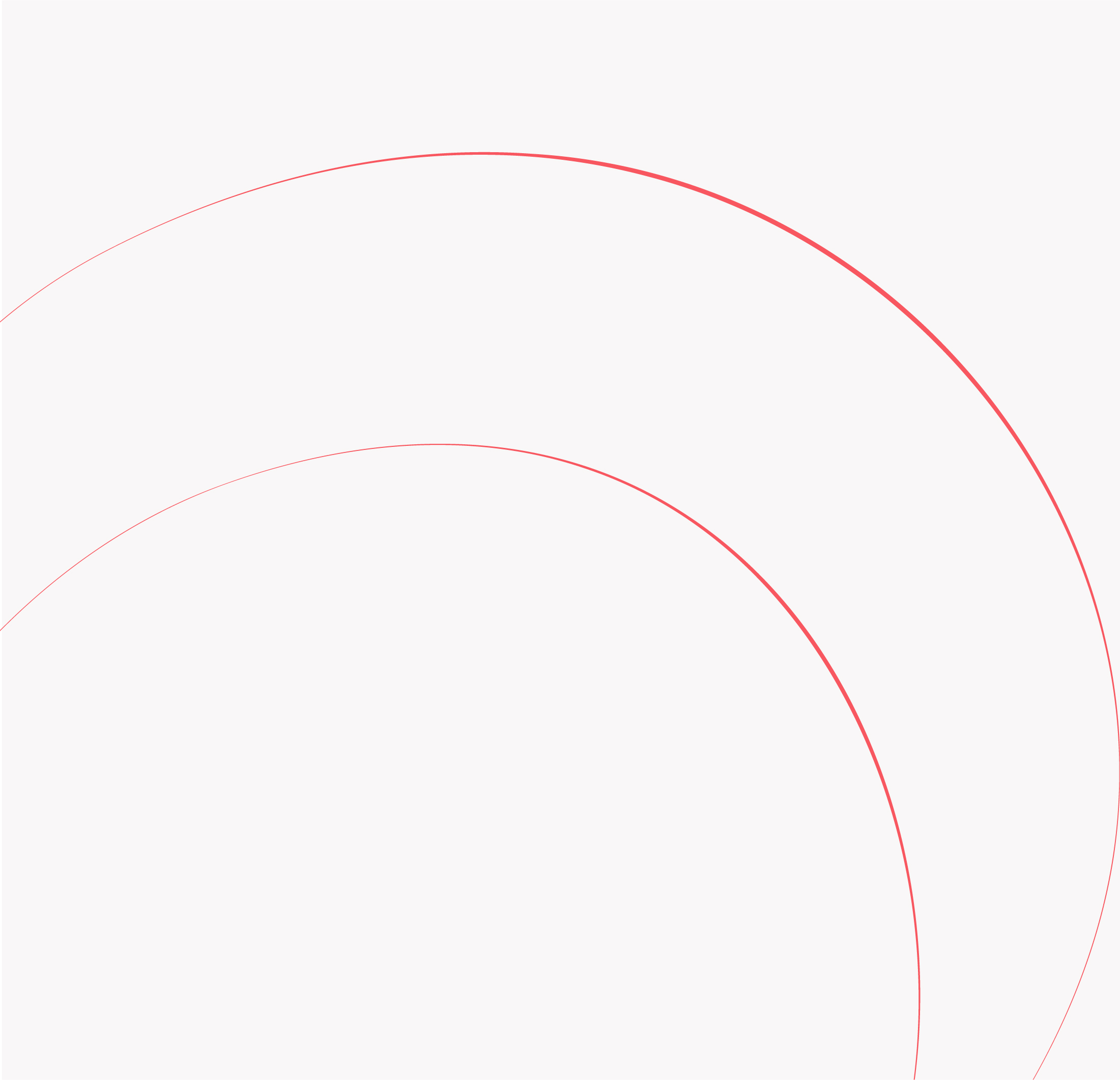
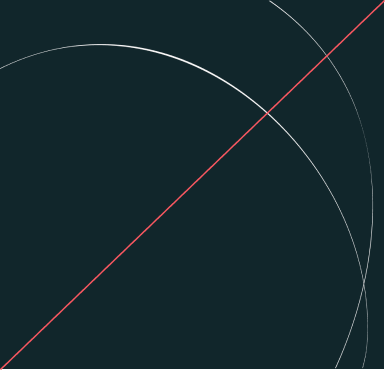
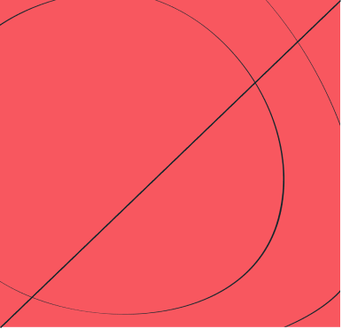
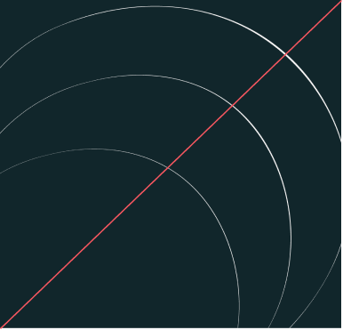
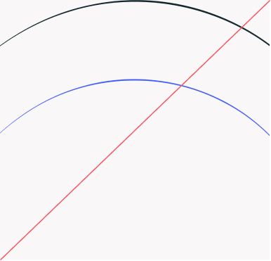
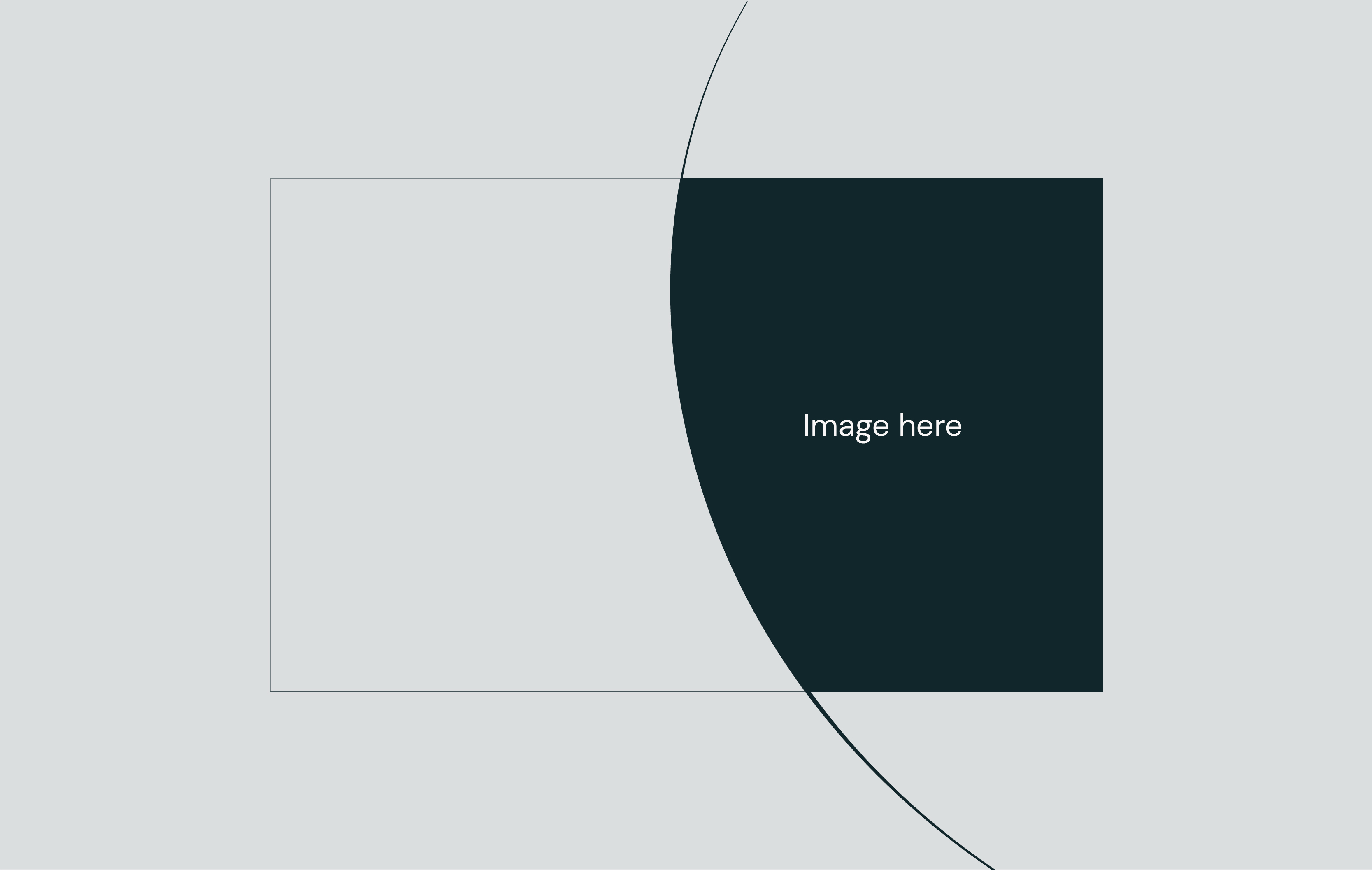
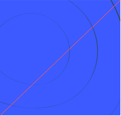
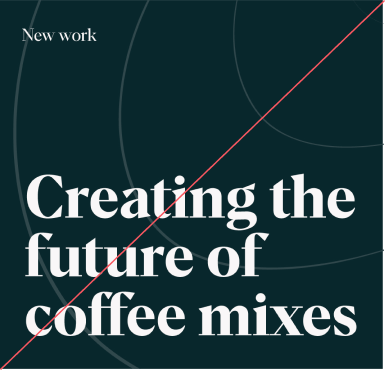
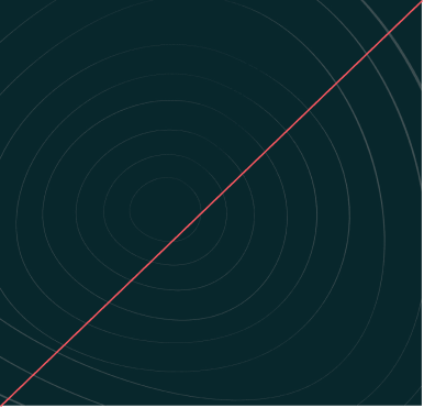
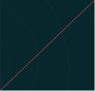
Impact lines, simply put, are a series of concentric circles which respond to content and give a sense of the ‘next’. They’re flexible, working in every direction — left, right, diagonally, up and down, or from a central point.
Impact lines, simply put, are a series of concentric circles which respond to content and give a sense of the ‘next’. They’re flexible, working in every direction — left, right, diagonally, up and down, or from a central point.
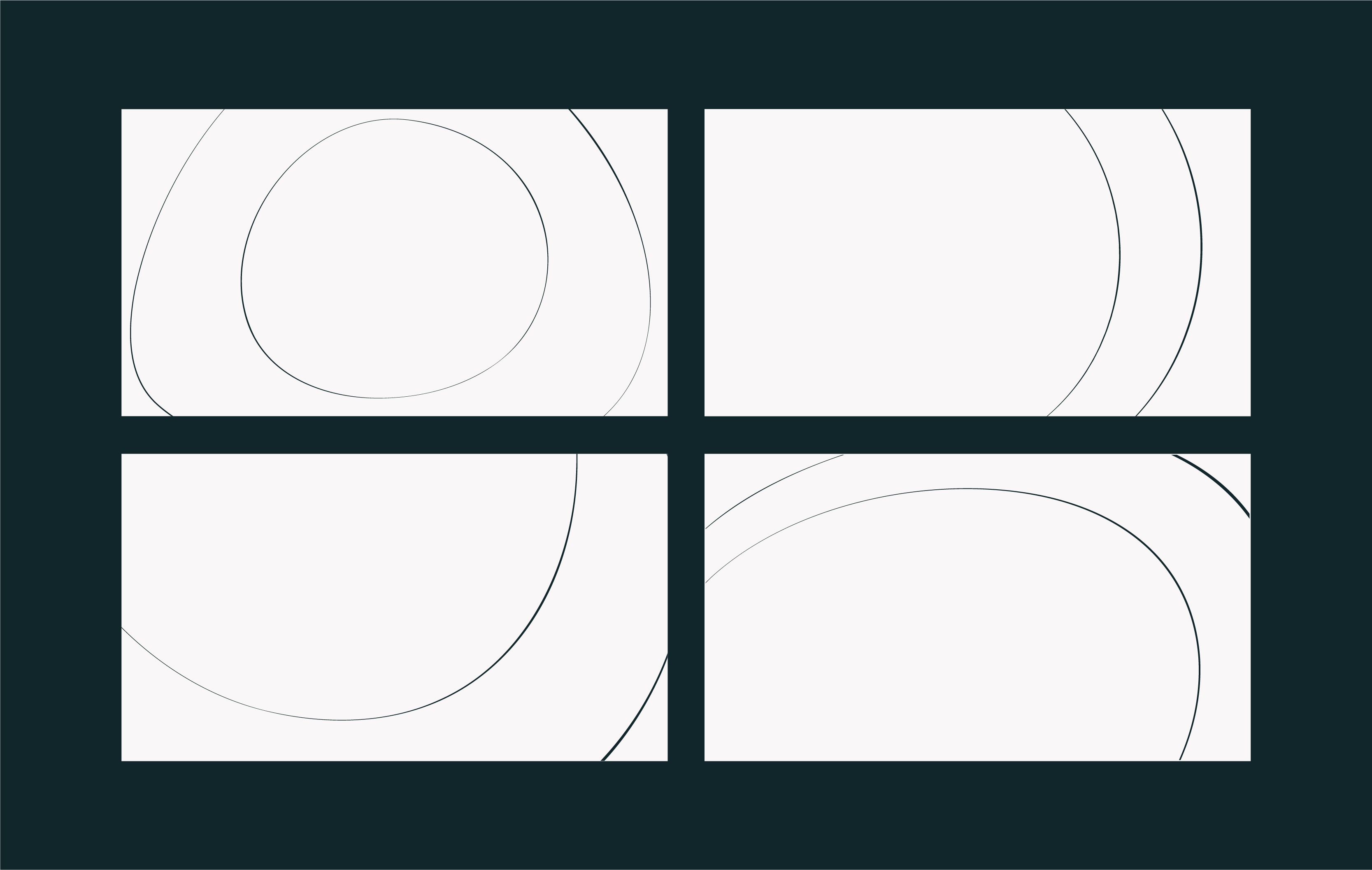
Impact lines, simply put, are a series of concentric circles which respond to content and give a sense of the ‘next’. They’re flexible, working in every direction — left, right, diagonally, up and down, or from a central point.
The hero dictates how and where we use the lines. The lines create a clear focal point in the layout, travelling outwards from that point.
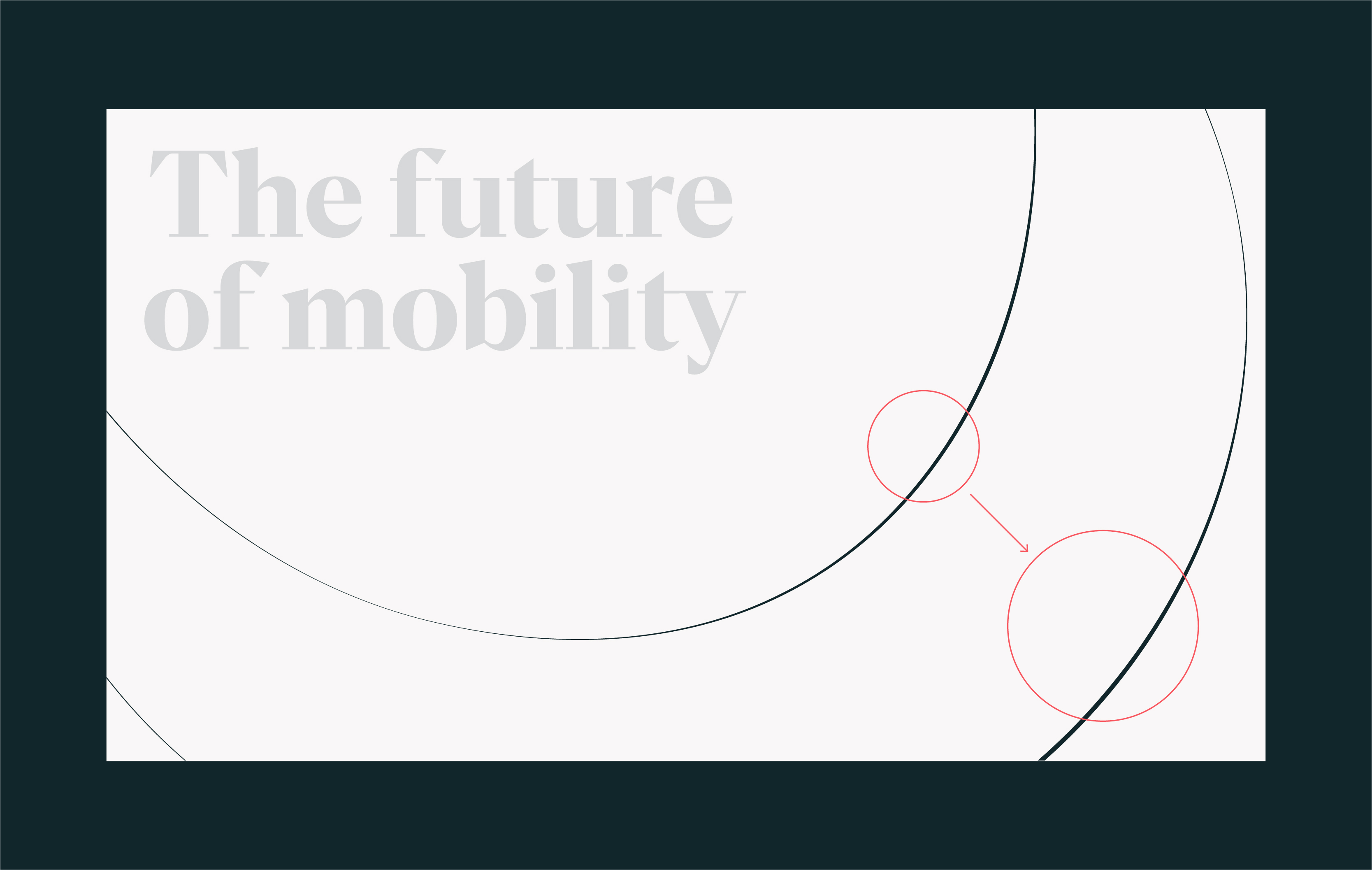
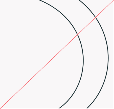
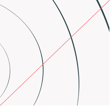
We use purposeful thick-to-thin strokes to accentuate the directional impact. It’s really important that the weight corresponds across both lines to create a dynamic feel. As well as the weight change within the lines themselves, we accentuate the impact further by making the outer stroke thicker than the inner by 1pt.
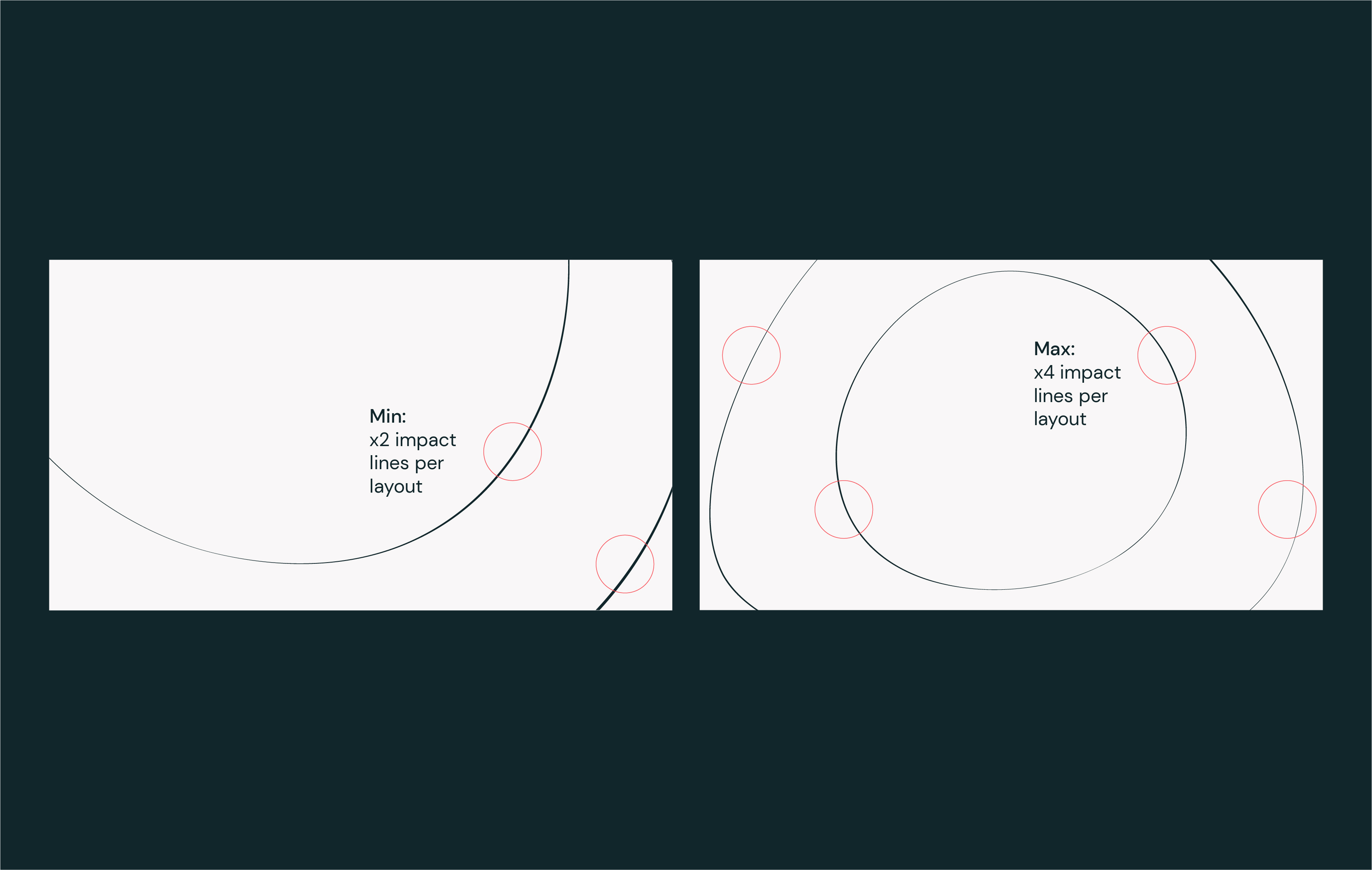
The minimum number of lines we use in a layout is two, and the maximum is four. (Our patterns are an exception; see pattern section for more info).
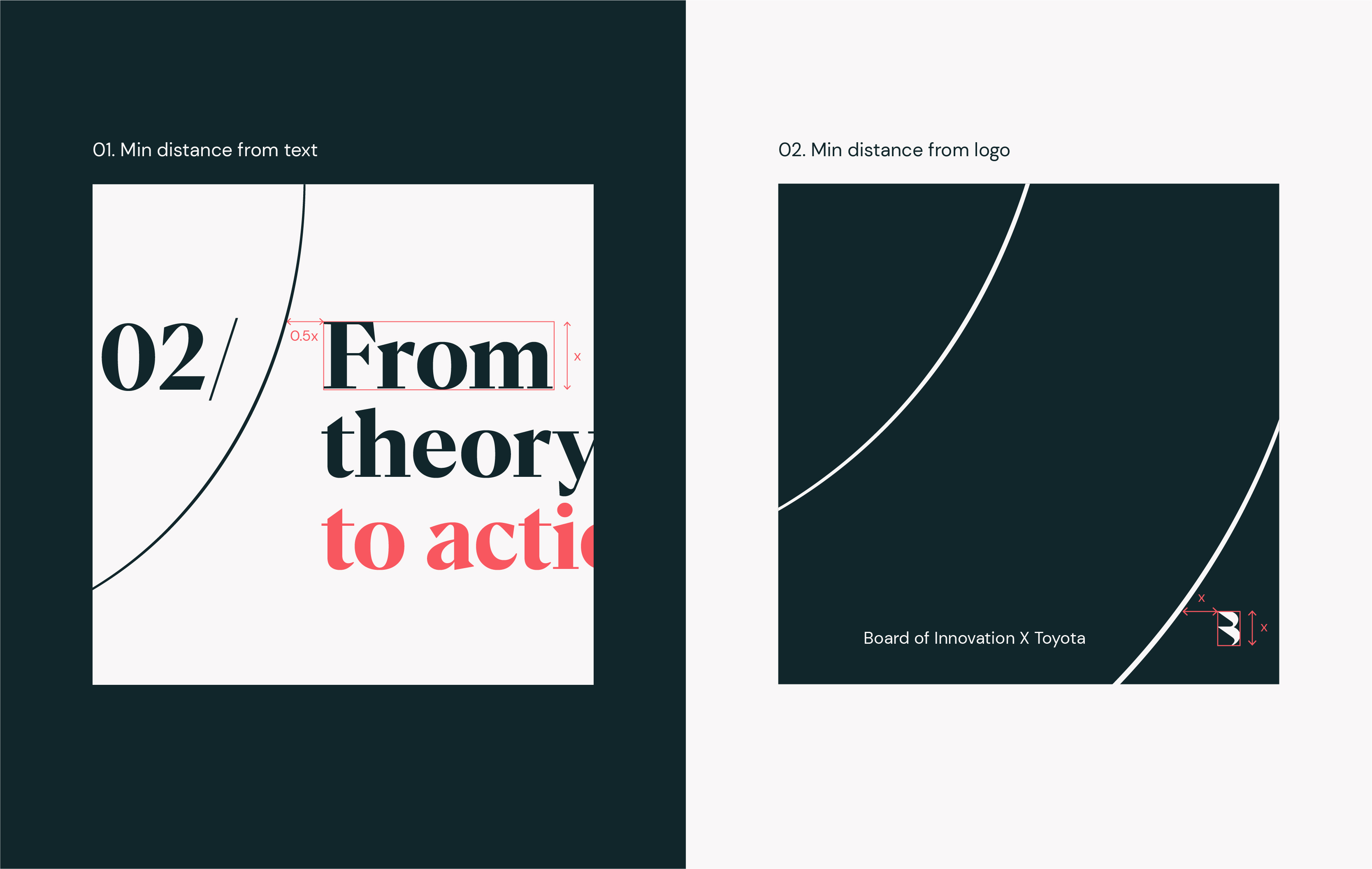
In all applications, make sure to give content plently of room to breathe. Our impact lines are there to support as a secondary element. Follow these minimum distance rules for type and our logo, to make sure they never get fenced in by our lines.
How to use
We can be really flexible with the way we use our impact lines. They are made from larger assets which are then cropped into in different ways to create layouts for various formtats. They can be rotated, mirrored and scaled up and down.
We can be really flexible with the way we use our impact lines. They are made from larger assets which are then cropped into in different ways to create layouts for various formtats. They can be rotated, mirrored and scaled up and down.
We can be really flexible with the way we use our impact lines. They are made from larger assets which are then cropped into in different ways to create layouts for various formtats. They can be rotated, mirrored and scaled up and down.
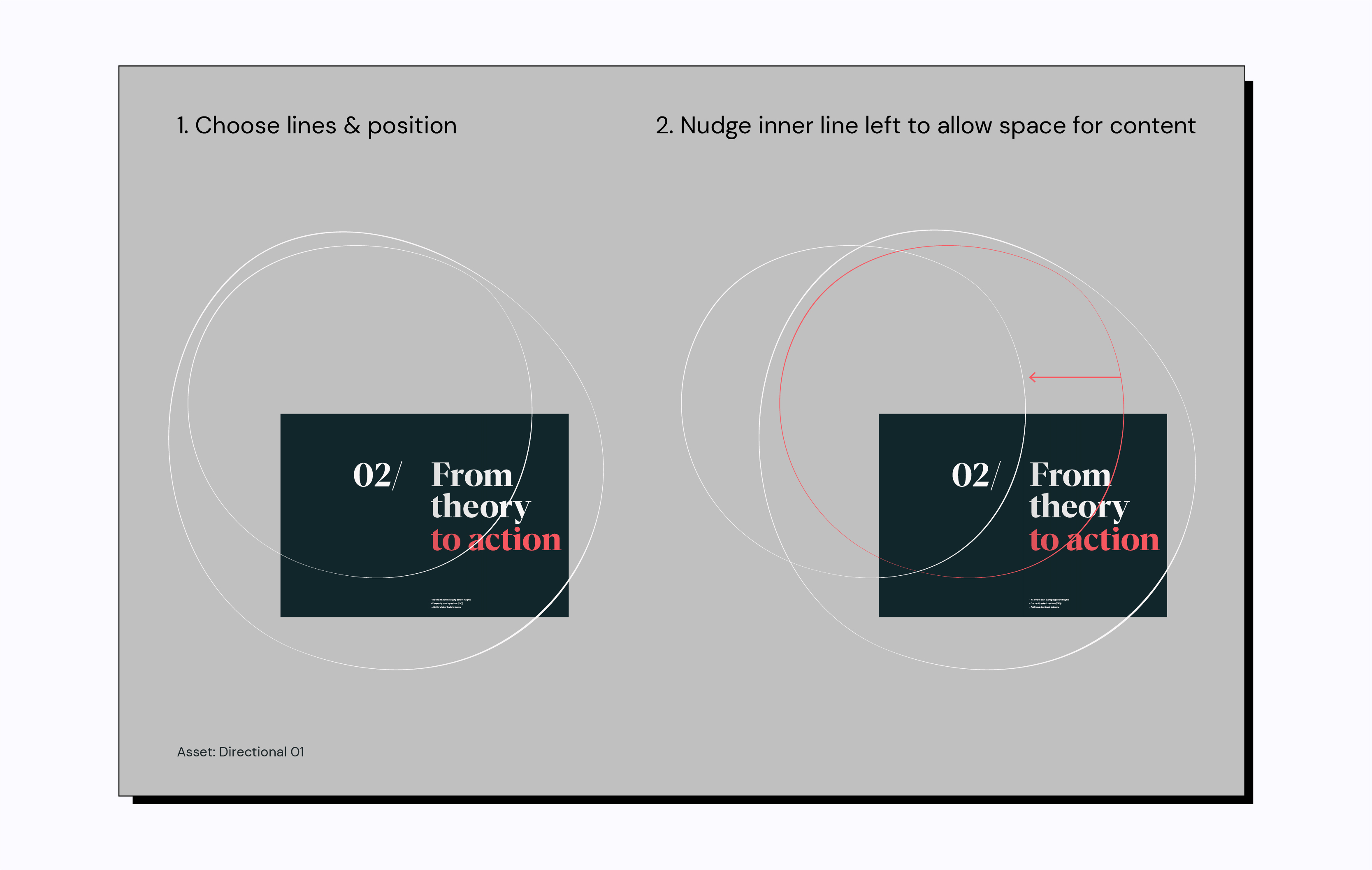
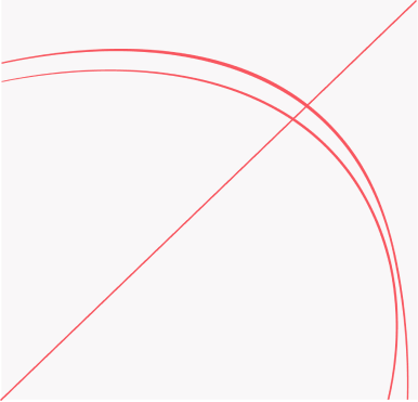
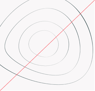
To make sure our impact lines always allow space for content, we can edit the position of the inner circle as shown in the diagram.
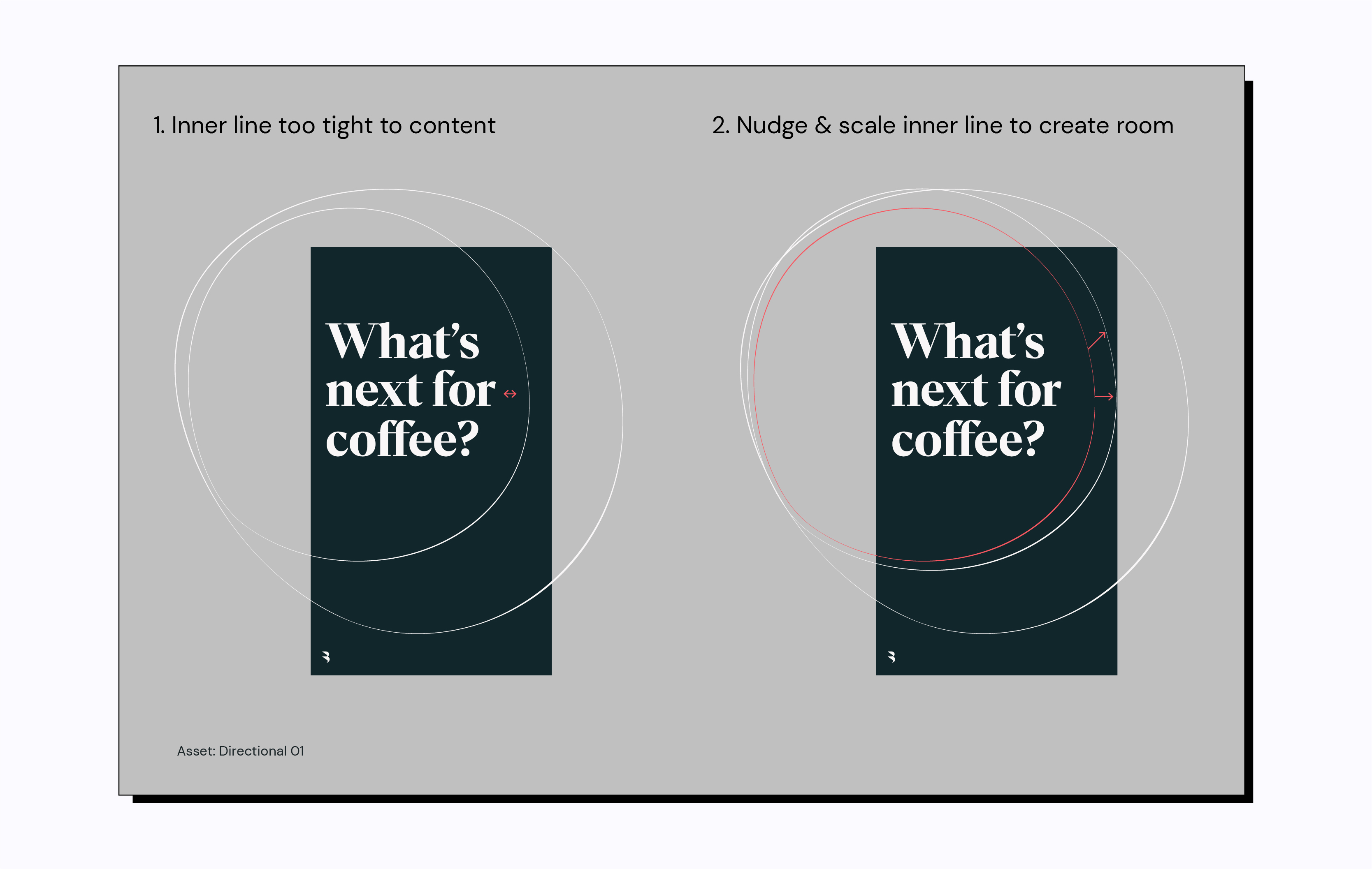
For further flexibility, as well as nudging and repositioning the inner circle, we can scale our lines up and down, as long as the content stays within the circle. We want to make sure the content has lots of room, so the impact lines can be pushed closer together when needed.
Assets
To make the impact lines easy to use, we’ve created the following assets for directional and central impact lines. Within those two categories there are a few different assets to ensure all formats and layouts are covered. Lines that are directional always pulse to the right, and lines that are central can go up or down, left and right.
To make the impact lines easy to use, we’ve created the following assets for directional and central impact lines. Within those two categories there are a few different assets to ensure all formats and layouts are covered. Lines that are directional always pulse to the right, and lines that are central can go up or down, left and right.
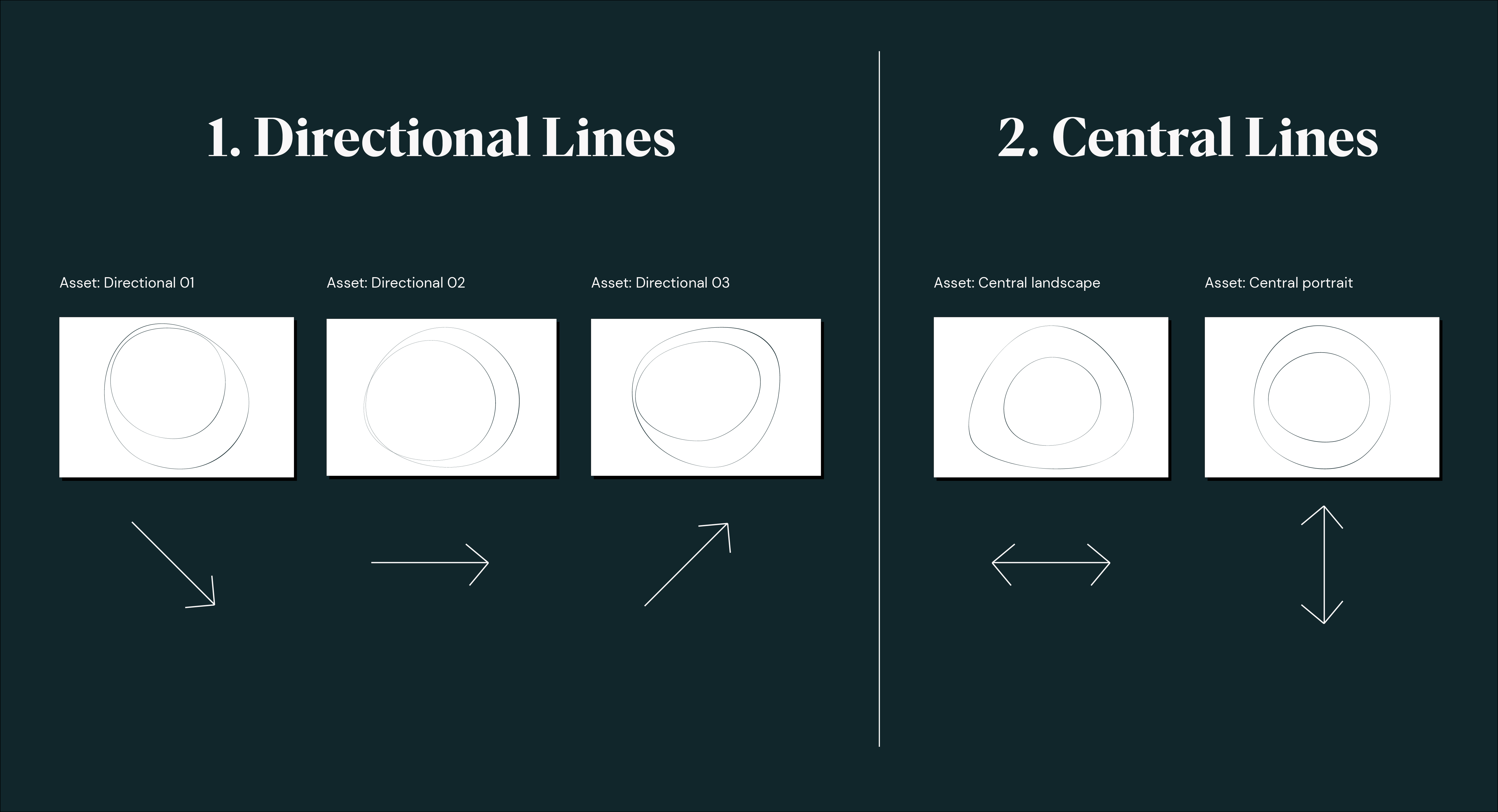
Assets in use
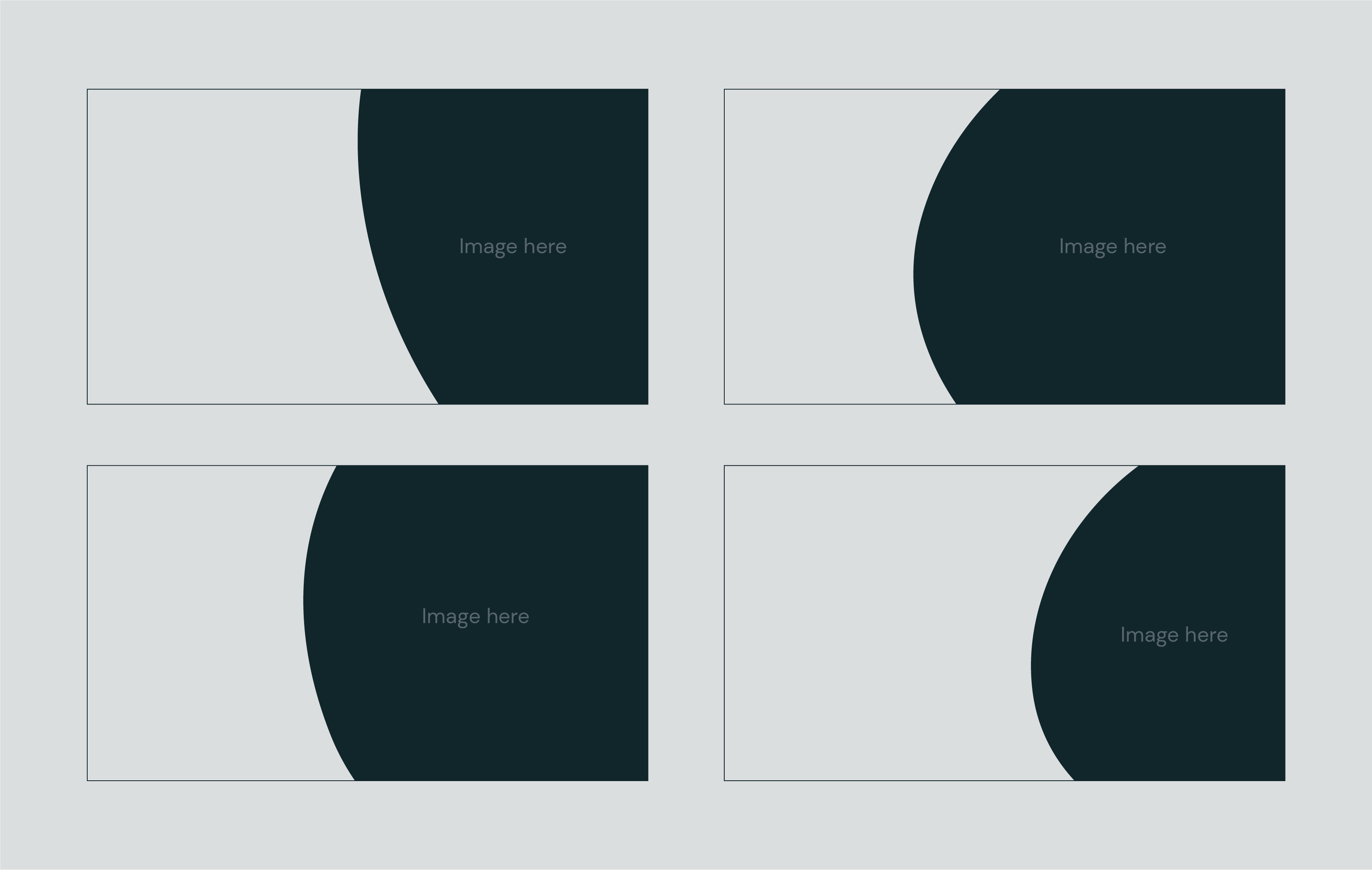
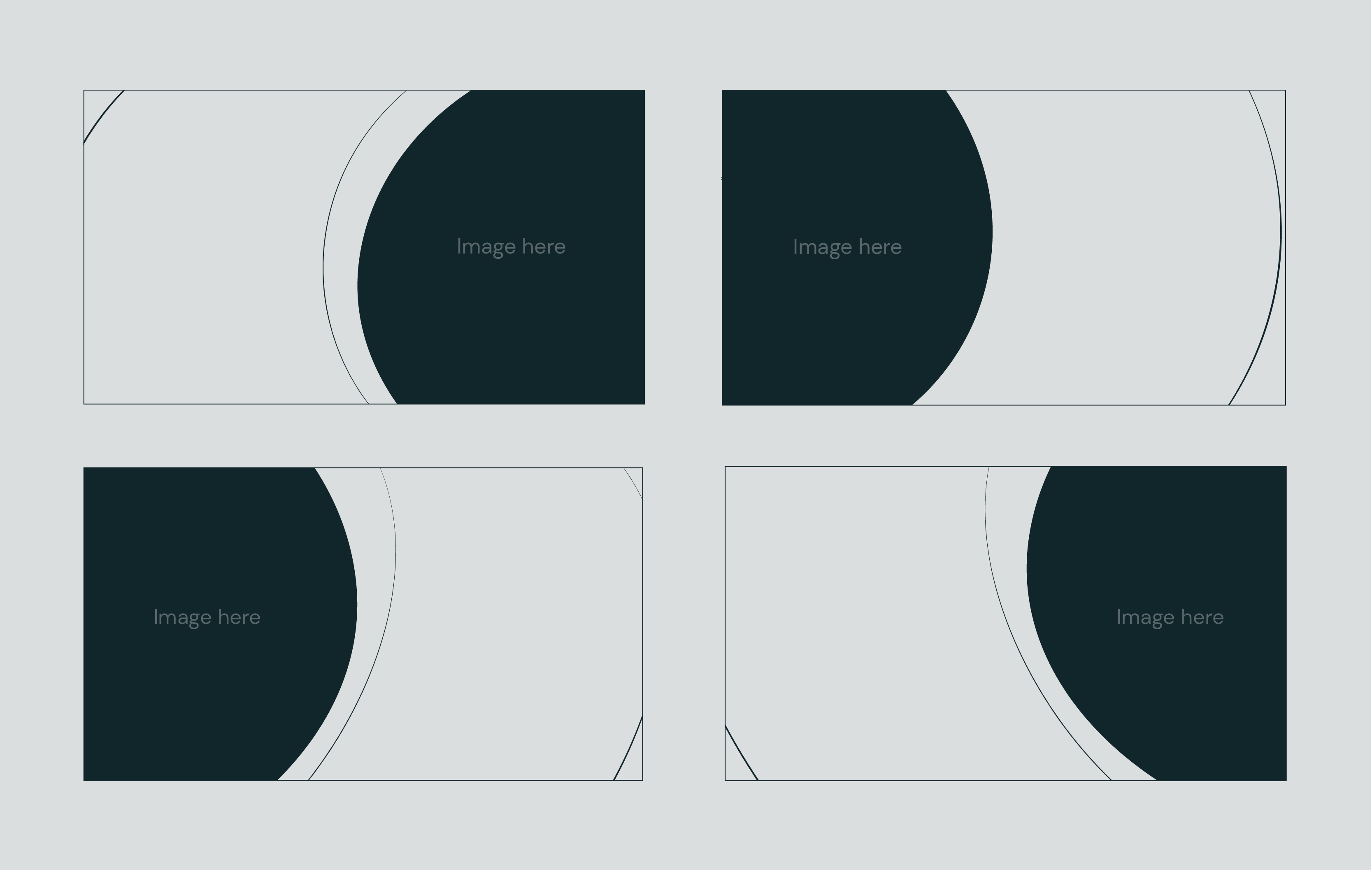
The asset Directional 01 is good for layouts where the content lives in the top or bottom corners. It can be flipped, pointing diagonally upwards or downwards.
The asset Directional 01 is good for layouts where the content lives in the top or bottom corners. It can be flipped, pointing diagonally upwards or downwards.
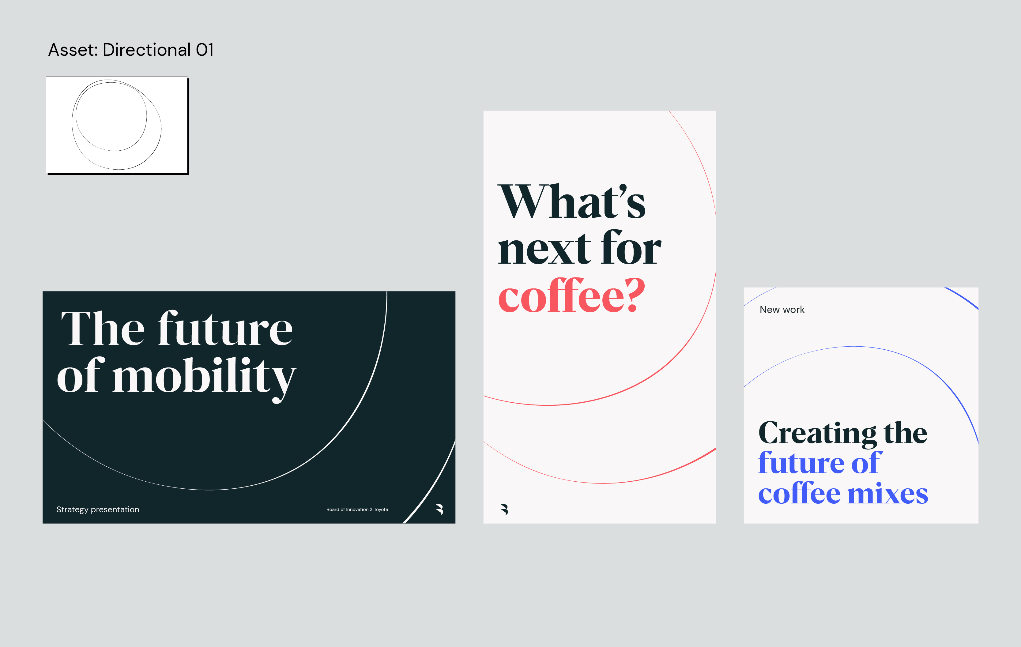
The asset Directional 01 is good for layouts where the content lives in the top or bottom corners. It can be flipped, pointing diagonally upwards or downwards.
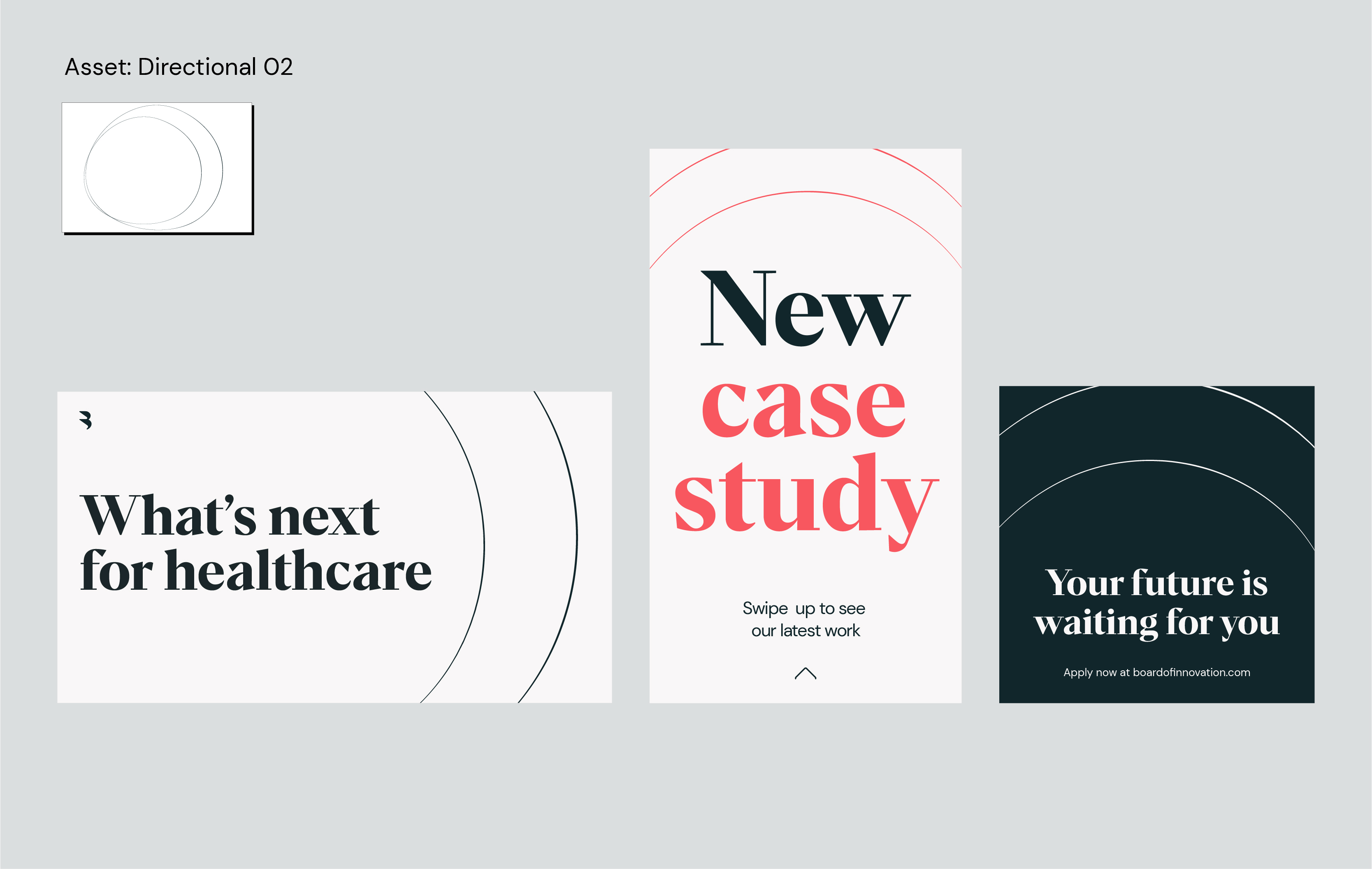
The asset Directional 02 is good for layouts where the content points in a directly horizontal way, to the left or upwards.
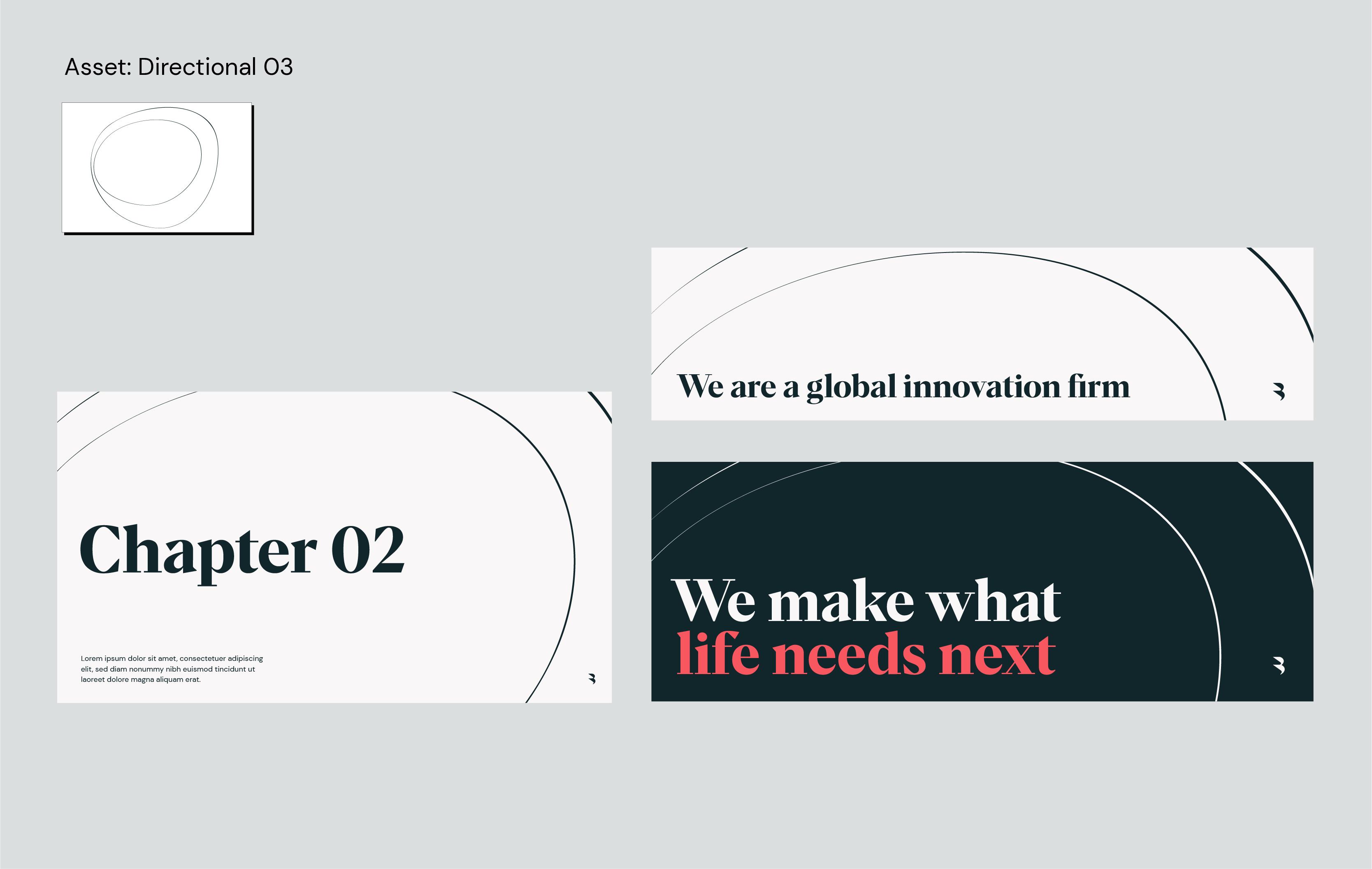
The asset Directional 03 is good for landscape or extreme landscape layouts, where the content lives in the left bottom corner. It’s also useful for thinner banner images, or for layouts with lots of content as it creates a large clear space.
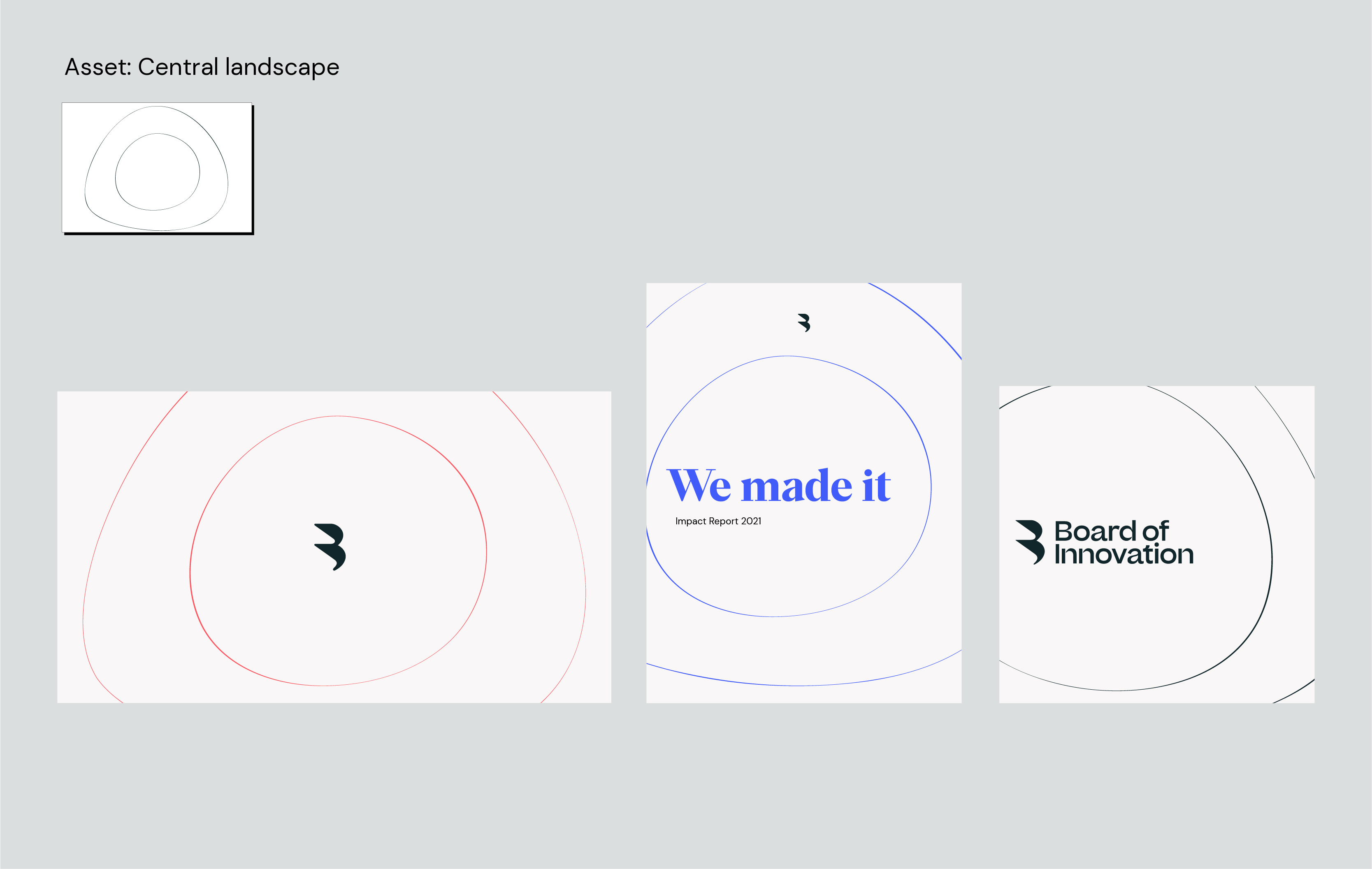
The asset Central landscape is good for layouts where the content lives in the center, creating the impact from the middle outwards.
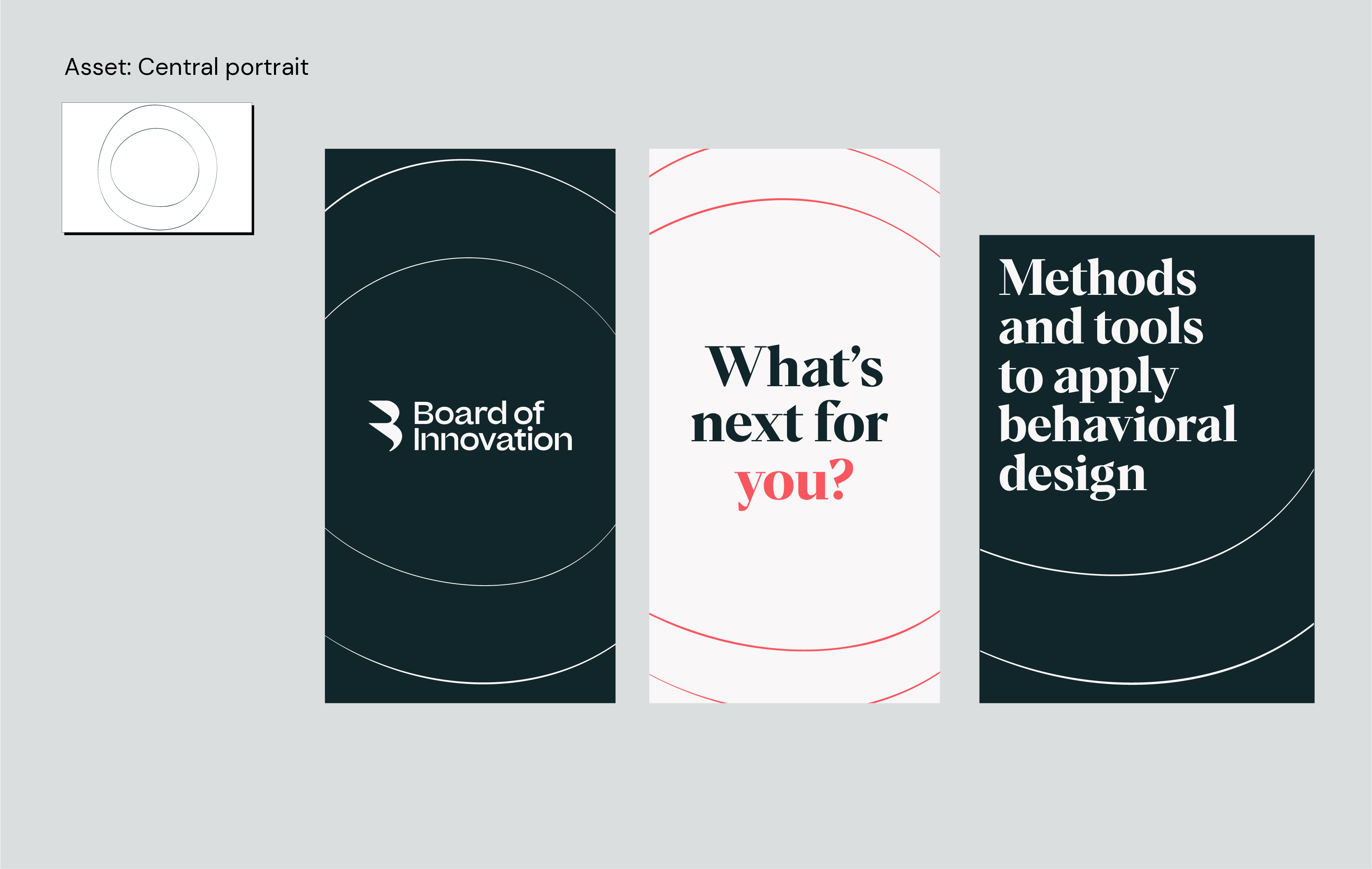
The Central portrait asset is good for thinner layouts where the content is either in the center or lives at the top, creating the impact downwards.
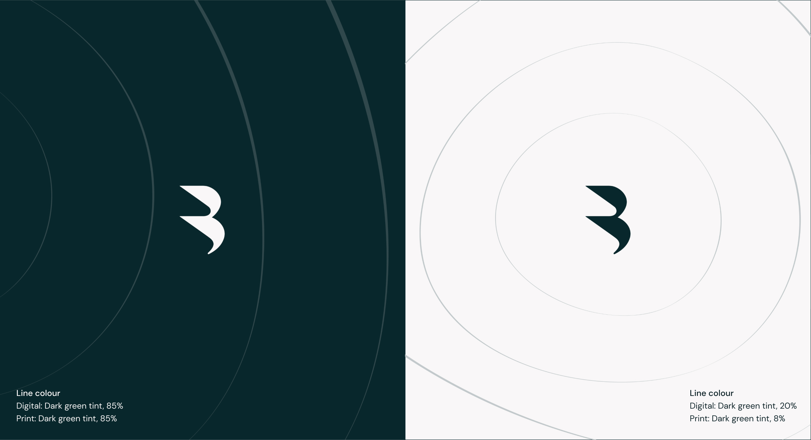
Colours
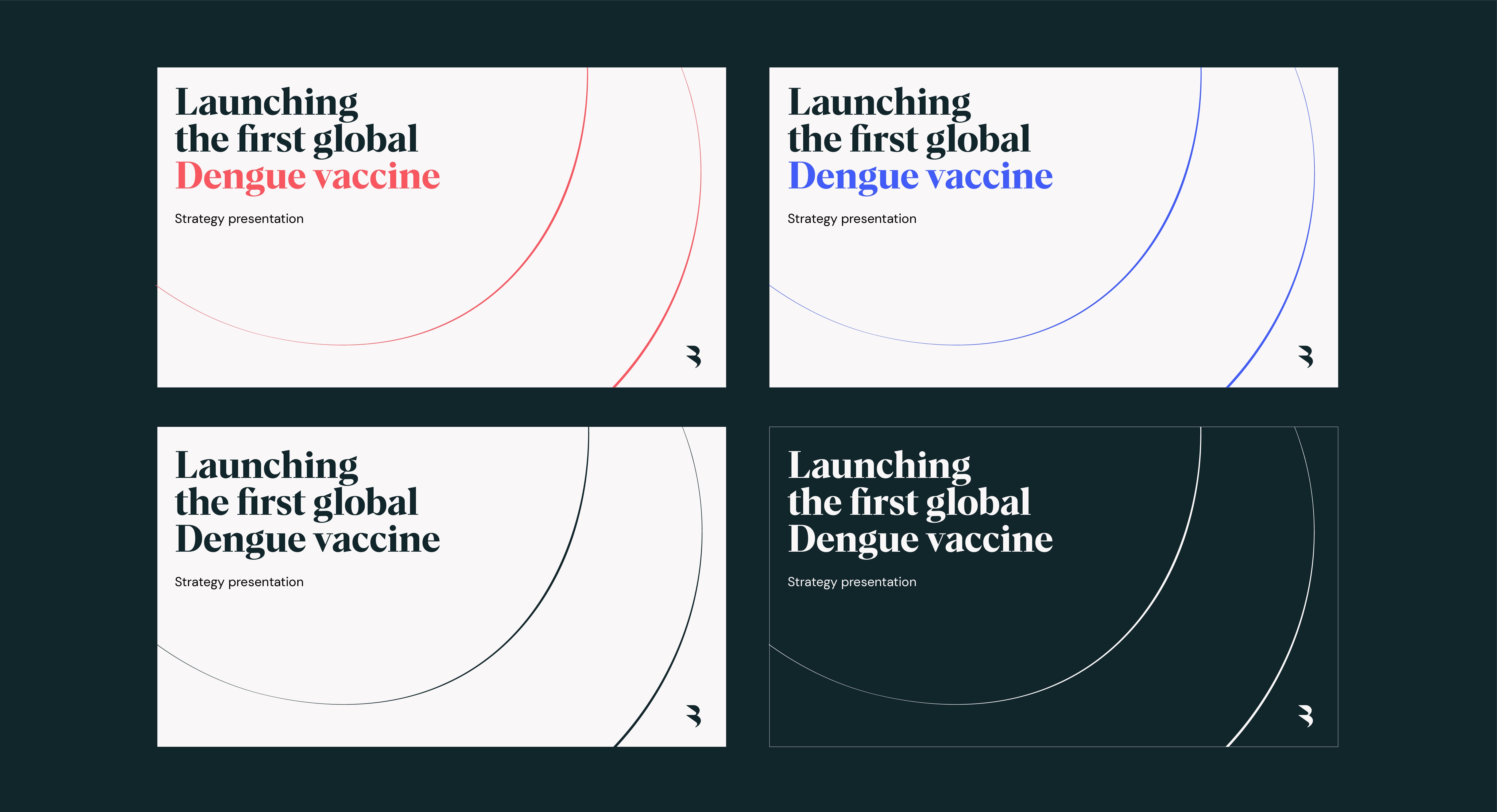
We use our impact lines in the following colour ways:
We use our impact lines in the following colour ways:
Make your
own
If you want to make a new impact line asset, use the following steps to ensure they are consistent with the others in the toolkit.
If you want to make a new impact line asset, use the following steps to ensure they are consistent with the others in the toolkit.
Set artboard size
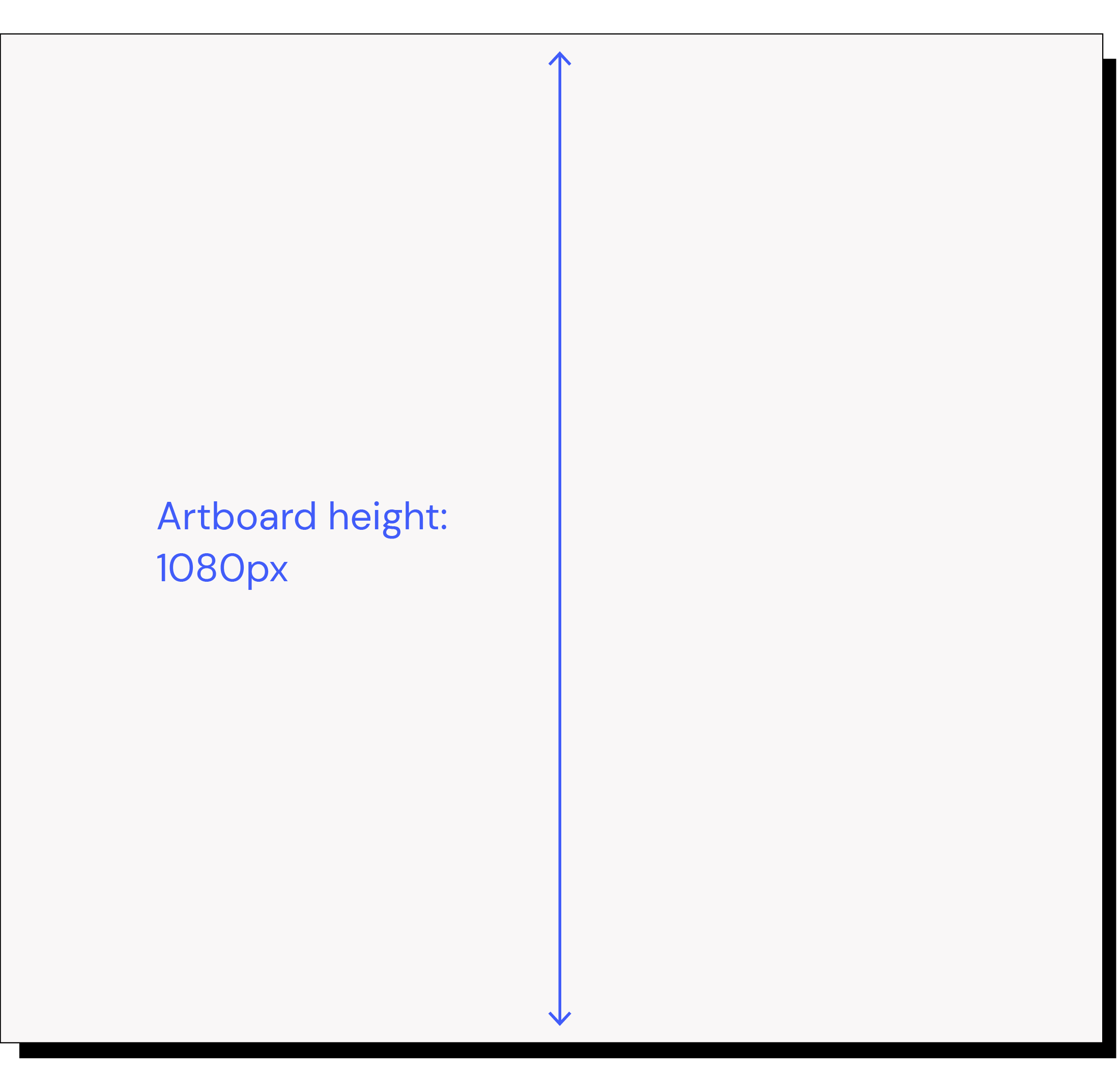
To ensure line thickness is consistent when creating a new asset always create it at a height of 1080px
2. Create outer shape
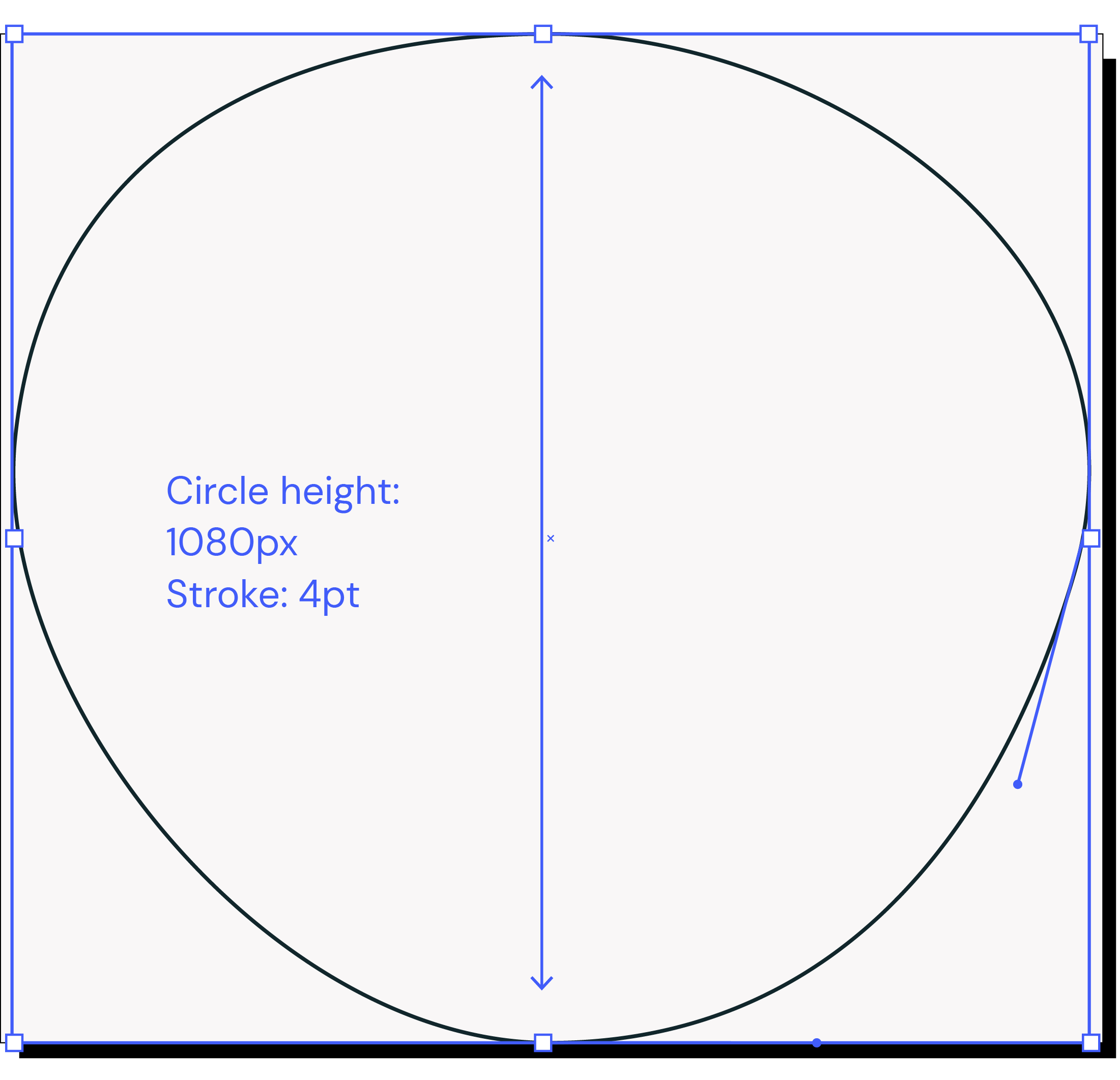
Draw a circle to the height of 1080px, stroke 4pt and use the Direct Selection tool (A) to make it slightly uneven
3. Create inner shape
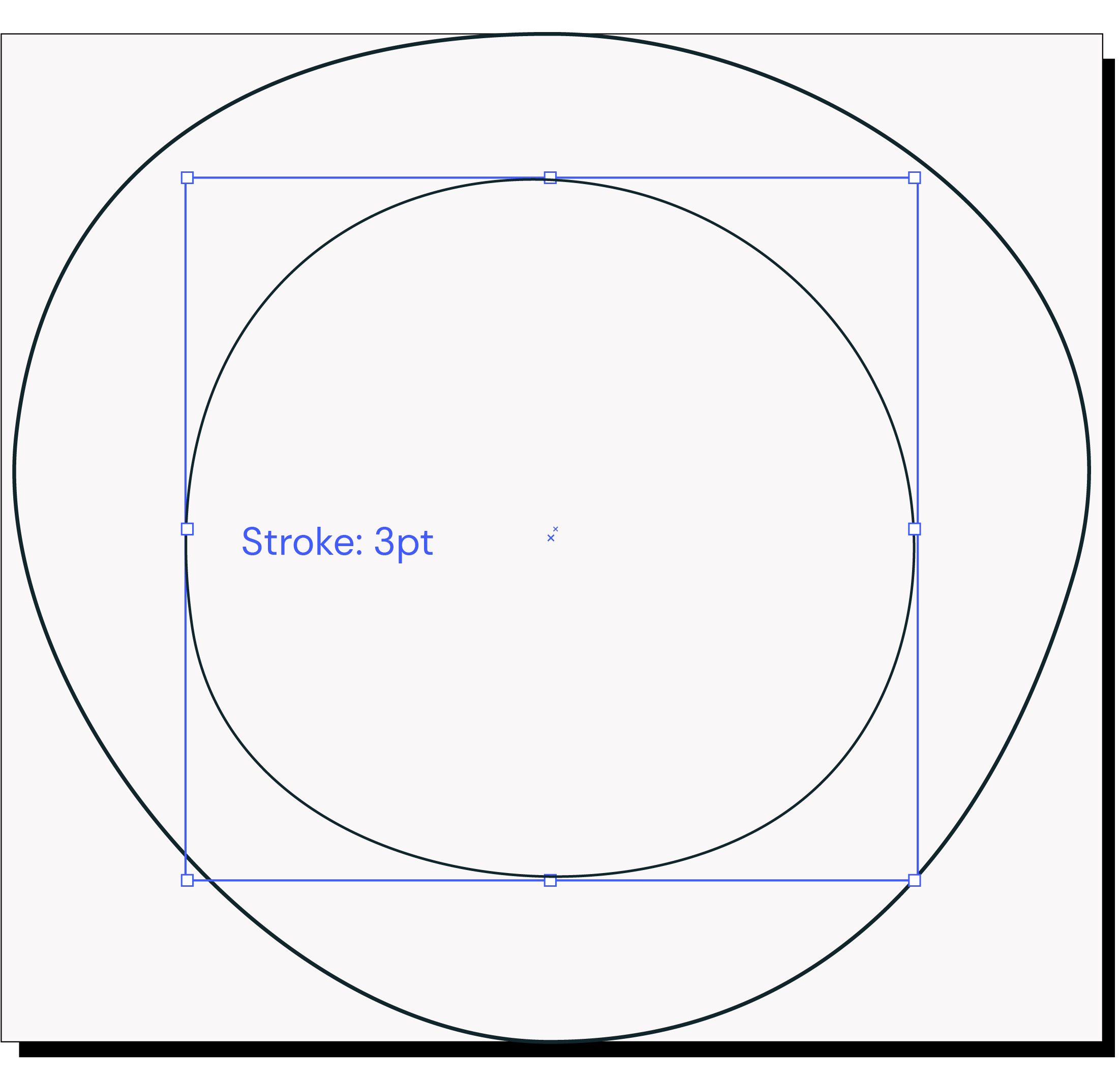
Duplicate the circle and do the same as before making the shape slightly different from the outer. Make stroke 3pt.
4. Create impact thin to thick quality
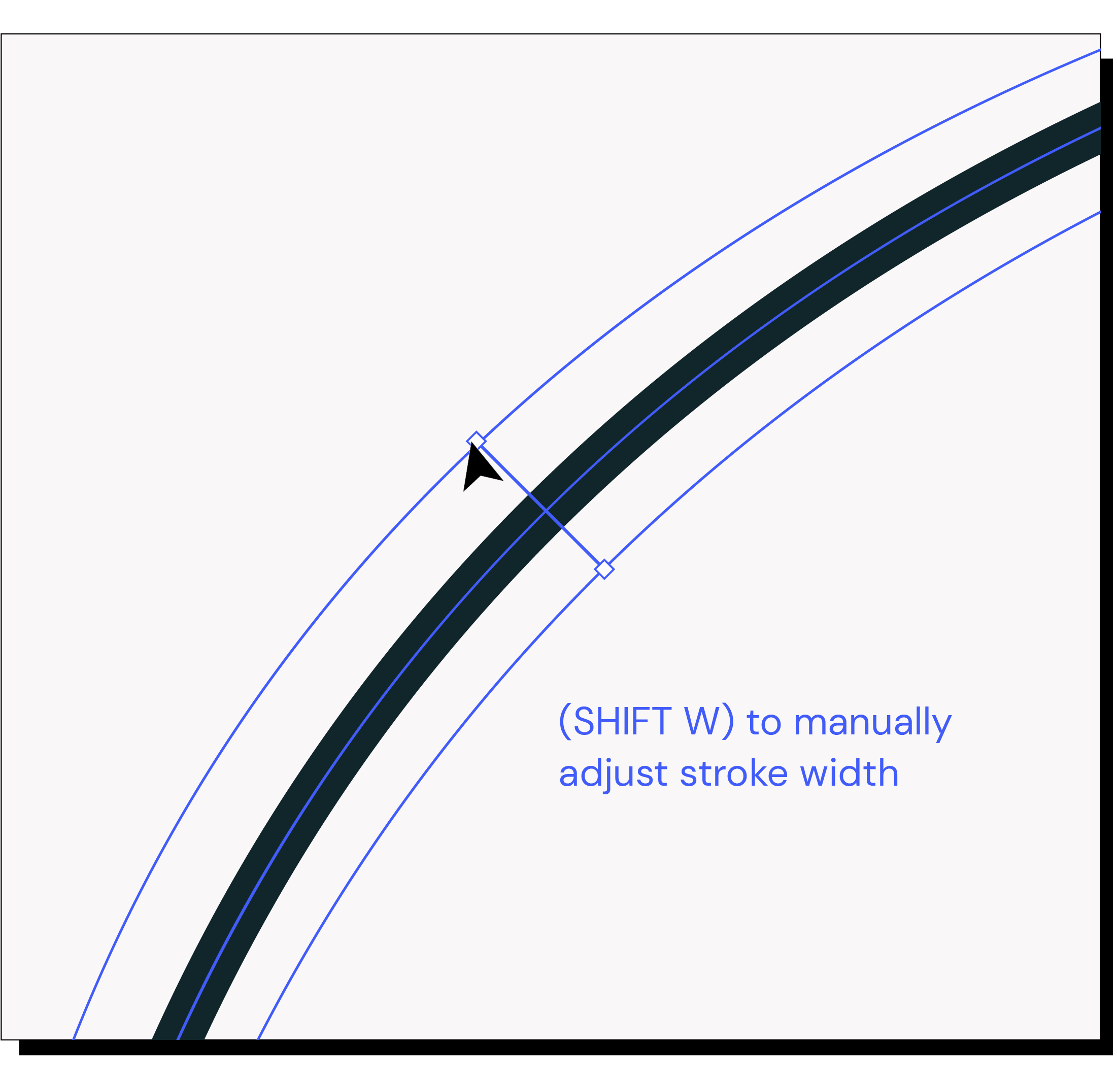
Use the shortcut SHIFT W to alter the line thickness to creating the impact thick to thin line quality.
5. Apply thick to thin to both
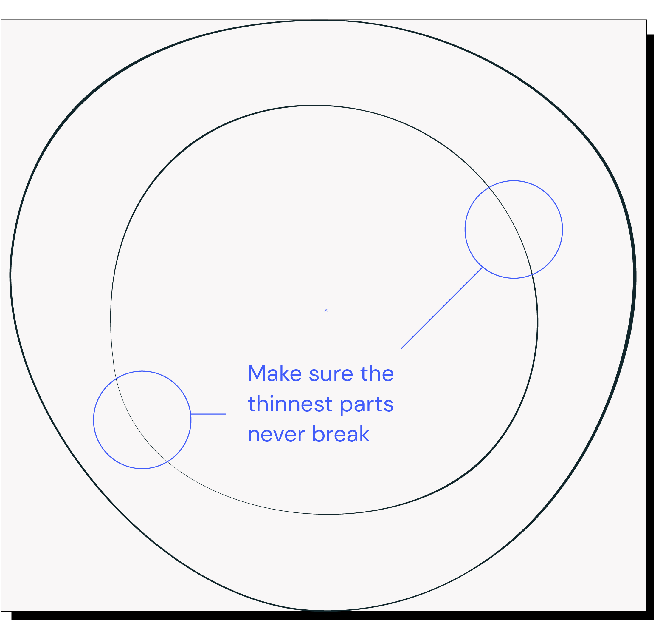
Do this to each line in turn making sure they correspond to each other. They can be delicate but always make sure the thinnest parts never break by ensuring the stroke is no less than 2px at atcual size.
Things to avoid
Don’t overlap lines
Don’t use mono width or the same width for both lines
Don’t use them too close to each other
Don’t use in unspecified colourways
Don’t apply other effects to the line
Don’t use more than two lines (except in patterns)
Don’t make lines different colours
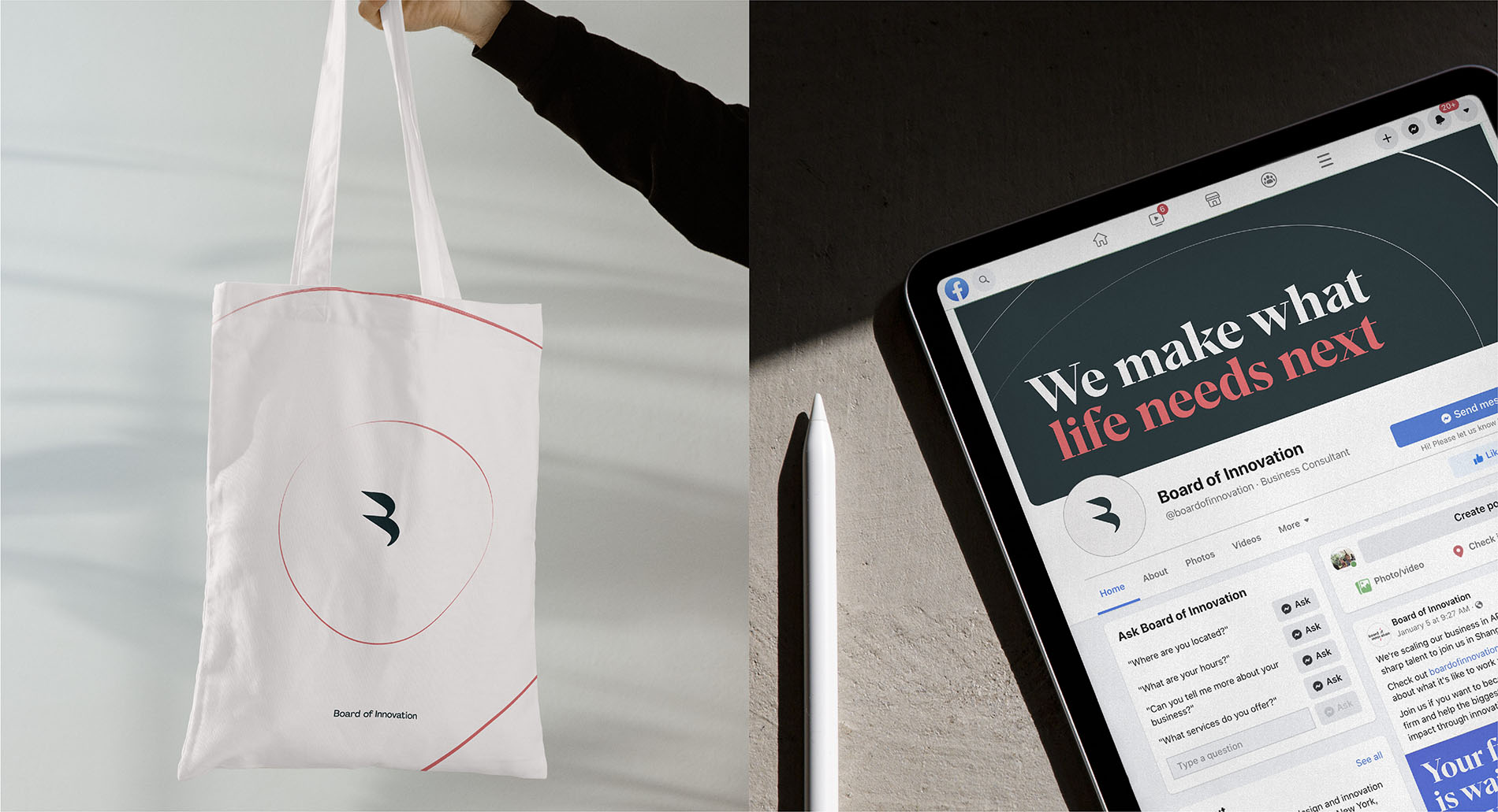
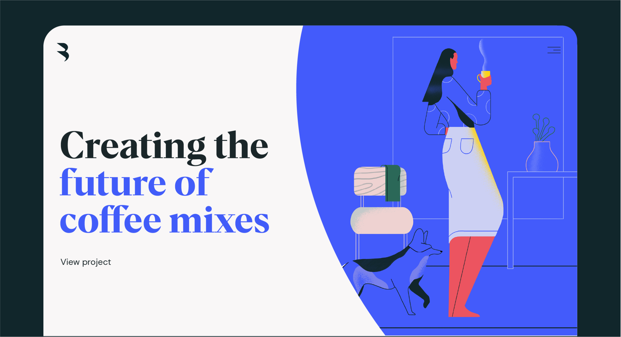
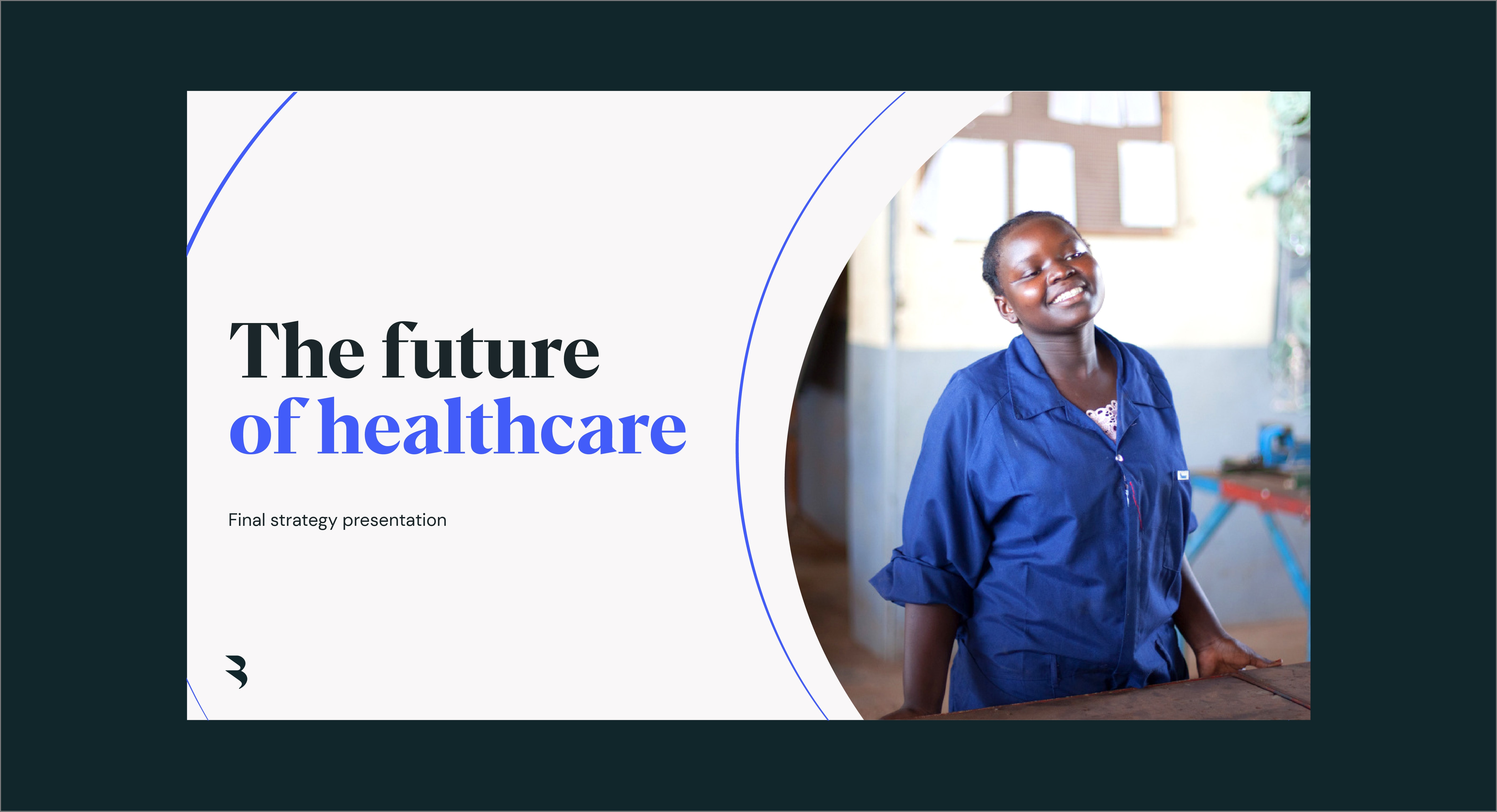
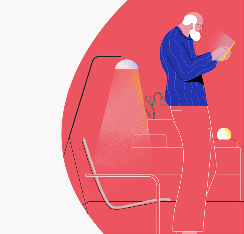
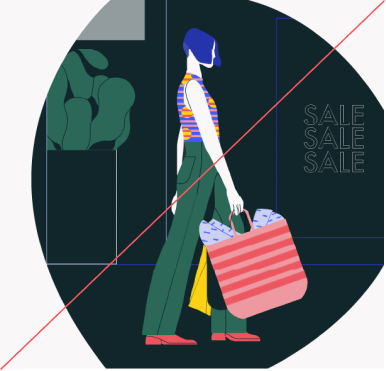
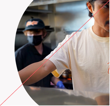
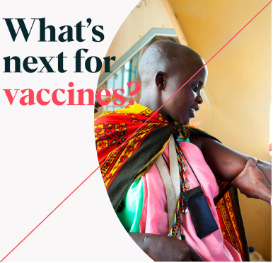
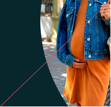
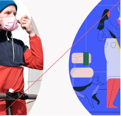
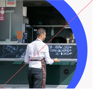
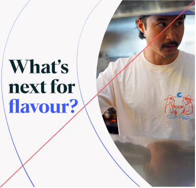
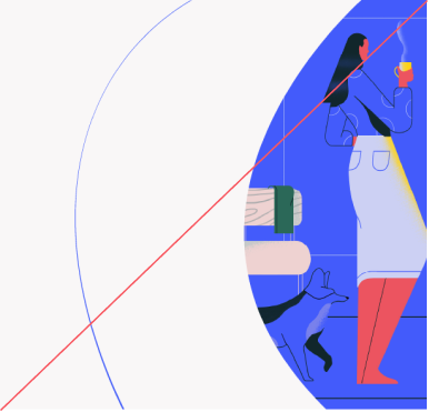
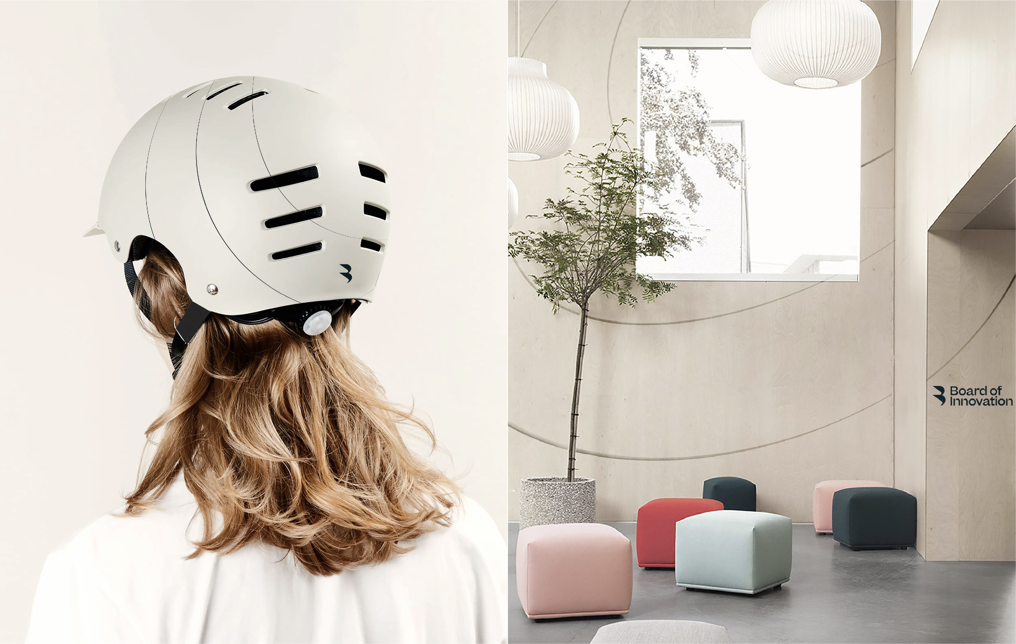
02. Focus areas
Our impact lines can also become containers for imagery. These create bold focus areas within layouts, housing illustrations or photography.
The basics
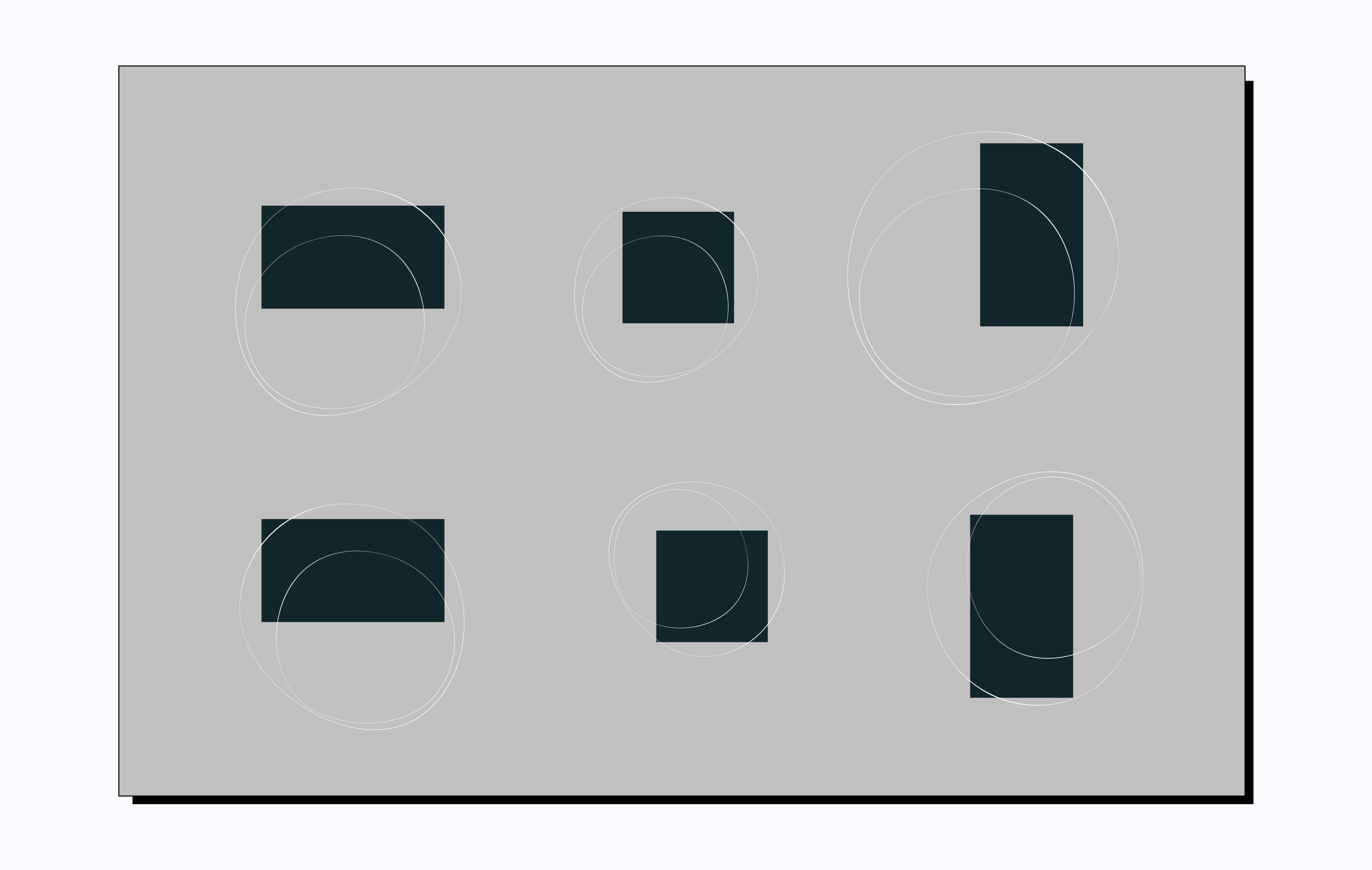
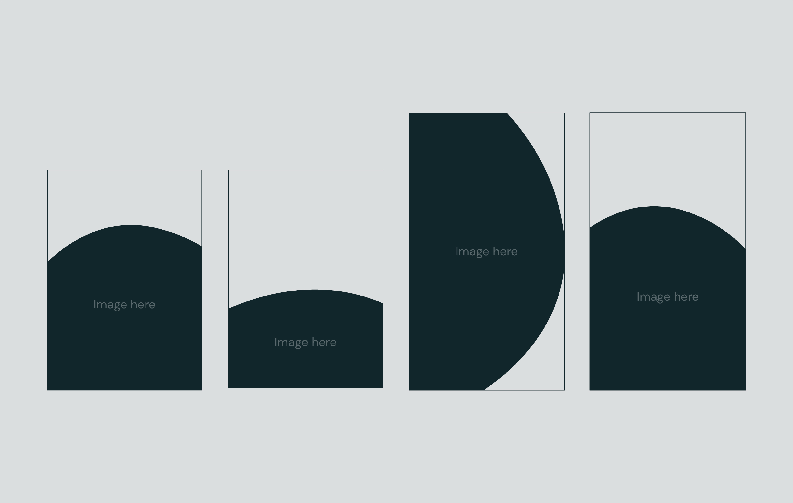
Containers are simply our impact lines, blown up, cropped and made solid to create masks for imagery.
Containers are simply our impact lines, blown up, cropped and made solid to create masks for imagery.

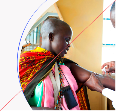
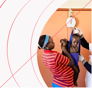
We use them as a way of containing photography within layouts.
We also use them as a container for illustration within layouts. When using with illustration, the architectural lines within images break free from the focus area, to tell the same story of ‘impact’ and ‘next’ that our impact lines do.
Templates
To make the focus areas easy to use, we have the following assets and templates to use for both landscape and portrait formats.
These can be used a starting point, and are flexible to move, mirror and crop into, showcasing the content at its best.
To make the focus areas easy to use, we have the following assets and templates to use for both landscape and portrait formats.
These can be used a starting point, and are flexible to move, mirror and crop into, showcasing the content at its best.
To make the focus areas easy to use, we have the following assets and templates to use for both landscape and portrait formats.
These can be used a starting point, and are flexible to move, mirror and crop into, showcasing the content at its best.
To make the focus areas easy to use, we have the following assets and templates for both landscape and portrait formats.
These can be used a starting point, and are flexible to move, mirror and crop into, to allow the content to look its best.
Things to avoid
Don’t show full focus area device
Avoid image crops with no focus point
Don’t overlay text onto focus device
Don’t use with any other solid colour backgrounds, only Off-White
Don’t use multiple in one layout
Don’t add any effects
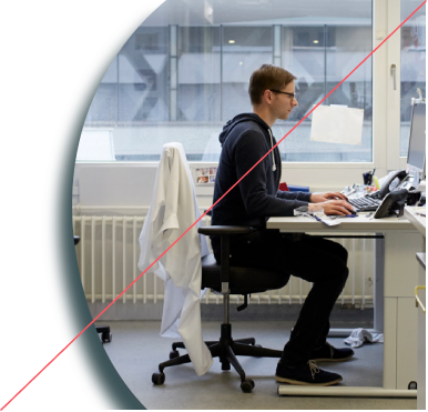
03. Combined
We can combine impact lines and focus areas to really accentuate the sense of change we’re making. This is somthing we do primarily in motion, but can also be recreated in the following ways in static layouts when needed.
The basics
To allow enough room for content, our impact lines move outwards from the focus area to give an extra sense of movement and momentum.
To allow enough room for content, our impact lines move outwards from the focus area to give an extra sense of movement and momentum.

How to use
Like the other lines in our toolkit, we can be flexible within layouts and can move the device and impact lines left, right, up or down to allow enough room for the content.
Like the other lines in our toolkit, we can be flexible within layouts and can move the device and impact lines left, right, up or down to allow enough room for the content.
When combining our impact line and focus areas we use one impact line only. Layouts should never feel overly crowded.
Templates
To make the combinations easy to use, we have the following templates to use for both landscape and portrait formats.
These can be used as a starting point, and are flexible to move, mirror and crop into, to allow the content to look its best.
To make the combinations easy to use, we have the following templates to use for both landscape and portrait formats.
These can be used as a starting point, and are flexible to move, mirror and crop into, to allow the content to look its best.
Things to avoid
Don’t fill lines with solid colour
Don’t fit lines too tight around content

Don’t use lines in two different colours
Don’t use when illustration breaks the focus area frame
Don’t touch or cross over focus device
Don’t use more than two lines
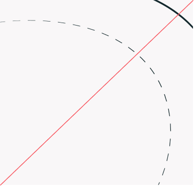
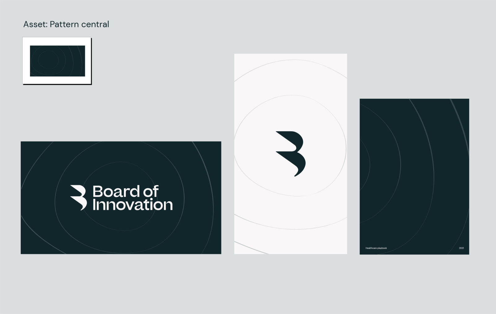
04. Patterns
These are secondary brand assets, so we don’t use them often. They’re useful as backgrounds, in physical spaces or on merch to add a little extra brand presence.
The assets
We have two pattern assets. Like our impact line, one is more directional and the other begins more from the center.
We have two pattern assets. Like our impact line, one is more directional and the other begins more from the center.
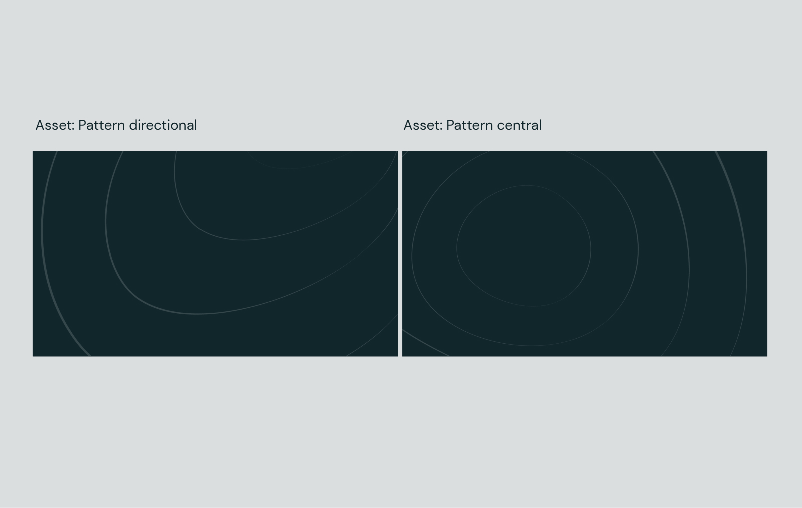
We have two pattern assets. Like our impact line, one is more directional and the other begins more from the center.
Unlike the other impact line assets, these are fixed and can’t be edited. However, you can scale them up and down and crop them to create different layouts for various formats. They can be mirrored left and right.
Colours
We use our impact line in the following colour ways only. As these are a secondary asset to be used in quieter moments, we never use them with blue or red solid coloured backgrounds.
We use our impact line in the following colour ways only. As these are a secondary asset to be used in quieter moments, we never use them with blue or red solid coloured backgrounds.
Pattern
usage
We can use our patterns in places where there is no content, such as inner pages of reports or presentations. This adds brand personality to quieter moments.
We can use our patterns in places where there is no content, such as inner pages of reports or presentations. This adds brand personality to quieter moments.
We can use our patterns in places where there is no content, such as inner pages of reports or presentations. This adds brand personality to quieter moments.
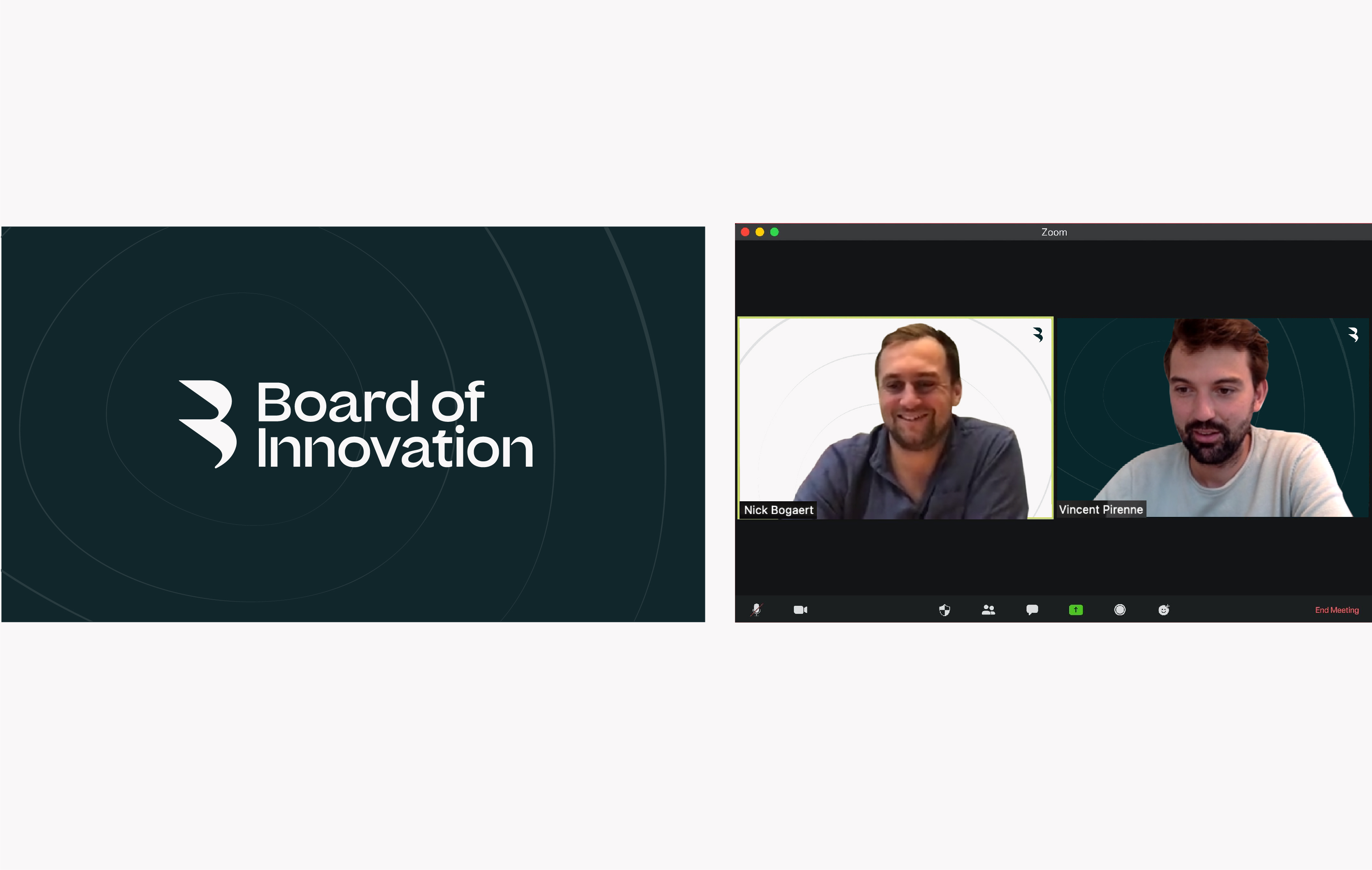
We can use our patterns as a background for our logo, on screen-savers or office screens, or as backgrounds on Zoom.
Things to avoid
Don’t use in unspecified colours
Dont use with unspecified content
Don’t show the edges of pattern
Don’t duplicate and make too small
Don’t add opacity to the patterns so they become too faint
Don’t make patterns any darker - it needs to be subtle
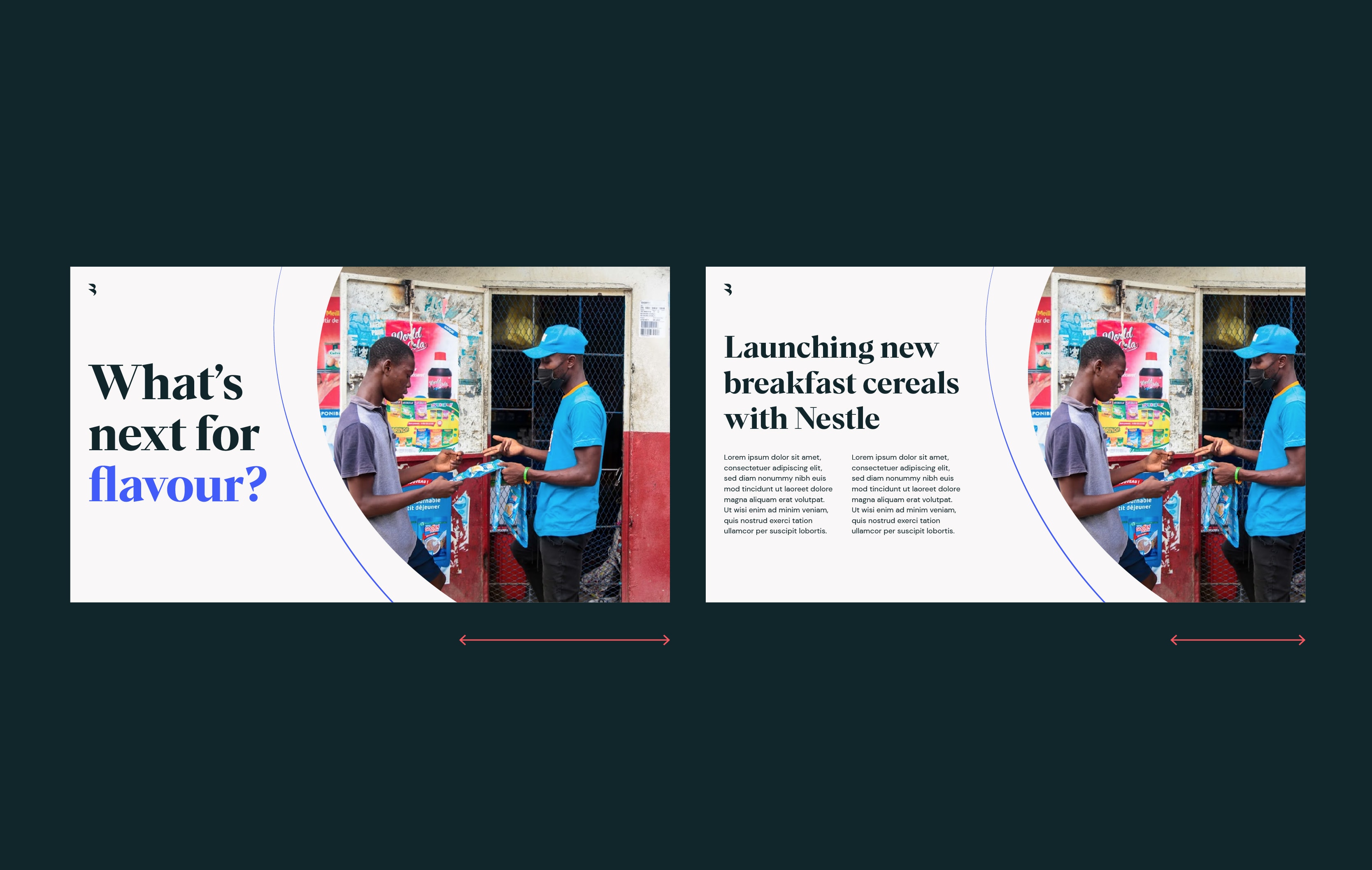
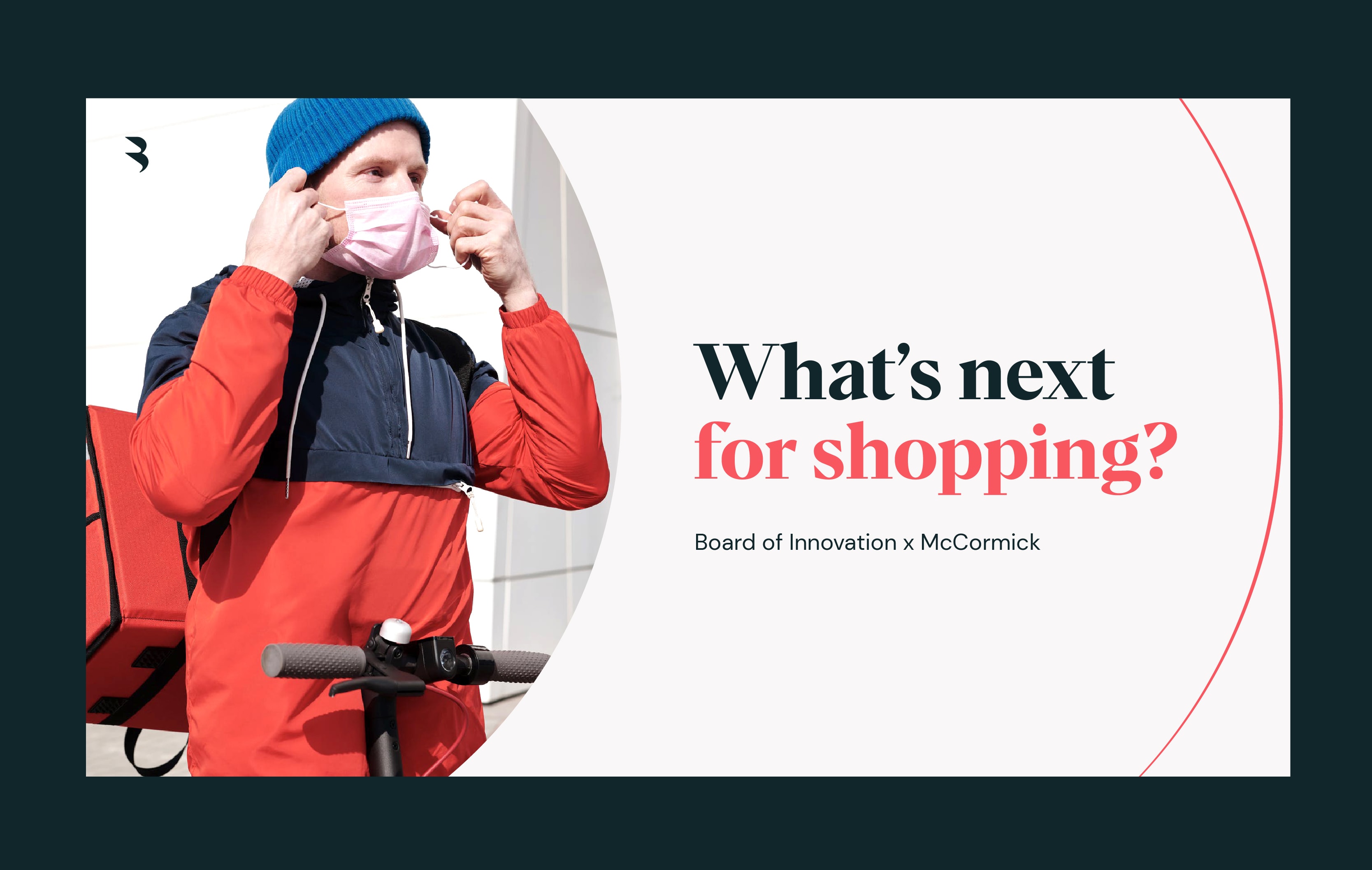
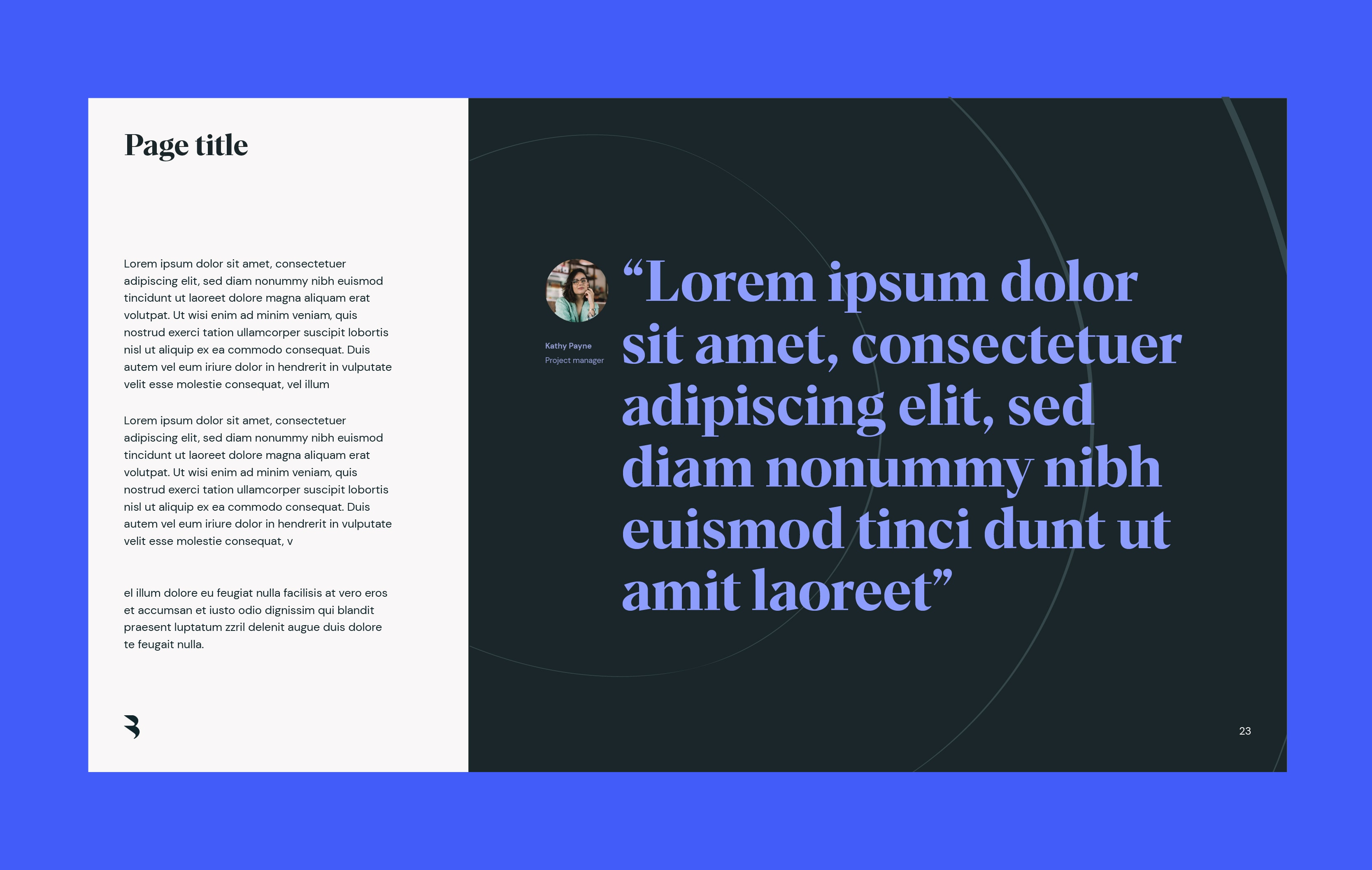
Impact lines
best practice
Now you know how to use them, let’s take a look at our 4 impact line variations in use.
Now you know how to use them, let’s take a look at our 4 impact line variations in use.