Typography

Editorial and sophisticated (with just the right amount of edge), our typeface ensures impact in everything we communicate.
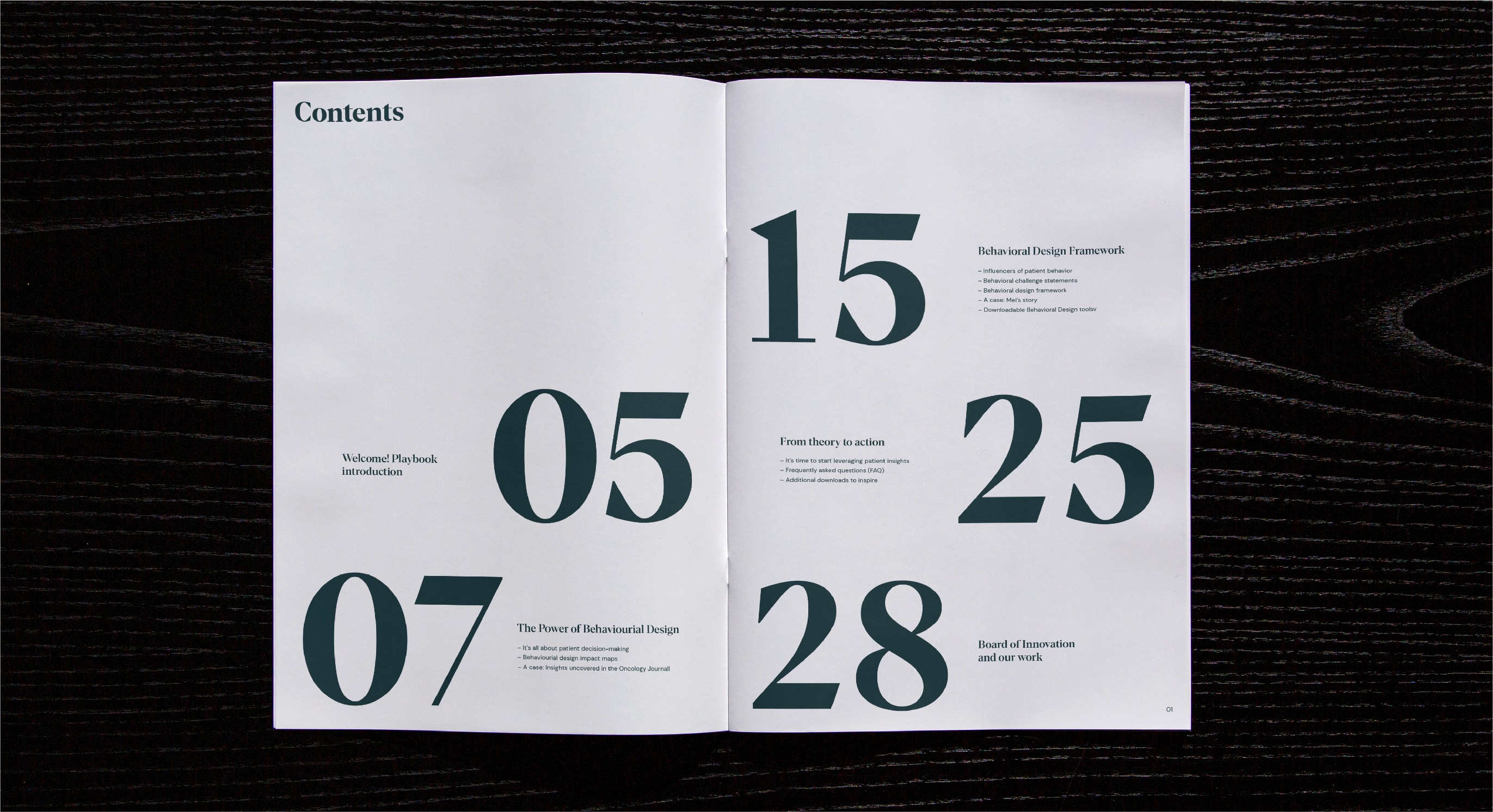
Cheat sheet
We lead with a bold headline typeface which shows off our confidence, expertise and knowledge. For sub headlines, we use the same typeface, but in a lighter weight. For body copy, we use a functional yet friendly Google font. Used together, we create the perfect tonal balance across all our brand touchpoints.
We lead with a bold headline typeface which shows off our confidence, expertise and knowledge. For sub headlines, we use the same typeface, but in a lighter weight. For body copy, we use a functional yet friendly Google font. Used together, we create the perfect tonal balance across all our brand touchpoints.

Headline
typeface
Para Supreme is our primary brand typeface and used for all headings and sub headings. It’s characterful, bold and works brilliantly in large sizes.
Para Supreme is our primary brand typeface and used for all headings and sub headings. It’s characterful, bold and works brilliantly in large sizes.
Supporting
typeface
DM Sans is our secondary, supporting typeface for all body copy and UI details. It’s a hardworking but friendly typeface, suitable for use in small sizes – plus, it’s a system font, so you can use it in every single Google Doc.
DM Sans is our secondary, supporting typeface for all body copy and UI details. It’s a hardworking but friendly typeface, suitable for use in small sizes – plus, it’s a system font, so you can use it in every single Google Doc.
Type
hierarchy
We create hierarchy by using contrasting type sizes and going big with our headlines and numbers. Use the following as guidance for typesetting to ensure maximum legibility and brand consistency. For general use, type should be set in multiples of 4.
We create hierarchy by using contrasting type sizes and going big with our headlines and numbers. Use the following as guidance for typesetting to ensure maximum legibility and brand consistency. For general use, type should be set in multiples of 4.

Hierarchy
examples
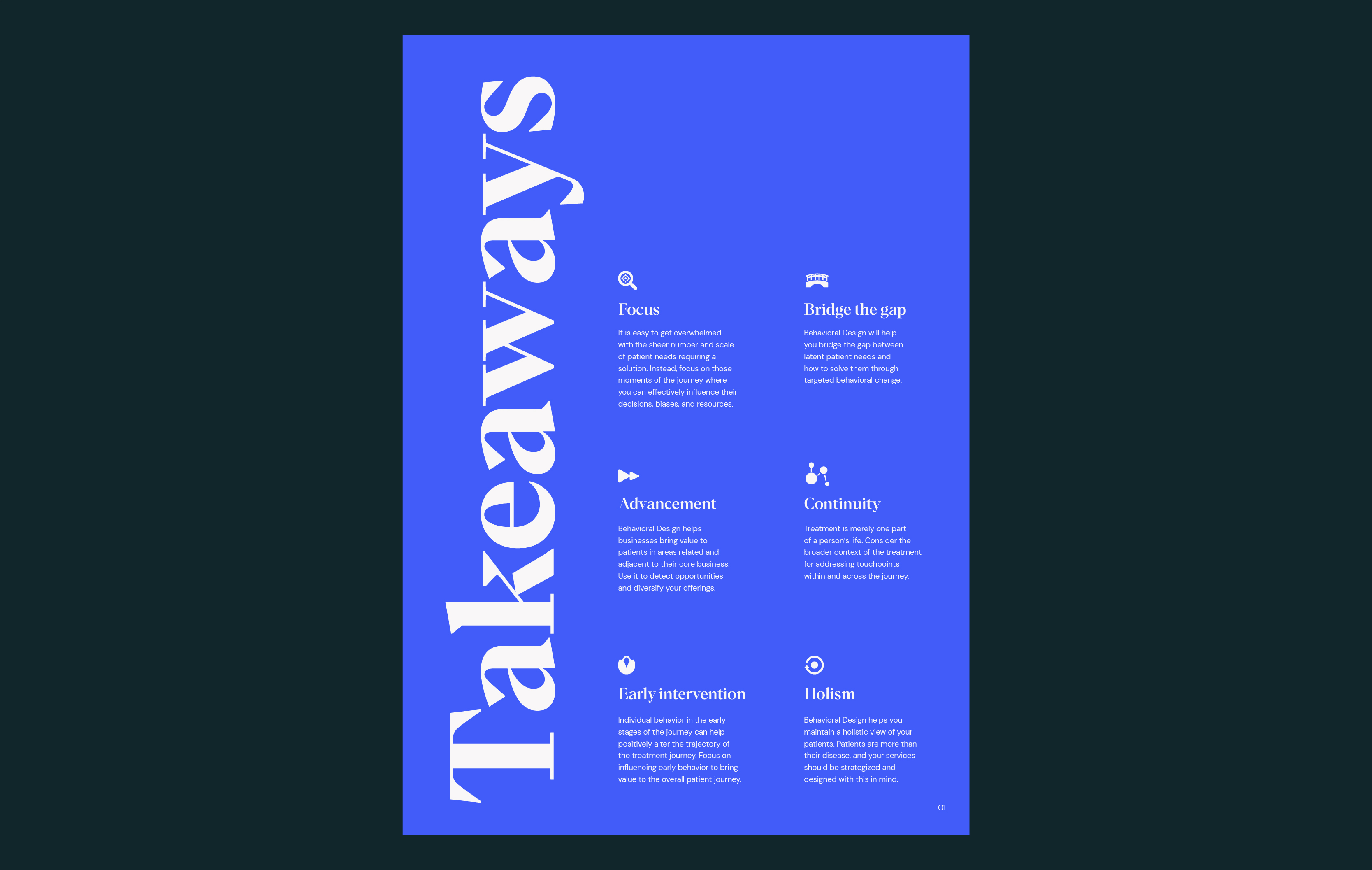
The following examples showcase how we have set-up our type sizes on different applications.
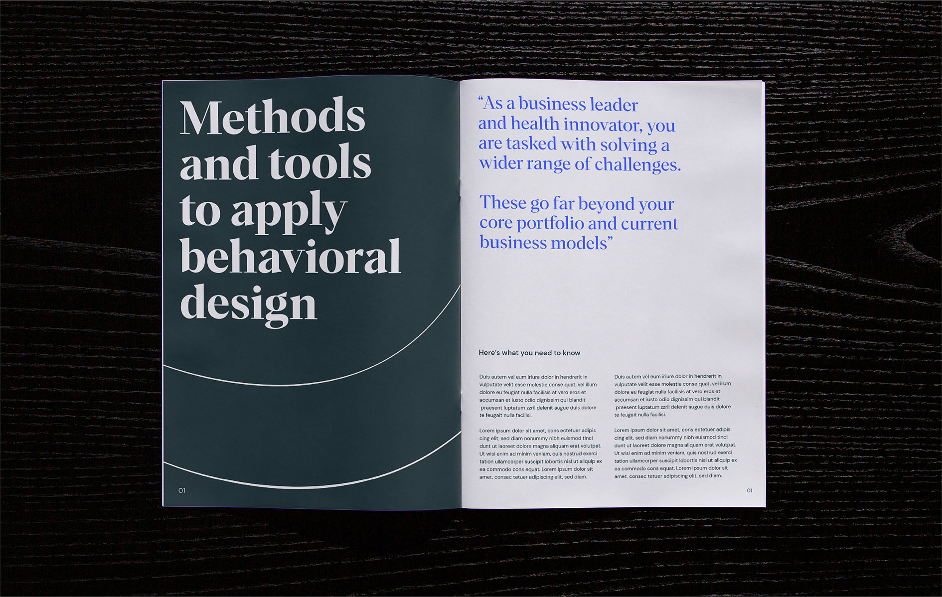
This example shows how in introductions, web page headers, and any other moments where we want to create real impact, we can go bold with our headline text Para Supreme Bold, using it at large
scale for longer paragraphs.
The following examples showcase how we have set-up our type sizes on different applications.
This example shows how in introductions, web page headers, and any other moments where we want to create real impact, we can go bold with our headline text Para Supreme Bold, using it at large
scale for longer paragraphs.
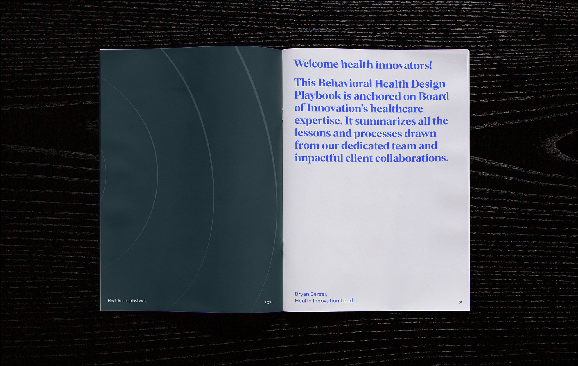
Page size - A4 Spread Headline - 36/40pt Sub-heading (name) - 16/20pt Body copy - 12/16pt
Page size - A4 Spread Headline - 88/92pt Sub-heading (quote) - 36/40pt Secondary sub-heading - 12/16pt Body copy - 8/12pt
The following examples showcase how we have set-up our type sizes on different applications.
This example uses the full set of type styles across an editorial spread. Using the full with of the pages to make the most of the sizes.
Page size - 1440 x 900px Headline - 36/40pt Sub-heading - 22/26pt Secondary sub-heading - 8/12pt
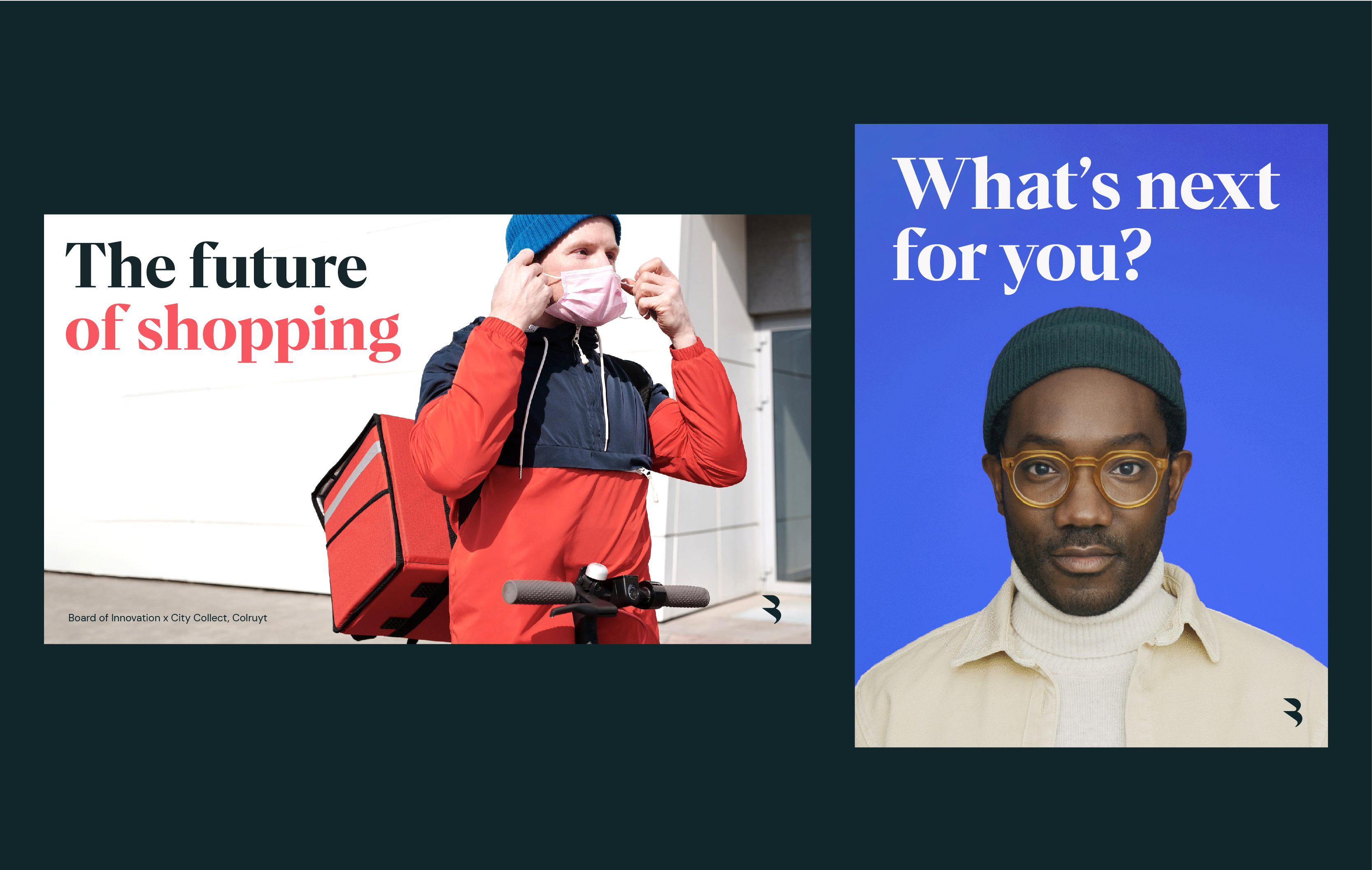
The following examples showcase the three ways that we approach sizing our logo in different scenarios.
In primary examples, where the logo is the hero, it should take centre stage over all other elements.
Page size - 1080 x 1920px Headline - 318/322pt Body copy - 40/44pt
The following examples showcase the three ways that we approach sizing our logo in different scenarios.
In primary examples, where the logo is the hero, it should take centre stage over all other elements.
System
substitutes
Wherever possible, we should use our headline brand typeface Para Supreme. However, when we’re using Google Slides, we can use the following font as a subsititute: DM Serif Display. In Miro, we use Tiempos Text for headlines, sub-titles and sub-headlines and Spoof for body copy.
Wherever possible, we should use our headline brand typeface Para Supreme. However, when we’re using Google Slides, we can use the following font as a subsititute: DM Serif Display. In Miro, we use Tiempos Text for headlines, sub-titles and sub-headlines and Spoof for body copy.


Type usage
We’ve put together some examples of how we can make our type look its very best.
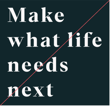
For hero headlines, we can be flexible depedent on the content. We use left, right or central alignment, at the top, center or bottom of layouts. Use large scales when possible for maximum impact.
We’ve put together some examples of how we can make our type look its very best.
For hero headlines, we can be flexible depedent on the content. We use left, right or central alignment, at the top, center or bottom of layouts. Use large scales when possible for maximum impact.
We’ve put together some examples of how we can make our type look its very best.
For hero headlines, we can be flexible depedent on the content. We use left, right or central alignment, at the top, center or bottom of layouts. Use large scales when possible for maximum impact.
We’ve put together some examples of how we can make our type look its very best.
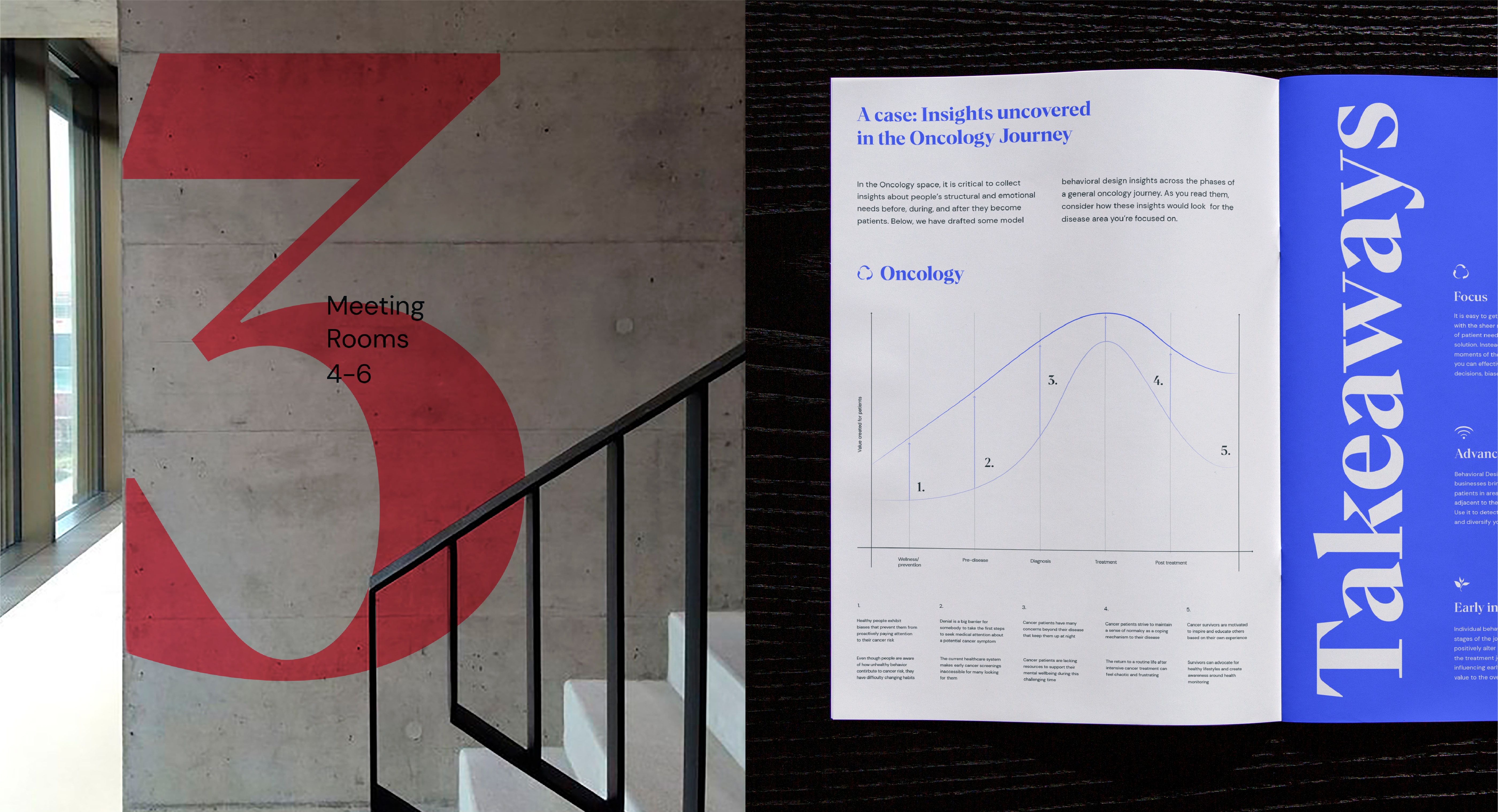
We can be playful with our type and use in interesting ways. For example, in instances where there’s lots of content in a layout, we can flip our type and use it vertically to create hierarchy.
We’ve put together some examples of how we can make our type look its very best.
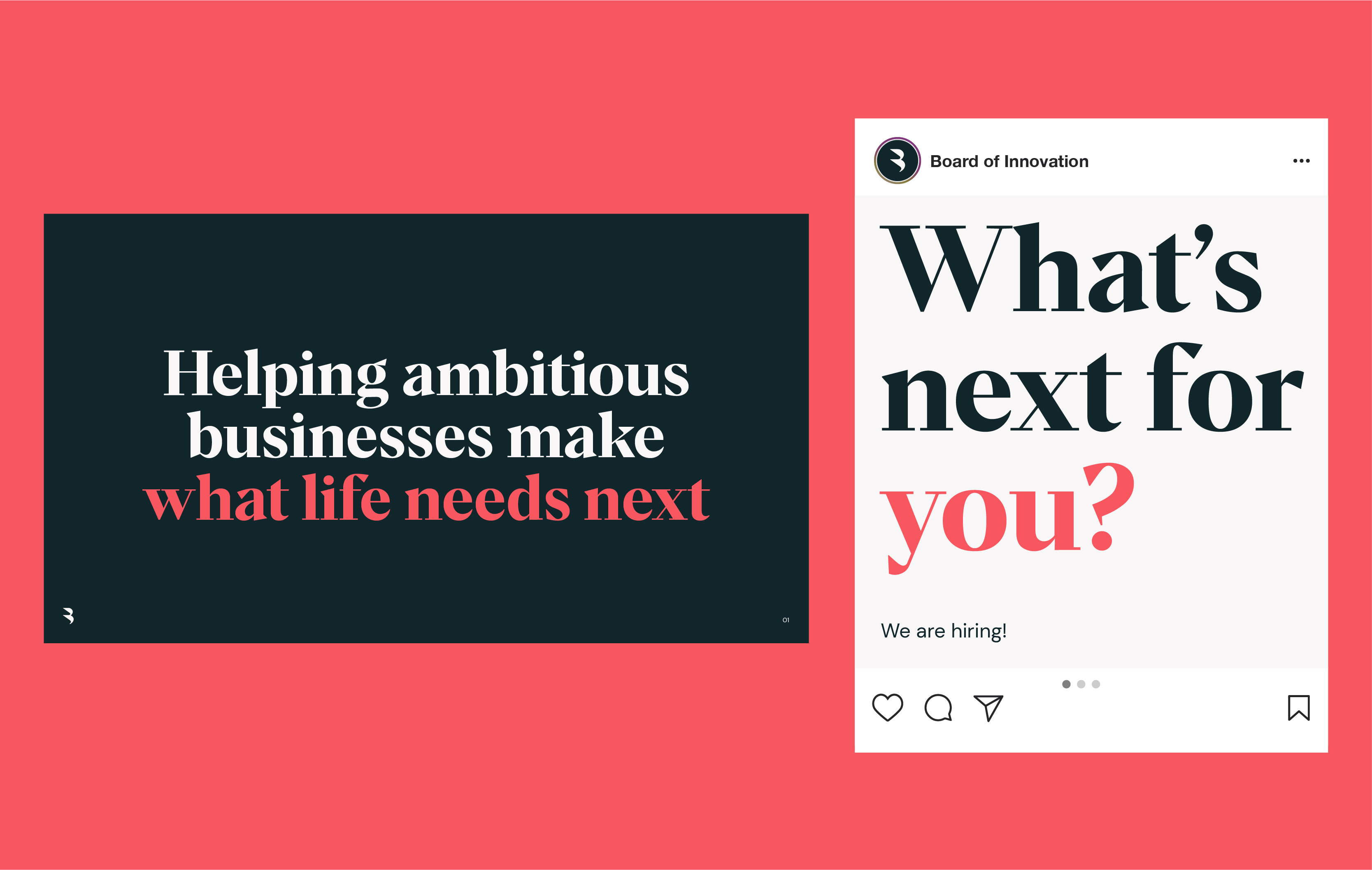
When using type over imagery, we can use in any of our brand colours. Always ensure there’s enough clear space behind the type, and that the colour you’ve chosen creates enough contrast.
We’ve put together some examples of how we can make our type look its very best.
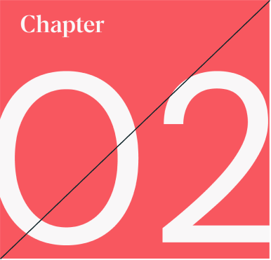
Go big and bold with numbers. In presentations when you have to use the system substitute font for headlines, use the provided pngs number assets of Para Supreme wherever possible rather than DM Serif Display. These can be downloaded from the hub section.
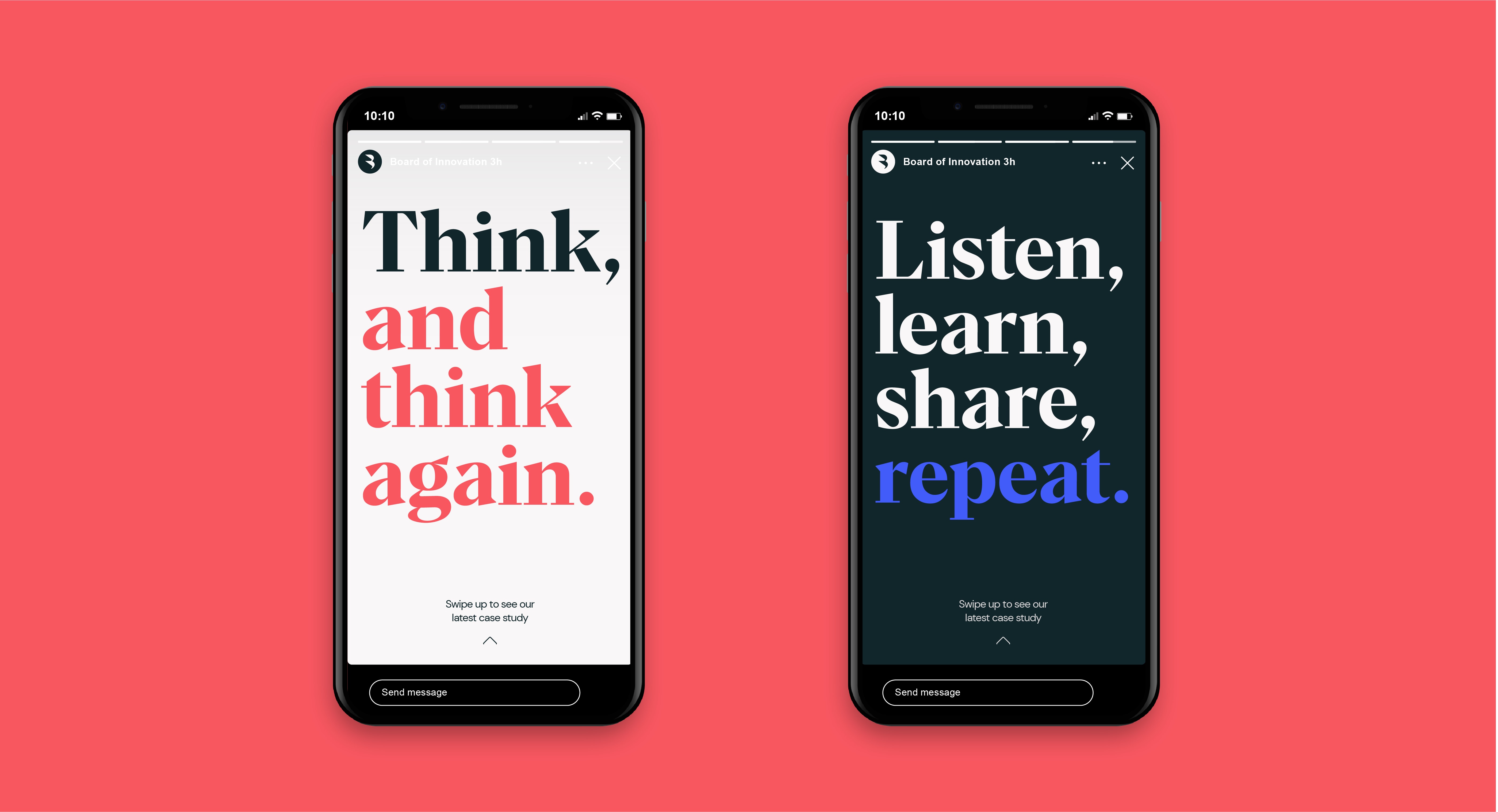
Type highlight
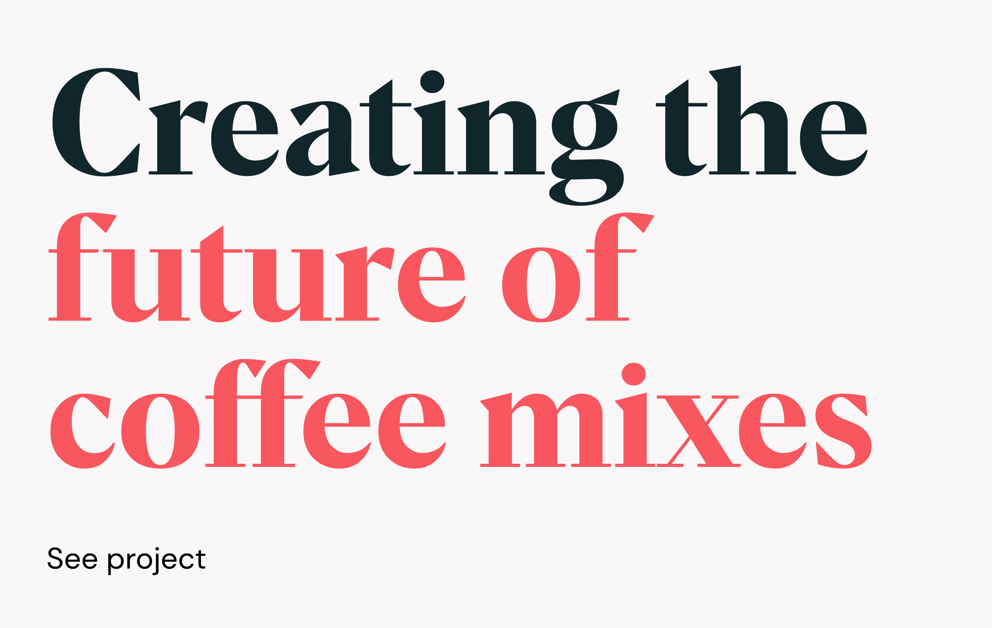
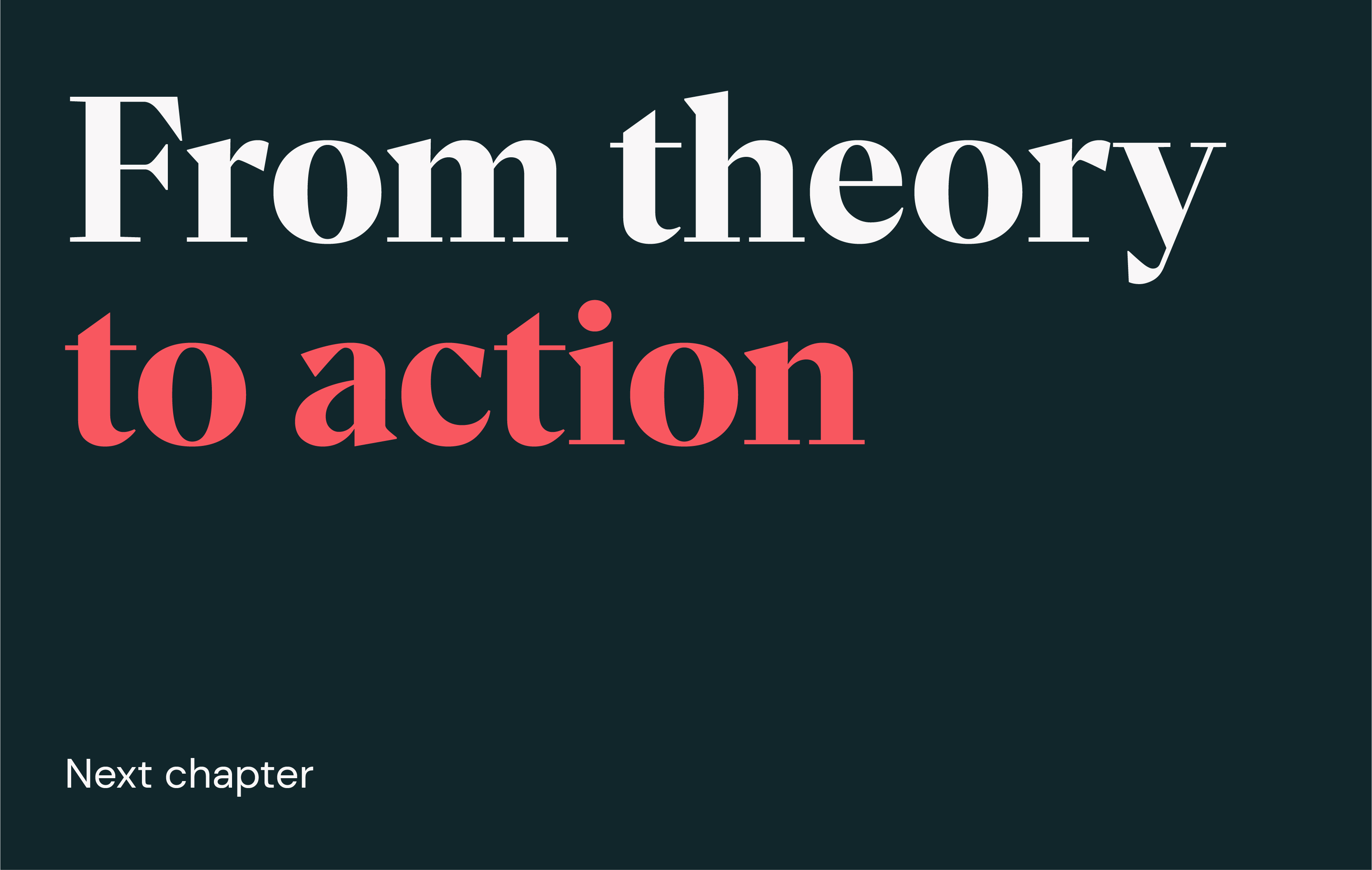
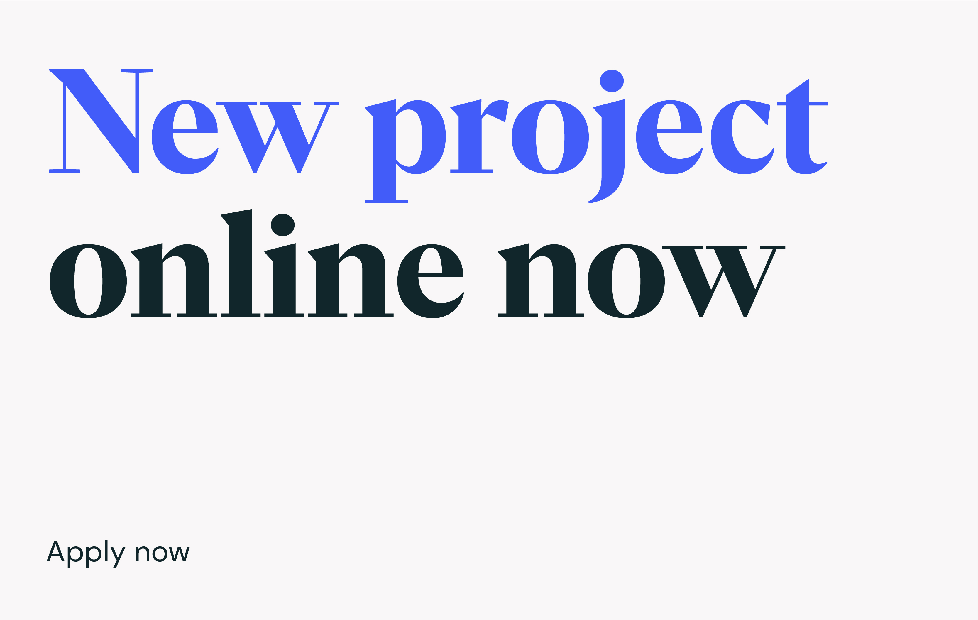
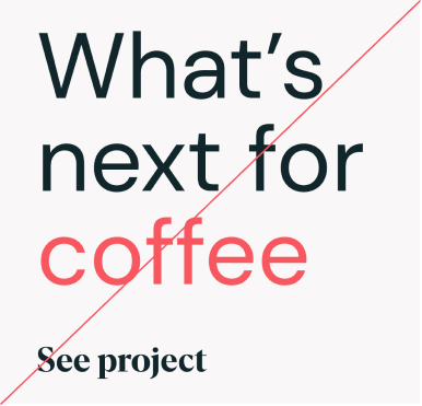
We can create extra emphasis and focus within headlines, highlighting select words with our brand colours. Be selective and only choose the most important words, never entire sentences.
Ensure the whole line is highlighted. This can either be the top or bottom, but never break over multiple lines.
We can create extra emphasis and focus within headlines, highlighting select words with our brand colours. Be selective and only choose the most important words, never entire sentences.
Ensure the whole line is highlighted. This can either be the top or bottom, but never break over multiple lines.
Examples
Now you know how to use our type, let’s take a look at the most effective ways we can put it into practice.
Now you know how to use our type, let’s take a look at the most effective ways we can put it into practice.
Things to avoid

Don’t use illegable colour combos
Don’t flip the hierarchy of typefaces
Don’t use incorrect kerning/spacing
Don’t use DM Sans for large numbers
Don’t make type too similar in size

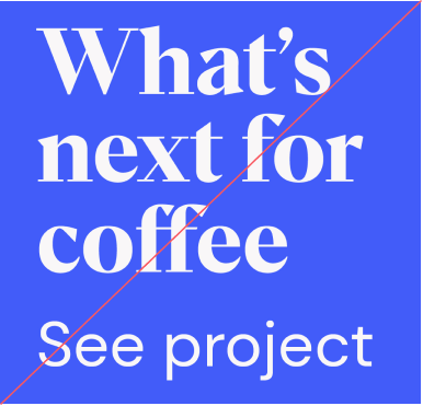
Don’t skew type

Don’t use more than one colour pop